Articles related to Users
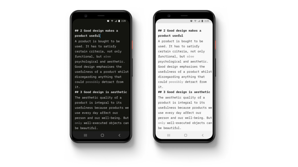
Style Check on Android
Your most requested feature
How to Think Different
True respect is mutual
Subscription or no Subscription?
That is not the question
Design is Political
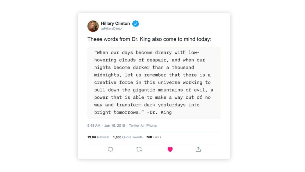
And Hillary Clinton uses iA Writer
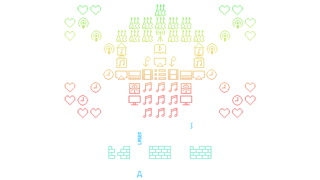
On Icons
We ♥ icons, madly

Kill Blog Comments?
You can't discuss and moderate at the same time
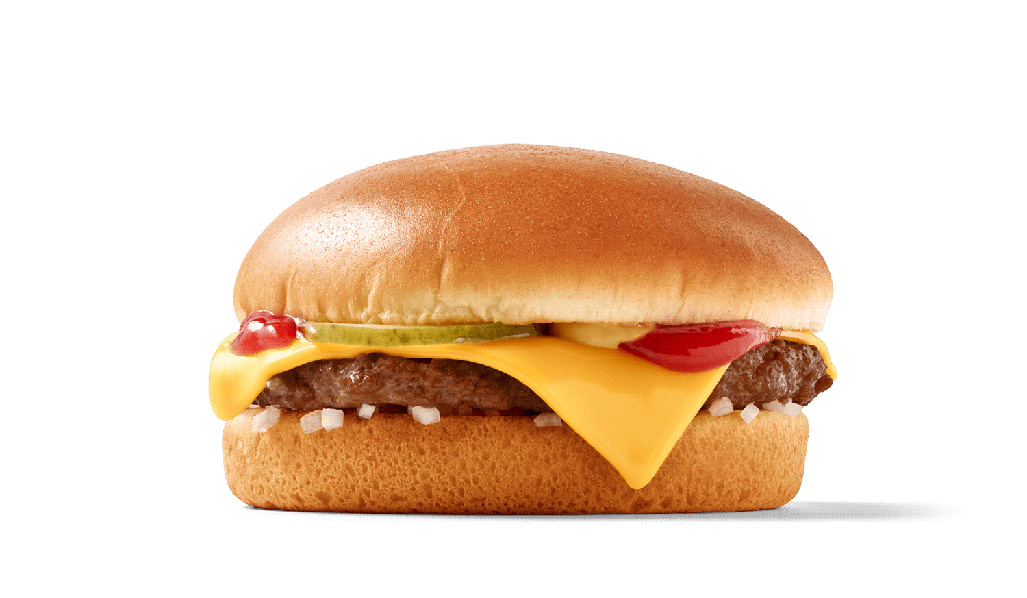
The Interface of a Cheeseburger
Brand = UI
Web Design is 95% Typography
Text as UI
Usability News
The F-Pattern


