Using 10 pixel Verdana made sense in a time when screens were 640 pixels wide. Today it is a mistake.
There are some great arguments for small font sizes. Here are the top three:
- With smaller type sizes we can avoid scrolling
- We can always adjust the font size
- Busy pages covey rich content, they look more professional
If you use small type because you want to spare us from scrolling: Relax, scrolling is fine. Flipping pages in books is fine, too. Being able to read the text is key. Telling your reader to “get glasses” is funny—especially if they already wear them. But designing bent over with your face glued to the screen is bad for your back; try leaning back and continue designing in a relaxed position. Your designs will be more relaxed, and so will you.
Sure, people can adjust the font size, but do you want to? Do you want to adjust your car seat every time you get in? Expecting your users to zoom in every time puts them in a similar position. Adjusting the font size beyond matters of sheer accessibility can be a delicate matter, and most users are not typographic specialists. The type size a designer chooses should have little to do with taste or personal prevalence. Unless you have diminished eye sight, the readability of a typeface finds its optimum in a narrower range than one might think.
Throwing all kinds of information at the user is lazy, and makes for a disorienting experience. We are paid to think about the content, and make choices between what is important and what isn’t.
Five Simple Rules
1. Standard font size for long texts
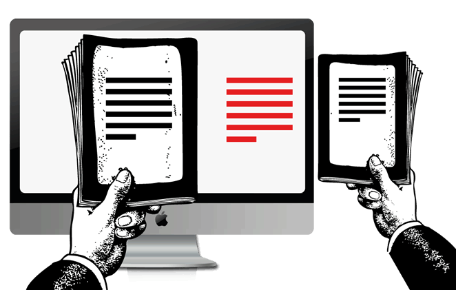
To realize how small the text is on many websites, compare to a book that you feel comfortable reading, then change the font size until the type on the book and the screen are about the same size:

It will look big if you hold the book right next to the screen, but it will look fine if you hold the book at a comfortable reading distance. Congratulations, you’ve probably ended up at about the browser default of 100%, if not larger. As long as you respect the reading distance, this works across devices too.
Initially it is more difficult to create a visually pleasing layout with a bigger font size, but that challenge will help you design a simpler, clearer site. Anyone can cram a page with information, but making it simple and easy-to-use is hard. At first, you will be shocked by how big the default text is. But after a day you won’t want to see anything smaller, and you quickly realize why all browsers use the default text size.
2. Active white space
Let your text breathe. Again, this is not about taste.
The width of the column must be proportioned to the size of the type. Overlong columns are wearying to the eye and also have an adverse psychological effect. Overshort columns can also be disturbing because they interrupt the flow of reading and put the reader off by obliging the eye to change lines too rapidly. —Grid Systems in Graphic Design, Josef Müller-Brockmann
Having space around the text reduces the stress level, as it’s much easier to focus. You don’t need to fill the whole window. White space looking nicer is a consequence of functional design. Who said websites need to be crammed with stuff?
The question of the column width is not merely one of design or format; the question of legibility is of equal importance. —Grid Systems in Graphic Design, Josef Müller-Brockmann
Make sure that the line length (text column width, also called “the measure”) is not too wide, and that you add room on the left and right to make it easy for the eye to move from line to line. We don’t want to adjust either the font size or window size. When we open a website, we just want to read away. Column widths that scale are nice; never-ending text lines all across the screen are not.
As a rule of thumb, fit about 10-20 words per line. For liquid layouts on desktops a 50% column width (in relation to window size) is a good benchmark to get started.
3. Reader-friendly line height
Line height is a delicate issue. But if you know the basics, you can get pretty far.
Lines that are too narrowly set impair reading speed because the upper and lower line are both taken in by the eye at the same time. The eye cannot focus on excessively close lines and … the reader expends energy in the wrong place and tires more easily. The same also holds true for lines that are too widely spaced. —Grid Systems in Graphic Design, Josef Müller-Brockmann
The default HTML line height is too small. If you increase the line height, the text becomes more readable. For type on screen, 140% leading is a good benchmark.
4. Clear color contrast
If you are a web designer and believe you can get away with one of the following combinations, you might think about changing jobs:
- Light grey text on a lighter grey background
- Silver colored text on a snow white background
- Grey text on a yellow background
- Yellow text on a red background
- Green text on a red background, and so on…
If you insist you are a web designer, then you have to be aware that no one will ever find out that you exist, as no one will ever be able to read what you say. Let us see what you type. Note: for low resolution screens, an overly strong contrast (full black and white) is not ideal either, as the text starts to flicker. Benchmark: #333 on #fff.
5. No text in images
We want to be able to search text, copy text, save text, play with the cursor, and mark text while we read. Text in images might look pretty, but information needs to be readable and usable and scalable and citable and sendable first.
If you can’t make your website look nice without text in images, I am afraid that you will have to start again from scratch.


