INFORMATION PLAN
Articles related to Information Design
Design is Political
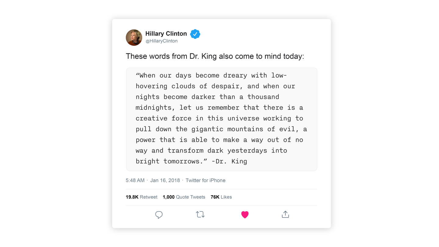
And Hillary Clinton uses iA Writer
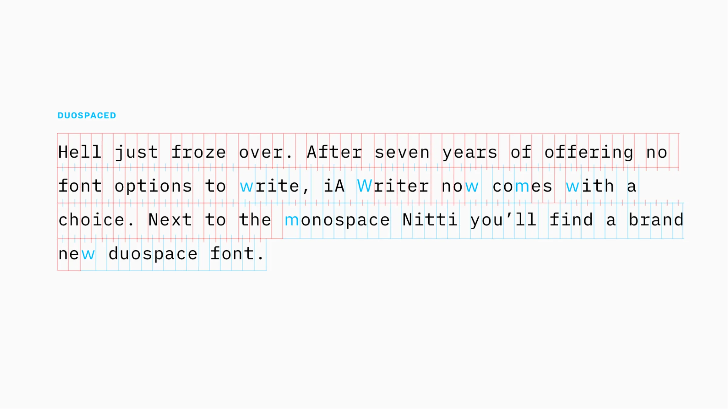
Duospace Fonts
In search of the perfect writing typeface
Our Next Trend Map
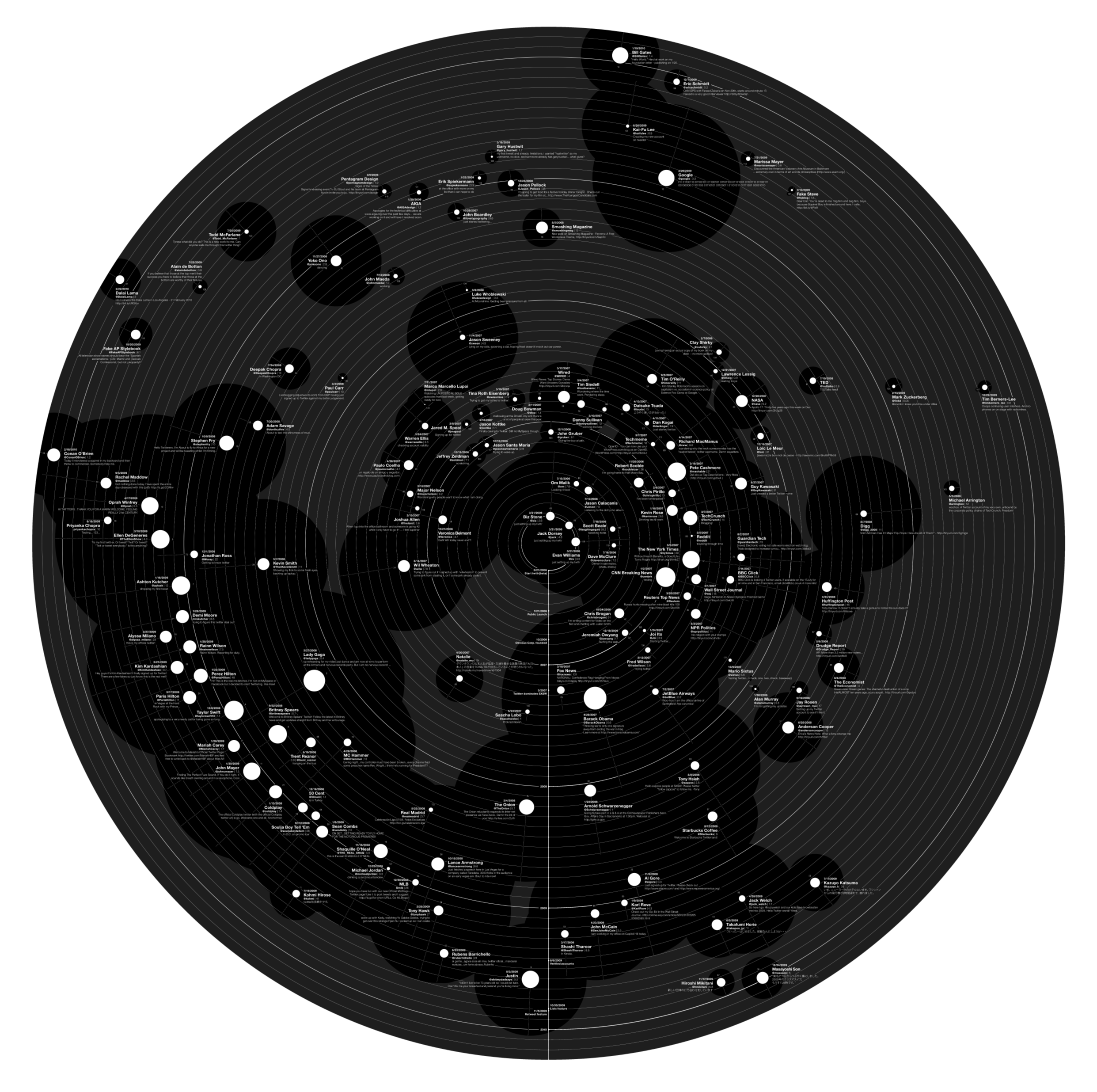
Meet the Cosmic 140

Web Trend Map Video Interview
An interview with GaijinPot.com
Web Trend Map 4
The coolest gift for geeks
Web Trend Map 4
A preview
Web Trend Map 3
The coolest gift for geeks
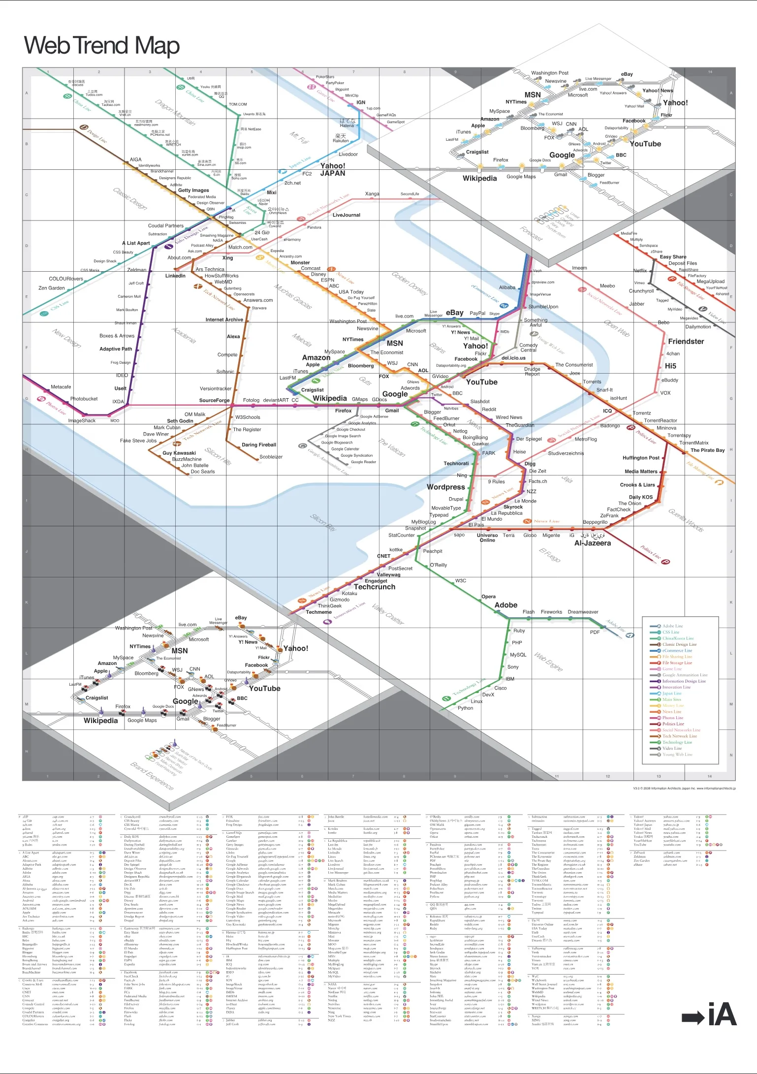
Web Trend Map 2008 Beta
We present you with the 2008 Web Trend Map, in all its beautiful beta glory. This time we’ve taken almost 300 of the most influential and successful websites and pinned them down to the greater Tokyo-area train map.
Web Trend Map 2008
New layers!
Trend Map 2008
What’s New?

Web Trend Map 2007
Version 2.0
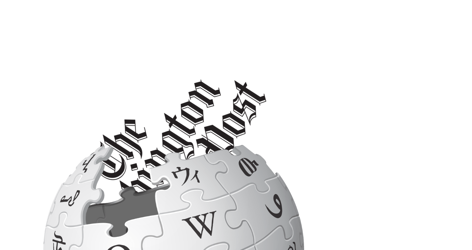
Newspaper Wiki
Schematics
Washington Post Redesign
...as a Wiki

The Future of News
How to Survive the New Media Shift
USA Today
Mission Accomplished
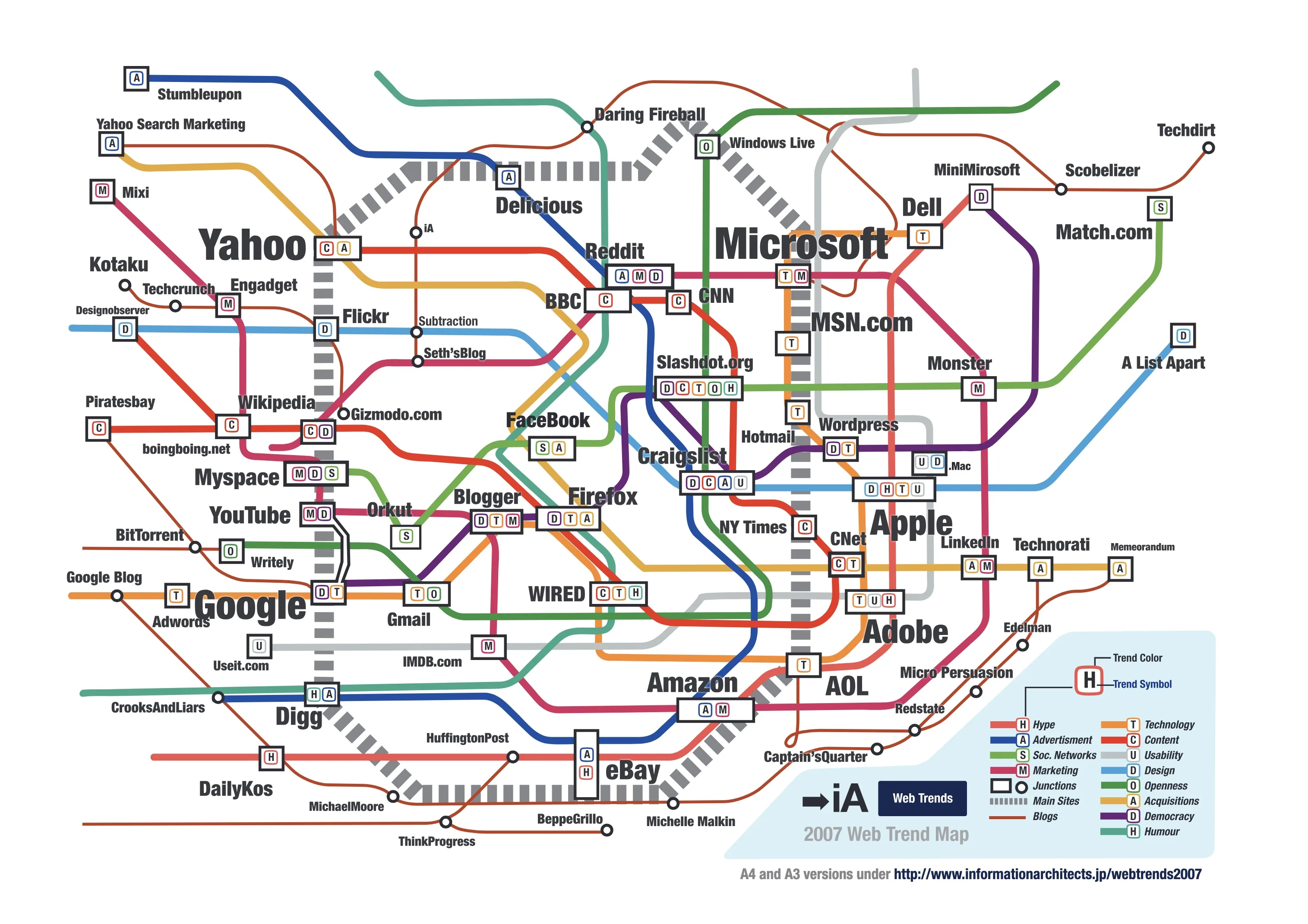
Web Trend Map 2007
Reactions
Web Trend Map 2007
All the big players

Usability and Branding
Webdesign is Product Design

Usable Interface Design
Why are Computers not Flying?


