🚪
Interface: “The way that you accomplish tasks with a product—what you do and how it responds,” according to Raskin. A “how” often discussed as a “what”. Inherent danger of “infinite regression” (B. Laurel) when discussing the notion as a layer between the human (see User) and a computer. Rabbit hole. In iA’s Metaphysics, interfaces are Thresholds.
The second Winterfest 2024 gift is a freshly squeezed iA Writer for Windows, now in public beta.
Dropbox finally has a native Files app integration. This is good news for iA Writer.
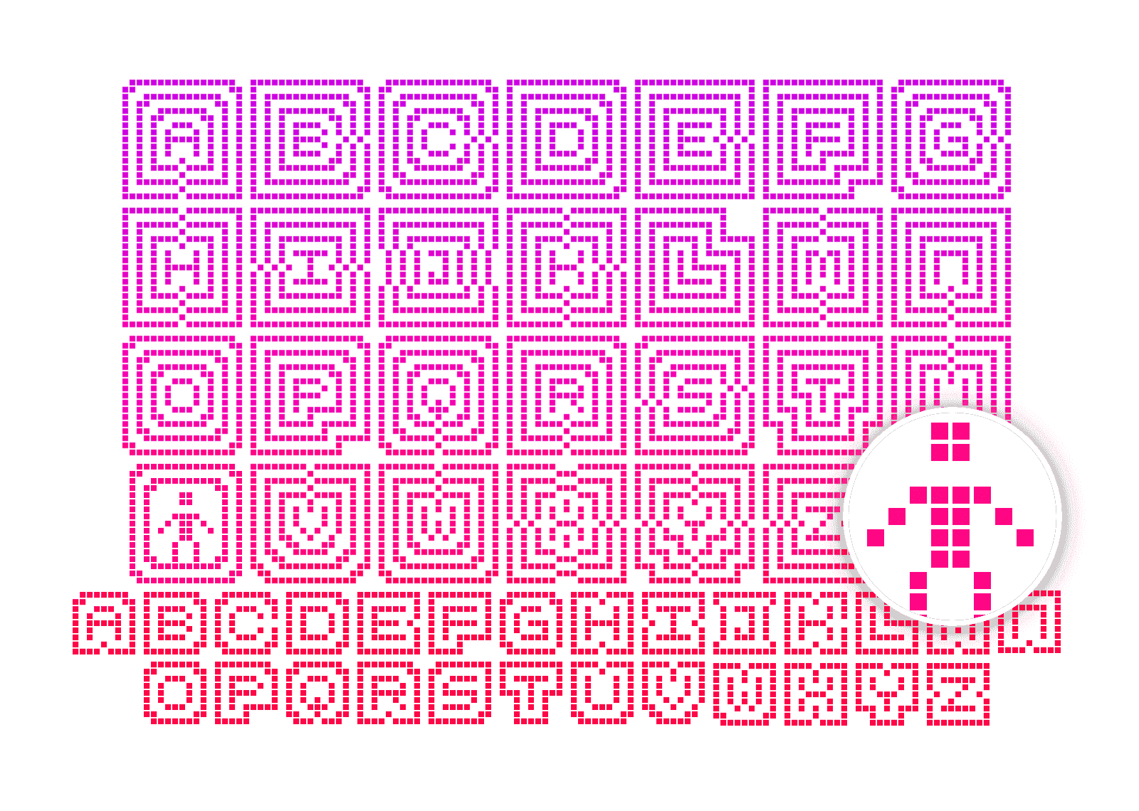
To spice up our monster essay on icons, we created an icon monster shooter arcade game. Planned as a one week hackathon, it turned into an amazing one year adventure. Here is what UX designers learned creating an arcade game.
Icons save space. Icons look crisp. Icons give quick answers to hard questions: How do we make it nicer? How can we brand it? How do we make it more fun? We ♥ icons. Until they start messing with our minds.
Will information technology affect our minds the same way the environment was affected by our analogue technology? Designers hold a key position in dealing with ever increasing data pollution. We are mostly focused on speeding things up, on making sharing easier, faster, more accessible. But speed, usability, accessibility are not the main issue anymore.
Learning to design is learning to see, an adventure that gets more and more captivating the further you go. A love letter to my profession.
iA Writer for Mac is the first native text editor that uses a responsive design. Why did it take so long?
How do you deal with erroneous tweets? Not any erroneous tweets, your erroneous tweets. The tweets that you misspelled or, worse, that contain information you later discover is false, or a late night knee-jerk response you regret in the morning.
When we built websites we usually started by defining the body text. The body text definition dictates how wide your main column is, the rest used to follow almost by itself. Used to. Until recently, screen resolution was more or less homogeneous. Today we deal with a variety of screen sizes and resolutions. This makes things much more complicated.
With the chaos of different screen sizes and a new generation of web browsers, the design paradigms of layout and typography have shifted away from static layouts and system fonts to dynamic layouts and custom web fonts. Screens are changing not just in size, but also in pixel density. Now we need not only responsive layouts, we also need responsive typefaces.
I had a perspective-changing talk on the subject of pay walls with the chief executive of a big publishing company (no, I can't tell you who). He asked me what I think about pay walls.
How do you navigate content on the iPad? Scroll or flip? In 1987, the biggest neck beards in tech held a conference on the Future of Hypertext and there were two camps, “Card Sharks” and “Holy Scrollers”. They had an epic battle over this question: Should you scroll or flip pages on the screen? Who won the fight?
Jeron van Geel interviewed Oliver Reichenstein on Jonny Holland. He asked a series of questions about the relationship between Philosophy, Design, Japan and Western culture.
Over the last two months we have been working on several iPad projects: two news applications, a social network, and a word processor. We worked on iPad projects without ever having touched an iPad. One client asked us to “start working on that tablet thing” before we even knew whether the iPad was real.
From December 2006 to February 2007 we were in touch with the product manager of Facebook. The prospective: Redesigning Facebook. Eventually. Since the contract was never signed, we kept our designs in the drawer. Until now…
I’ve been asked by the Italian magazine L’Espresso to write an article on The Future of Web Design. Here is the (longer) English text.
With websites turning more and more into web applications, functionally as well as aesthetically, it'd be interesting to look at what makes a Web app work in terms of skinning. We start off by comparing two different approaches: HTML-skin vs. desktop-application-skin. In other words, Google versus Apple.
We have hated this thing for over 12 years now—the button that launches a pull-up menu. Only the twisted minds over at Redmond could come up with this. Yeah, I know it's not a real "Start" button anymore, with Vista it's become more of a clickable logo like the Macintosh one. But, after all this time, it is still a push-up menu. And that is another major branding crime. Why?
A wonderful example of what not to do if you believe that Brand = Interface. Copying interfaces defines you as a second choice company.
The Interface is the brand—but few interfaces qualify to leave out the main orientational element—the logo.
A company may choose to rebrand itself because of a merger, a bankrupting scandal, or because they simply have outgrown their name. These are solid reasons; however, on the web, rebranding should be considered with the caution of a face transplant.
The last couple of days we have received some excellent feedback on our article “Washington Post Redesign as a Wiki”. First of all, thank you to everyone who took the time to study our problem and form an opinion. To be able to receive input from the best people in the field is rare and rewarding. We got lots of applause, together with some questions and reservations.
After our last post on “The Future of News” we have been asked again and again to illustrate what a newspaper as a wiki would look like. We’re happy to oblige…
When I read this morning that USA Today "refashions itself as a social network", I got a little shock as I was worried that they are going to eat our client's lunch. Fear nothing, client. Among information designers the USA Today redesign is a laughing stock.
If you have a website that is not user friendly, you have an unfriendly website which basically means that you lack manners. The specialists use that word (“user friendly”) so often that they forget that “friendly” actually is an ethical term.
In 2001, usability guru Jakob Nielsen—according to USA Today “the next best thing to a true time machine”—was convinced that by 2007 books would be gone and “fully replaced with online information”. Was he being serious?
Brands make us associate positive values and positive experiences with the products they mark. Brand values are defined by the senior management in the “Brand Matrix”. Coca-Cola recently changed their brand matrix. Are we soon going to associate other things with Coca-Cola?
All things have an interface. Shaping interfaces is shaping the character of things. The brand is what transports the character of things. When looking at McDonald’s, iPod, or Nintendo DS it becomes quite obvious that the interface *is* the brand.
“Most people make the mistake of thinking design is what it looks like. That's not what we think design is. It's not just what it looks like and feels like. Design is how it works.”
Simple websites are easy to use, easy to understand, nice to look at. In practice, websites are either unusable or ugly and filled with too many words. Why do designers have a hard time to keep it simple?
Since I’ve started developing websites I’ve been looking for the ideal layout. Today I got another hint on the direction to take. Jacob Nielsen calls it the “F-Pattern”.
As an information designer the interfaces we currently work on—no matter whether Apple or Windows—bother me. Yes, OS X looks a lot better than its predecessors, and Windows’ upcoming rip off of OS X looks better than the previous rip off.
If it is your side column on your website you want it. But does your user read—or even: see—it? You might argue that the side column is standard. So we do need it. Do we?
Whoever performed any usability tests knows that users look at the content straight away. Users first look the pictures, then at the titles, then at the text. Navigation often gets completely ignored. In my seven years of conceiving websites and monitoring usability tests I am tempted to say that navigation is useless.
Internet users can give websites a thumbs up or thumbs down in less than the blink of an eye, according to recently published study report. Nature.com and Wired recently reported on the fact that we pass judgement on a website in less than a second. This sounds like good news for web designers. Is it?