Articles related to Interface
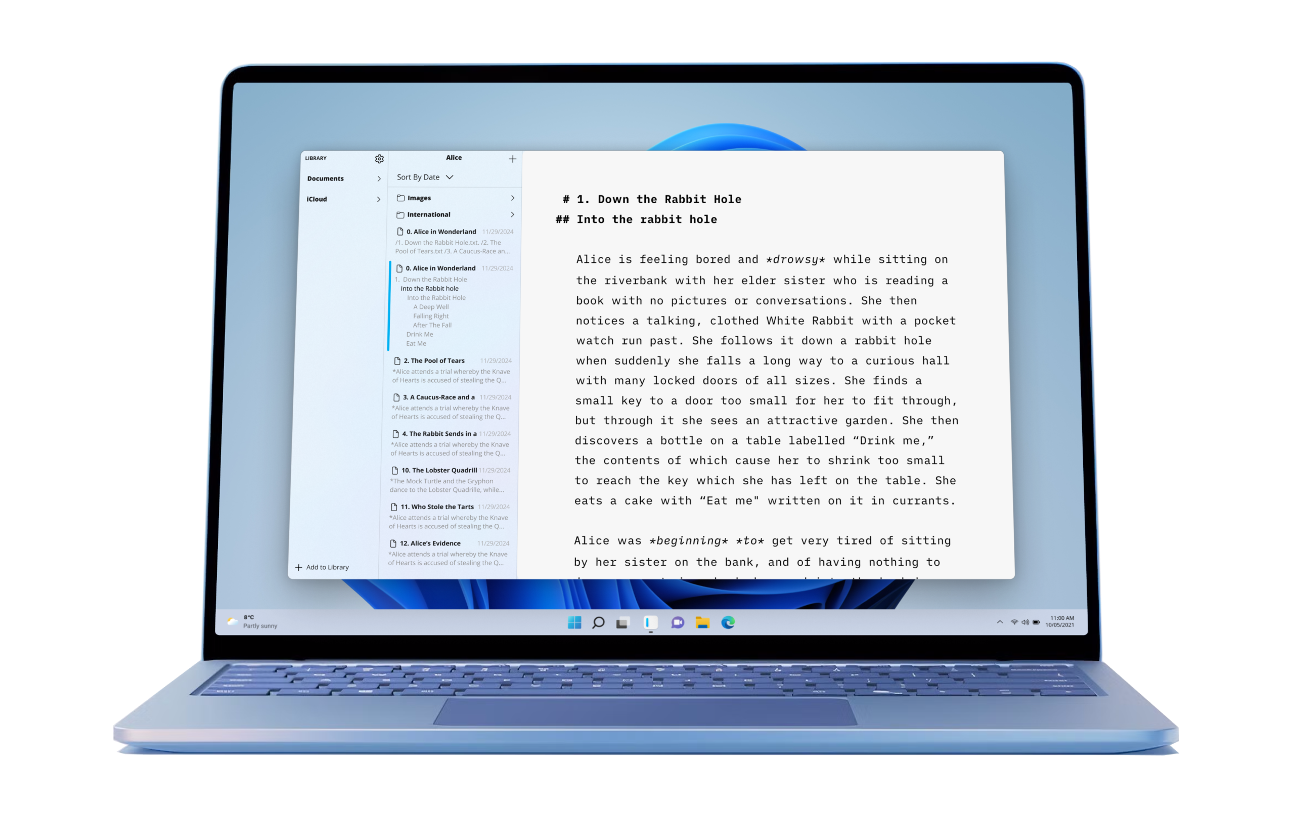
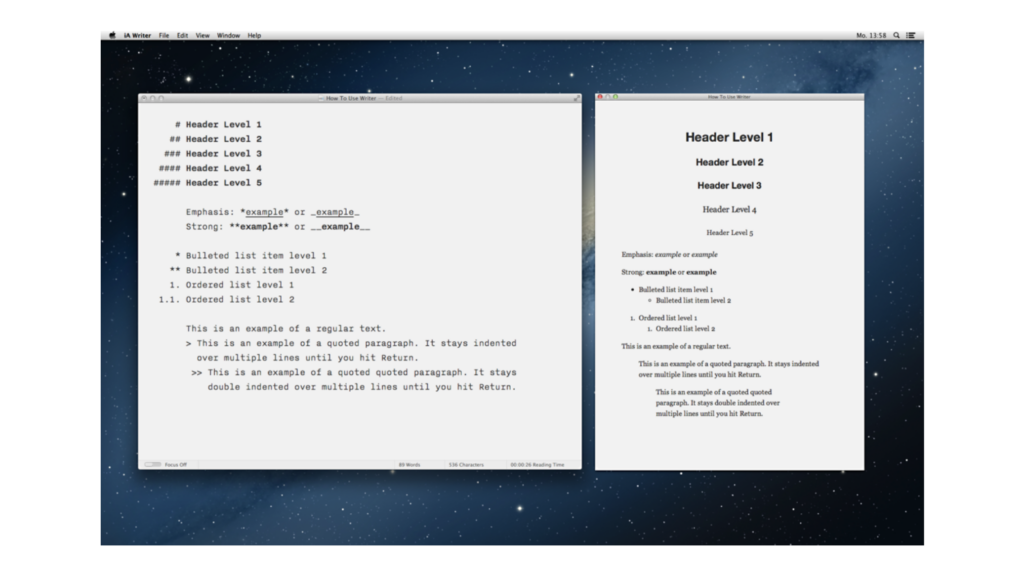
iA Writer for Windows 2.0
In public beta, coming soon
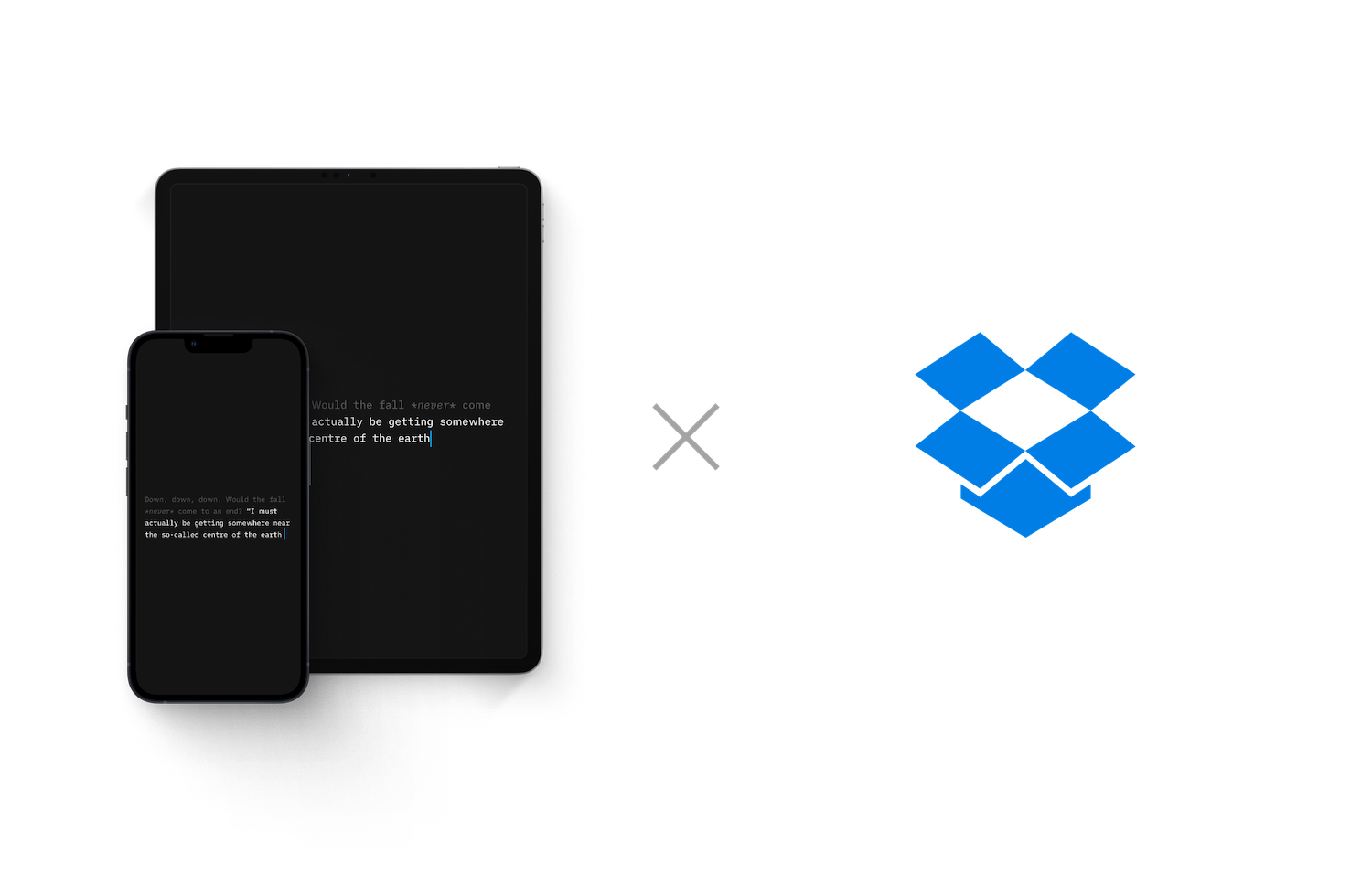
I Want You Back
(The Dropbox Remix)
UX Lessons In Game Design
What designers can learn from games
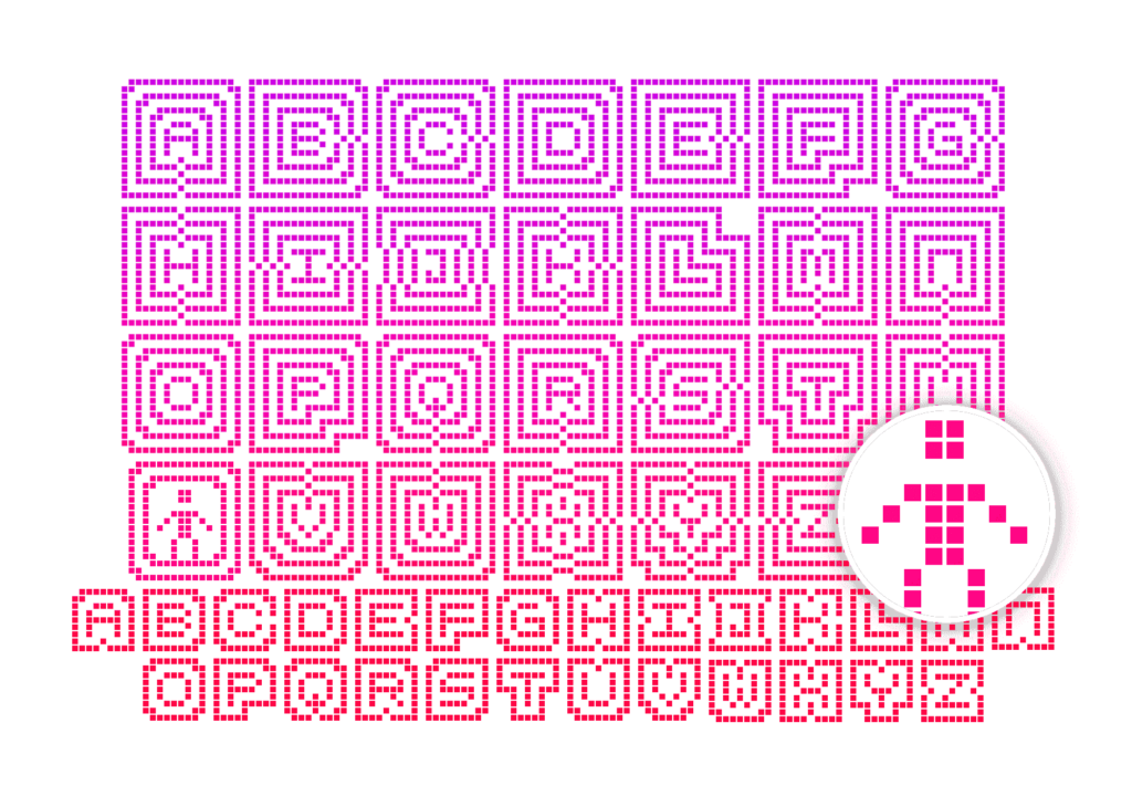
On Icons
We ♥ icons, madly

Information Entropy
The Great Internet Garbage Patch

Learning to See
A love letter
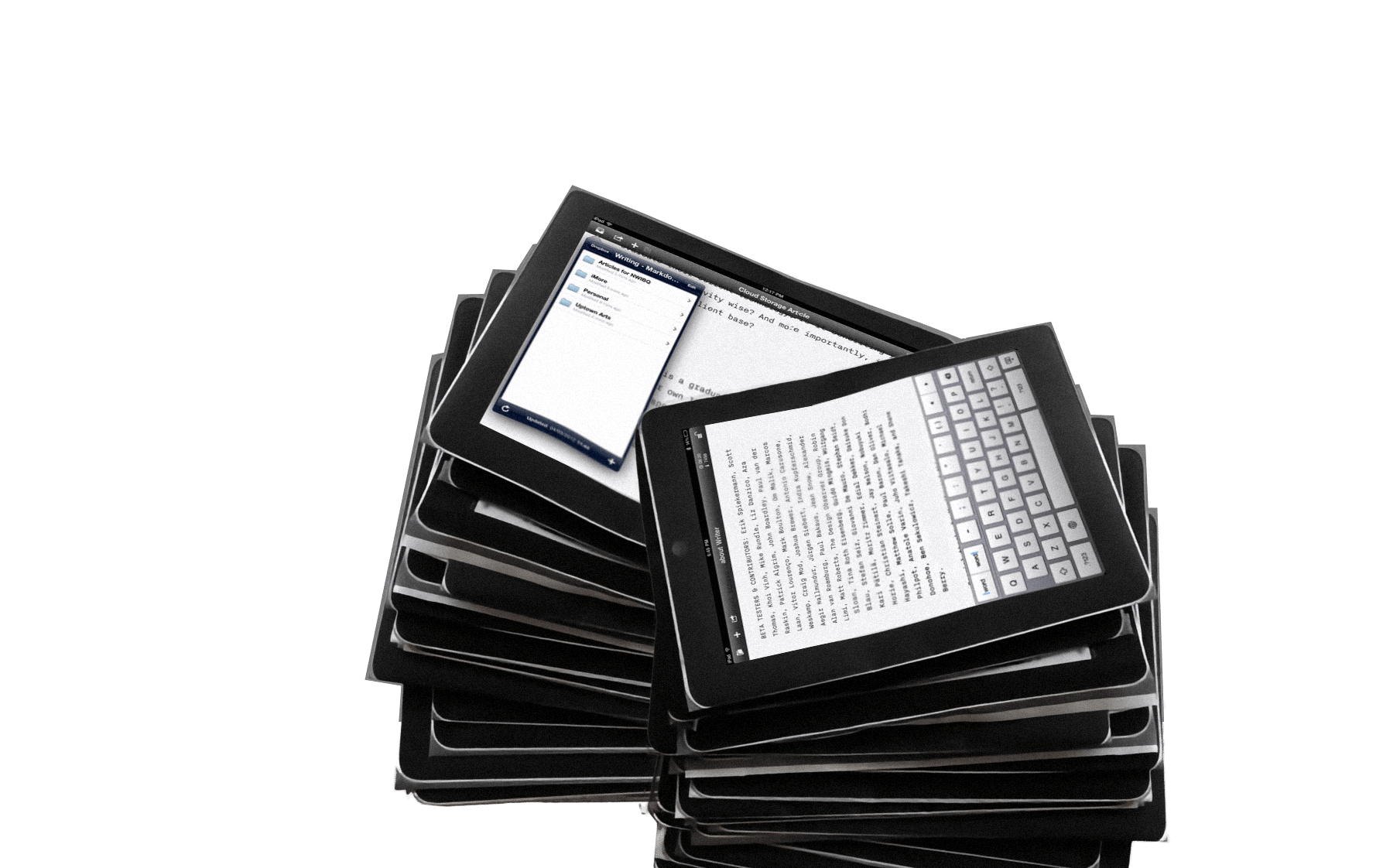
Bringing Responsiveness to Apps
Why did it take so long?

Twitterror
How do you deal with erroneous tweets?

Responsive Typography: The Basics
How to deal with a variety of screen sizes and resolutions
New Site with Responsive Typography
We need not only responsive layouts, we also need responsive typefaces.
Business Class
Freemium for News?

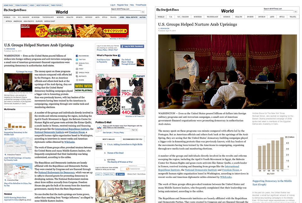
iPad: Scroll or Card?
“Card Sharks” vs “Holy Scrollers”

“Web design is engineering”
Interview with Jonny Holland
Designing for iPad
No iPad yet? Print it!
iA’s 2006 Facebook Designs, Redesigned
The contract was never signed, so we kept our designs in the drawer... Until now…
What’s Next in Web Design?
An outlook for L’Espresso
Webapp Death Match
Google vs. Apple

The Start-Button
Branding Crimes

Stealing Interfaces
Creation = Copy + Improve²
Missing Logo
Branding Crimes
The Essentials of Online Rebranding
Face Off
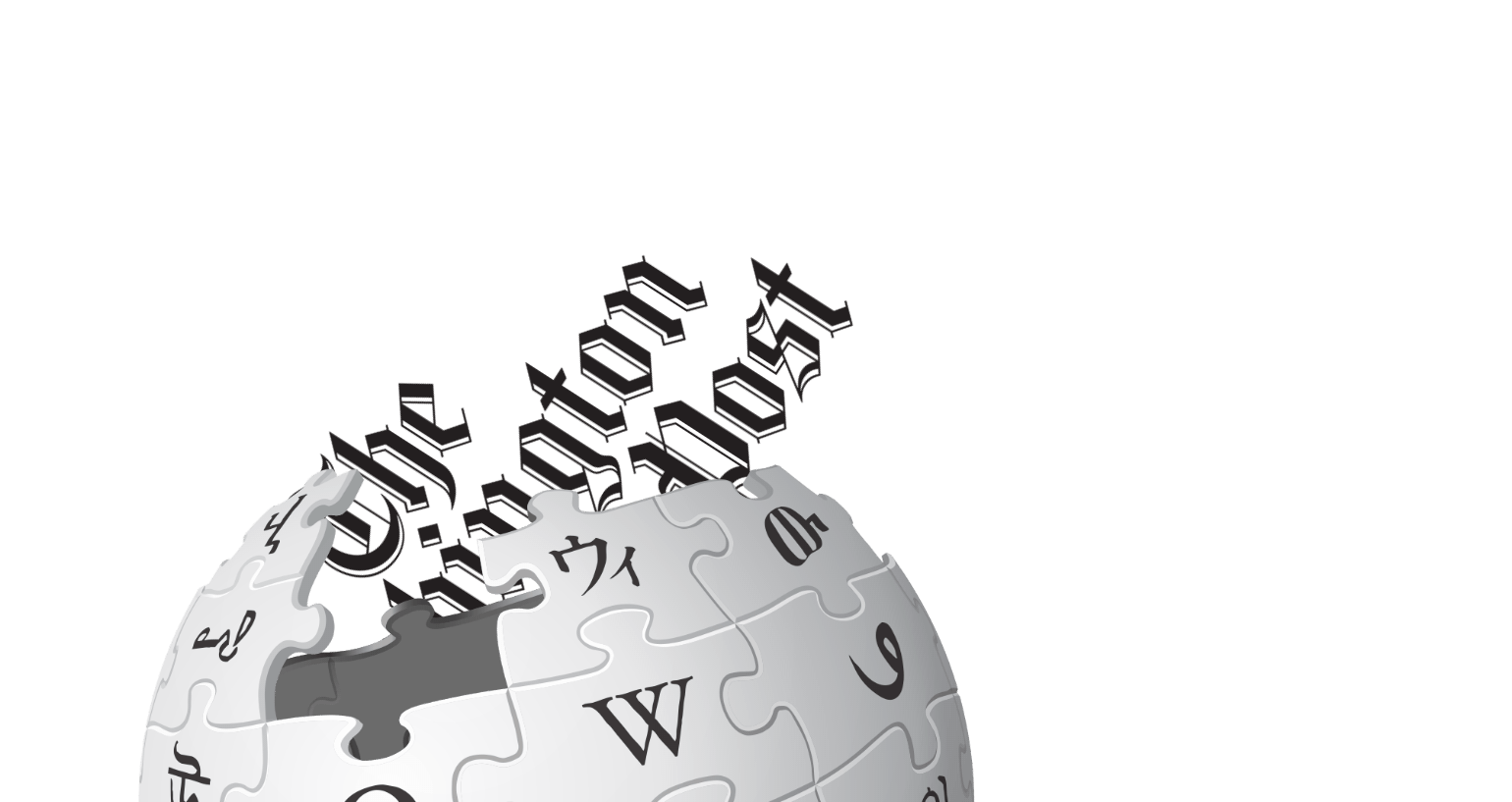
Newspaper Wiki
Schematics
Washington Post Redesign
...as a Wiki
USA Today
Mission Accomplished

The Electronic Gentleman
Inspiration is interactive, respect is reciprocal
Jakob Nielsen, Time Machine?
An interview with the usability guru
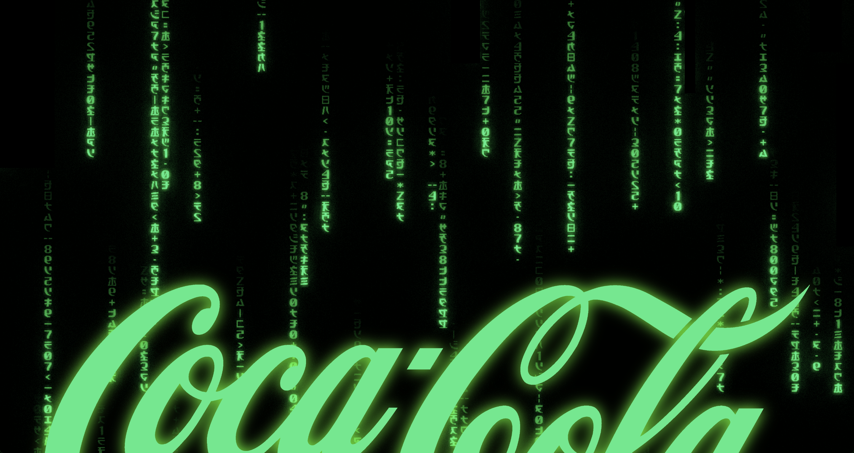
Coca-Cola and The Matrix
Signals work best if they're bold
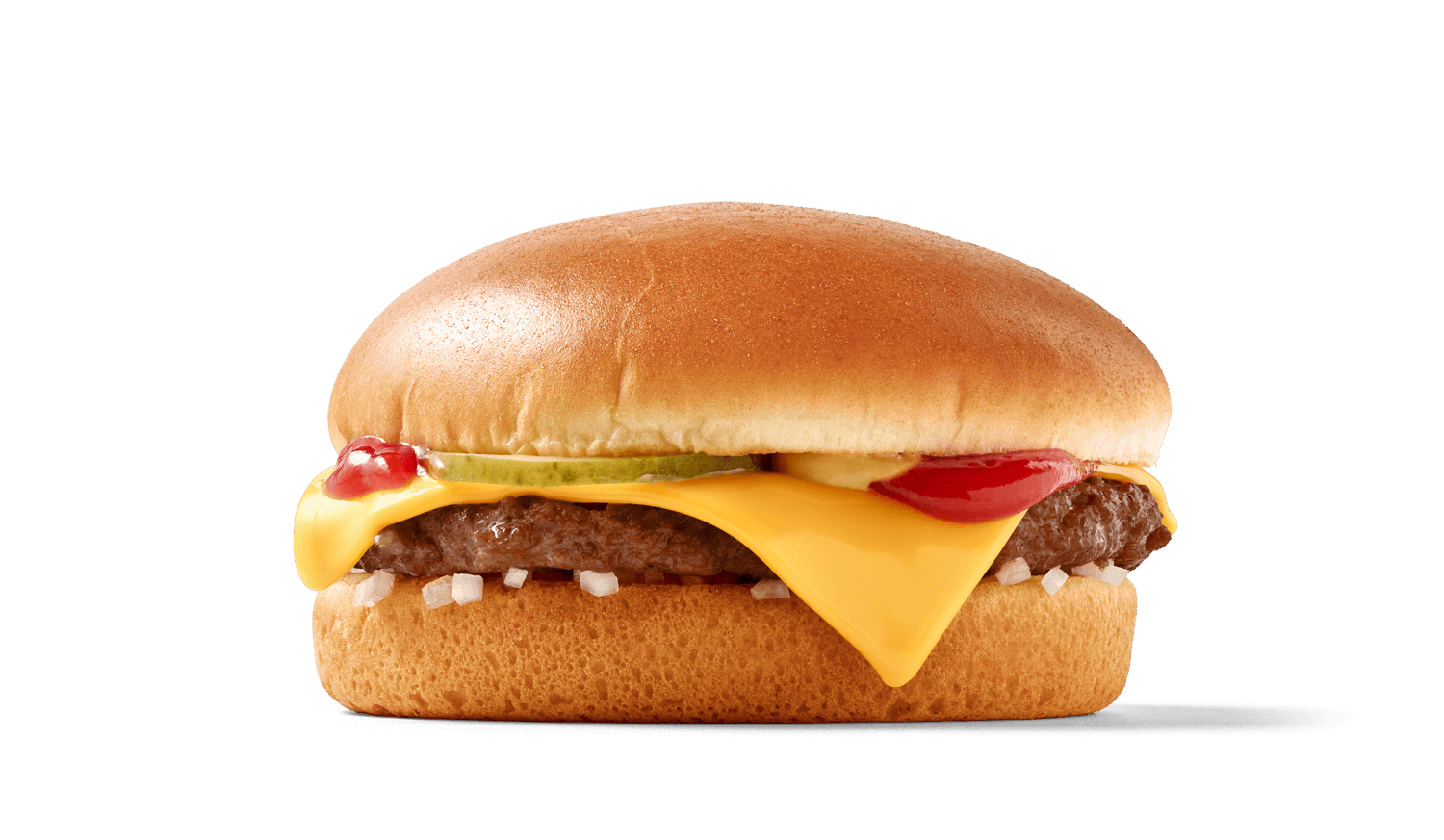
The Interface of a Cheeseburger
Brand = UI
Design is How it Works
Deeper beauty

Why is Simplicity Difficult?
Style is easy, ease is hard
Usability News
The F-Pattern
Usable Interface Design
Why are Computers not Flying?

The Right-Side Column
Just Noise?
Do We Really Need a Site Navigation?
It's not useless, but almost

How Important is Design on the Web?
Do pretty websites work better than ugly ones?


