👌
Usability: Usability is tied to what every person or "User" is “used to”. If somebody successfully completes their tasks, the product or service’s usability is considered high. If not, it is considered low. A designer can and should know theoretical usability standards. They can and should test the practical usability of a product or service. The only way to find out if a product is useable or not is to test it. The only way to be sure if it really is used or not is by releasing it. A useable product will be perceived as beautiful over a longer period of time, even if it has graphic deficiencies. Design Positivism suggests that usability will become an objective science with a set of laws carved in stone. In reality, usability rules are in constant flux as a medium evolves and is used by more people.
The second Winterfest 2024 gift is a freshly squeezed iA Writer for Windows, now in public beta.
Online sharing is now available in iA Presenter beta for Mac.
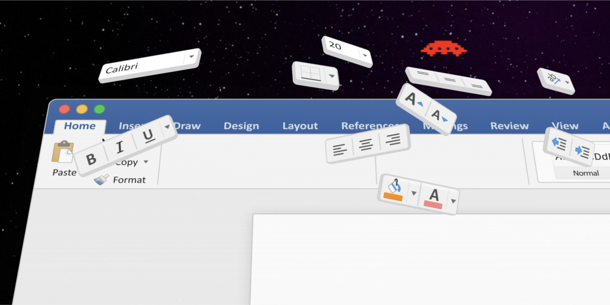
Microsoft Word is the classic do-all text editor used by... just about everyone. How does it compare to a modern, focused writing app like iA Writer?
Icons save space. Icons look crisp. Icons give quick answers to hard questions: How do we make it nicer? How can we brand it? How do we make it more fun? We ♥ icons. Until they start messing with our minds.
Will information technology affect our minds the same way the environment was affected by our analogue technology? Designers hold a key position in dealing with ever increasing data pollution. We are mostly focused on speeding things up, on making sharing easier, faster, more accessible. But speed, usability, accessibility are not the main issue anymore.
To get a good perspective, we start our projects with research. We go mobile first for prioritization, and we want all the content first so we can design in the browser… Unfortunately, the reality of web design follows a different stereotype.
Learning to design is learning to see, an adventure that gets more and more captivating the further you go. A love letter to my profession.
iA Writer for Mac is the first native text editor that uses a responsive design. Why did it take so long?
The following Interview on iA Writer and the secret of its success has appeared in Business Insider, who reached out to us, “to get the story on where his app came from, where it's heading, and what's wrong with contemporary text editors.”
How do you deal with erroneous tweets? Not any erroneous tweets, your erroneous tweets. The tweets that you misspelled or, worse, that contain information you later discover is false, or a late night knee-jerk response you regret in the morning.
When we built websites we usually started by defining the body text. The body text definition dictates how wide your main column is, the rest used to follow almost by itself. Used to. Until recently, screen resolution was more or less homogeneous. Today we deal with a variety of screen sizes and resolutions. This makes things much more complicated.
Interview with William Channer for DRT, focusing on “the importance of keeping interfaces simple, why current websites are complicated and the pitfalls of research and why it's a good starting point to understand user expectations.” This is the unedited transcript of the interview.
I had a perspective-changing talk on the subject of pay walls with the chief executive of a big publishing company (no, I can't tell you who). He asked me what I think about pay walls.
I’ve been asked by the Italian magazine L’Espresso to write an article on The Future of Web Design. Here is the (longer) English text.
First, think of a number between one and ten. Then take a step back and look at the words “User Experience Design” as if you had never seen them.
What makes Japanese design so special? Basically, it's a matter of simplicity; a particular notion of simplicity, different from what simplicity means in the West. So are things in general better designed in Japan? Well, actually, it's not that simple…
Designers are narcissists, programmers are nerds, and whoever wears a tie must be a jerk. Designers, programmers and business people love to hate each other. That's why we keep them separated…
With websites turning more and more into web applications, functionally as well as aesthetically, it'd be interesting to look at what makes a Web app work in terms of skinning. We start off by comparing two different approaches: HTML-skin vs. desktop-application-skin. In other words, Google versus Apple.
We have hated this thing for over 12 years now—the button that launches a pull-up menu. Only the twisted minds over at Redmond could come up with this. Yeah, I know it's not a real "Start" button anymore, with Vista it's become more of a clickable logo like the Macintosh one. But, after all this time, it is still a push-up menu. And that is another major branding crime. Why?
News organizations cannot continue to ignore the global shift from institutionally-controlled media to user-controlled media. They have to redefine their processes and face the obvious question: Do we still need old media for news?
If you have a website that is not user friendly, you have an unfriendly website which basically means that you lack manners. The specialists use that word (“user friendly”) so often that they forget that “friendly” actually is an ethical term.
Using 10 pixel Verdana made sense in a time when screens were 640 pixels wide. Today it is a mistake.
When people ask me about my background, they're confused. I studied philosophy. How come I do web design? In short: The old Greeks brought me here. What can Internet workers learn from the old Greeks?
In 2001, usability guru Jakob Nielsen—according to USA Today “the next best thing to a true time machine”—was convinced that by 2007 books would be gone and “fully replaced with online information”. Was he being serious?
All things have an interface. Shaping interfaces is shaping the character of things. The brand is what transports the character of things. When looking at McDonald’s, iPod, or Nintendo DS it becomes quite obvious that the interface *is* the brand.
“Most people make the mistake of thinking design is what it looks like. That's not what we think design is. It's not just what it looks like and feels like. Design is how it works.”
Simple websites are easy to use, easy to understand, nice to look at. In practice, websites are either unusable or ugly and filled with too many words. Why do designers have a hard time to keep it simple?
Since I’ve started developing websites I’ve been looking for the ideal layout. Today I got another hint on the direction to take. Jacob Nielsen calls it the “F-Pattern”.
We now have over 75 million websites we can go to, but still we only visit six of them regularly, as we just learned from a study recently made public by Directgov. Their findings make us think of a new phase of the Internet.
Your website is more important for your company and its brand portfolio than your business card, your brochures, the products you sell, your packaging, the address and the building your company resides in.
If it is your side column on your website you want it. But does your user read—or even: see—it? You might argue that the side column is standard. So we do need it. Do we?
Whoever performed any usability tests knows that users look at the content straight away. Users first look the pictures, then at the titles, then at the text. Navigation often gets completely ignored. In my seven years of conceiving websites and monitoring usability tests I am tempted to say that navigation is useless.
Internet users can give websites a thumbs up or thumbs down in less than the blink of an eye, according to recently published study report. Nature.com and Wired recently reported on the fact that we pass judgement on a website in less than a second. This sounds like good news for web designers. Is it?