Charts are tables. To make charts work, we had to make tables work. Markdown tables. And we wanted them to work on iPhone, iPad, and Mac. How did we do it?
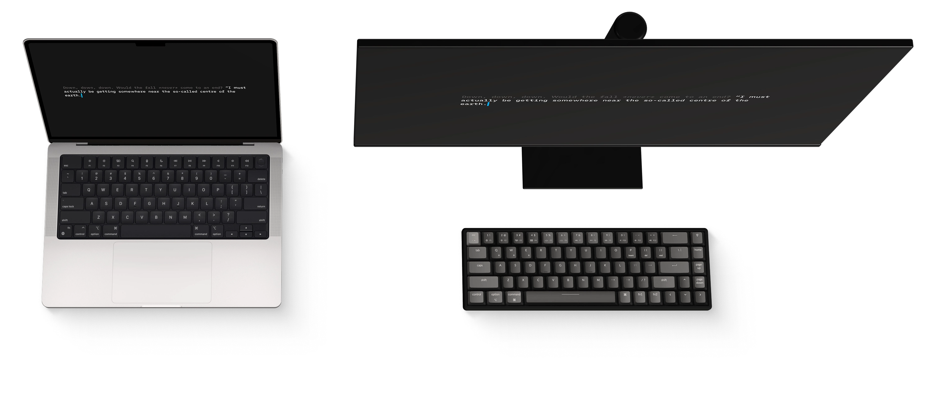
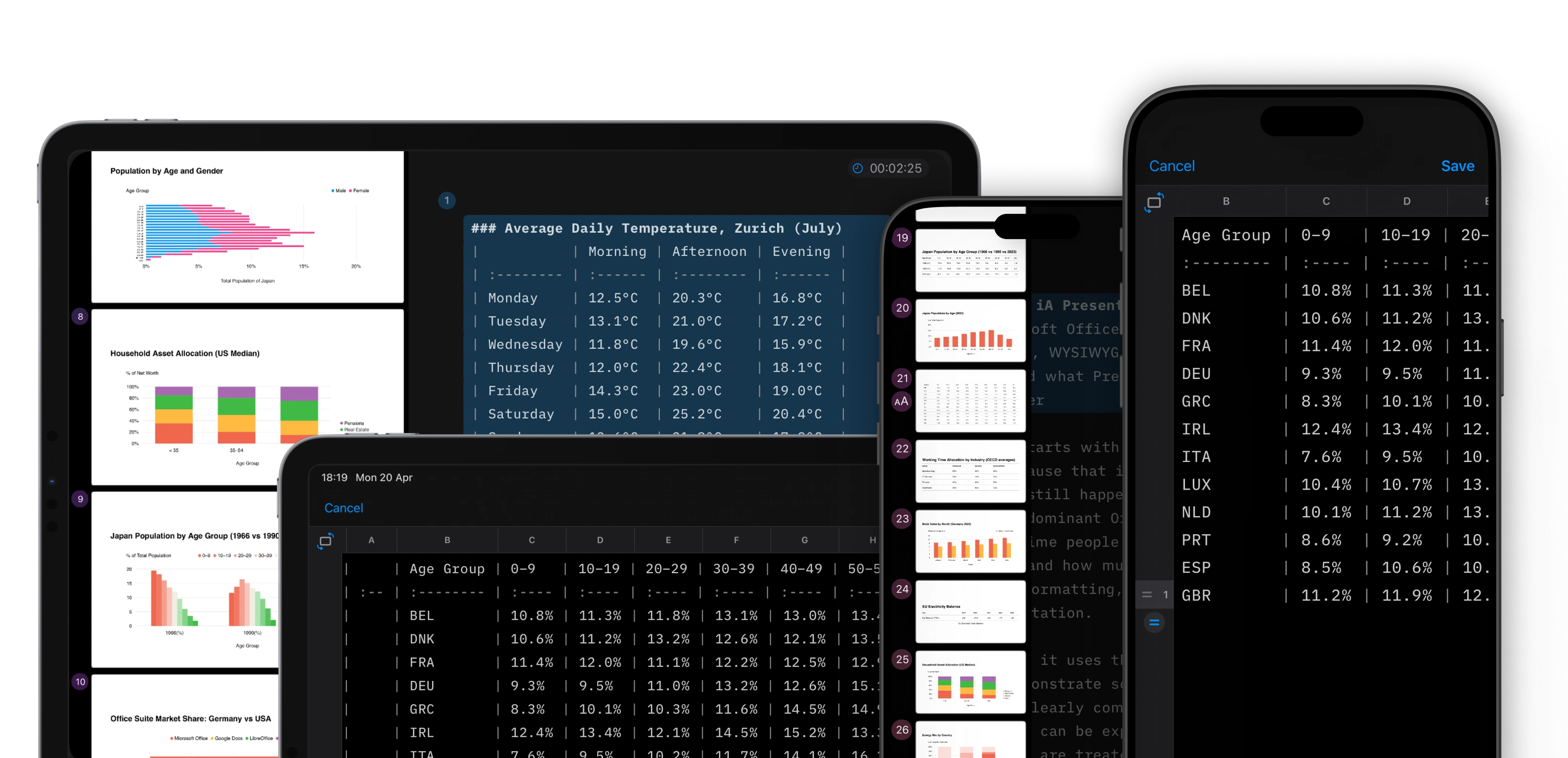
Late last year, we showed how charts fit into our text-based presentation app. The main challenge was simple charts that scale across devices.1 What we had not solved was the step before that: making tables work across different devices, portrait and landscape orientations.2
Markdown tables are notoriously hard to use. Columns and rows get jumbled. Even small edits feel like Sudoku. We wanted writing, fixing, and pasting data to be as simple as possible. So we got to work:
- In the editor, pipes are automatically realigned
- For more complex data, there is a scrollable table editor
- The table editor handles large tables on all screens
- Linked CSVs sync automatically
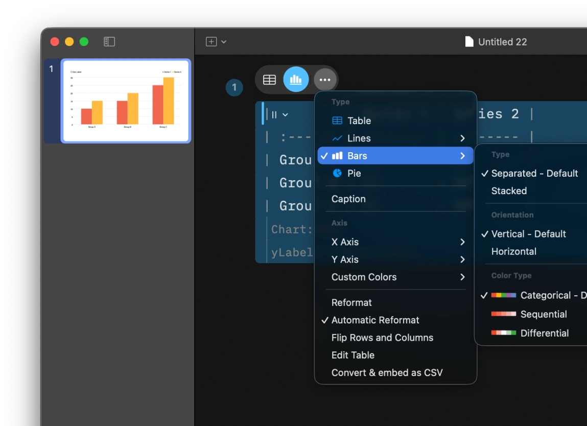
- The contextual table menu lets you turn tables into charts and fine-tune them
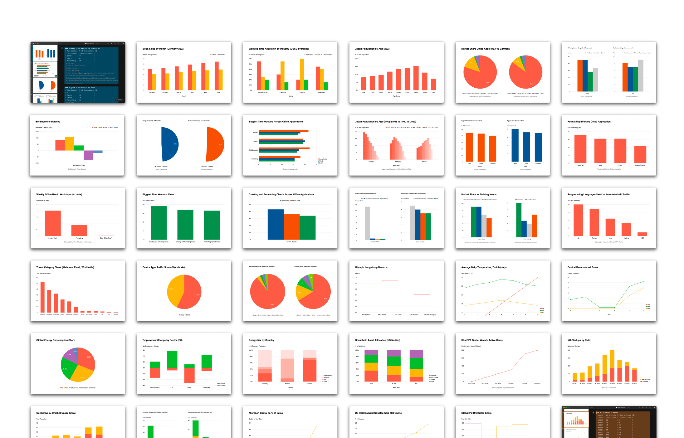
It is fast and simple. You enter data, switch the view, and the chart appears. It adapts to the viewport, stays readable, and needs little adjustment.
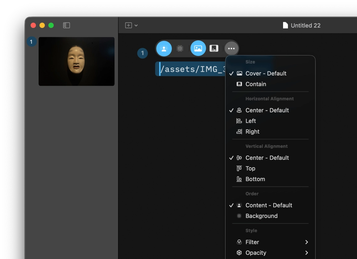
We added a floating control that appears when your cursor is on tables and charts. The same contextual interface pattern now applies to images. You can adjust placement and cropping very easily:
iA Presenter 1.6 comes with charts that scale. Based on extensive user feedback, we improved how tables work. Images also follow the same UI patterns. It is available from today. The update is free. To try it, download the latest version for macOS or visit the App Store for Mac or iPad and iPhone.
-
More on designing simple charts that scale across devices in Charts in Slides (December 2025). ↩︎
-
Tables are always difficult to handle. On phones, they barely work. And Markdown tables are one of the main reasons people resist Markdown. Markdown tables on mobile phones are like squaring the circle. We did not solve it, but we got closer. ↩︎