Articles related to Typography
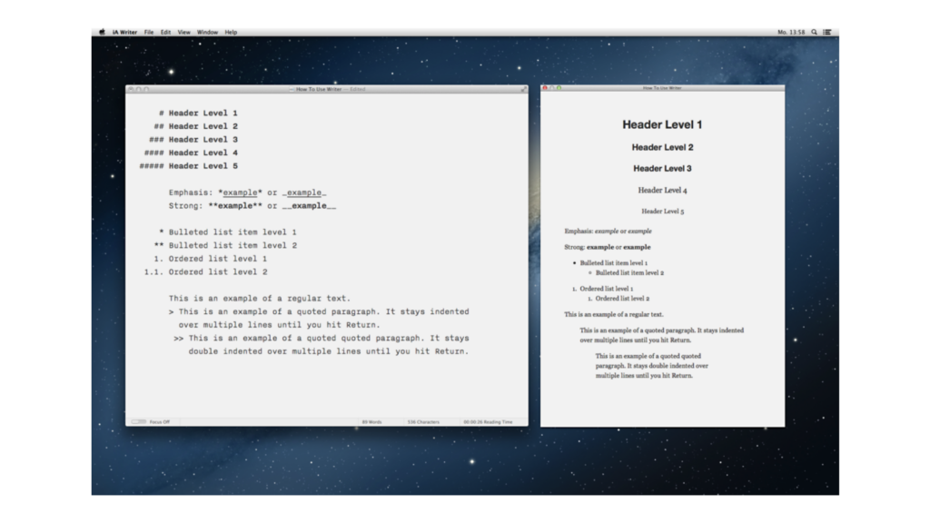
PDF Preview, New Typography, Preferences
1.2 of iA Writer for Windows

New File Library for Windows
iA Writer for Windows 1.1

A Typographic Christmas
iA Writer now offers three custom designed writing fonts
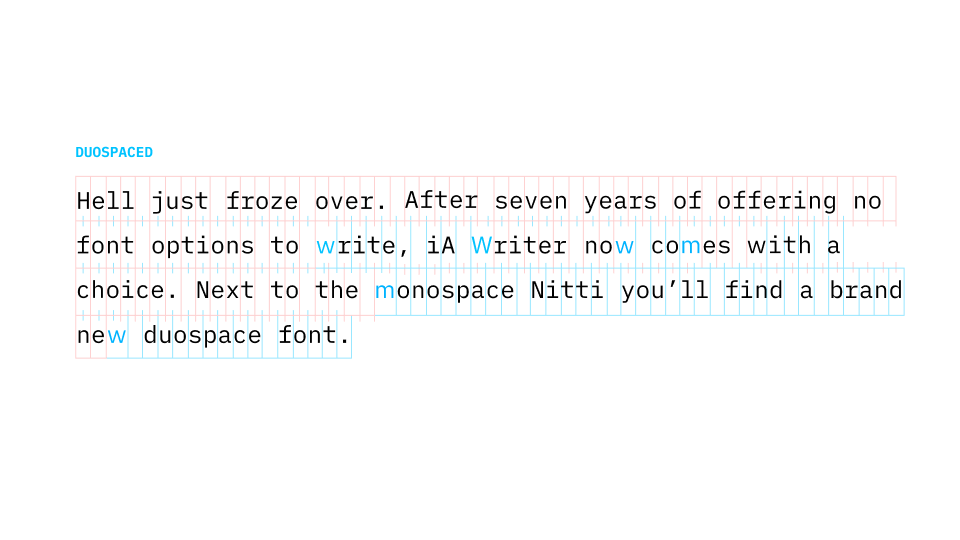
Duospace Fonts
In search of the perfect writing typeface
UX Lessons In Game Design
What designers can learn from games
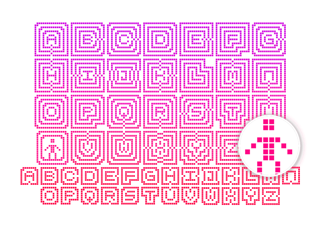
On Icons
We ♥ icons, madly
Logo, Bullshit & Co., Inc.
What makes designers think they are so special?
Learning to See
A love letter
Bringing Responsiveness to Apps
Why did it take so long?
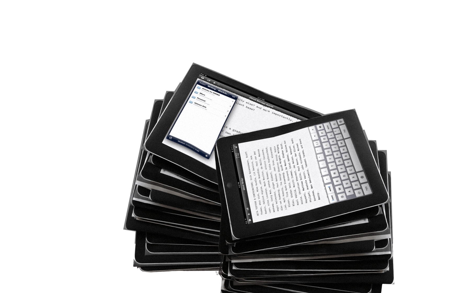
“400,000 downloads with a super simple app”
Interview with Business Insider
“Good design is invisible”
Interview with The Verge

Responsive Typography: The Basics
How to deal with a variety of screen sizes and resolutions
New Site with Responsive Typography
We need not only responsive layouts, we also need responsive typefaces.

iABC
The history, shape and sound pattern of each letter
Designing for iPad
No iPad yet? Print it!
What’s Next in Web Design?
An outlook for L’Espresso
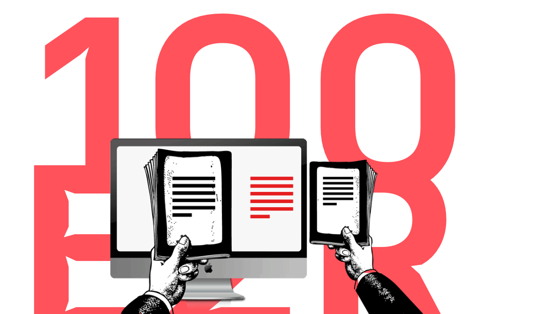
The 100% Easy-2-Read Standard
Don't be lazy

Read Different
Apple Ads in Japan

Webdesign is 95% Typography
Reactions
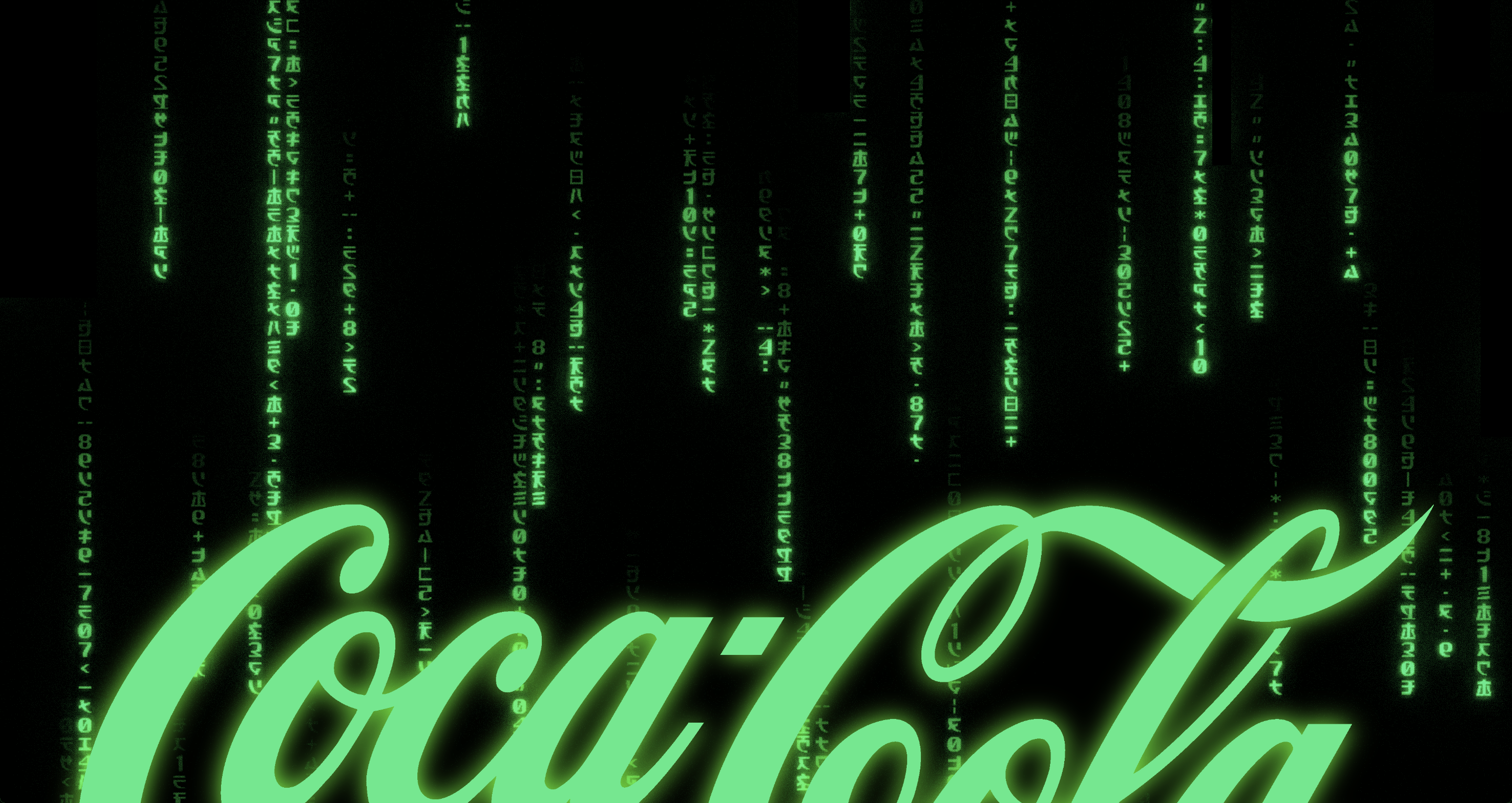
Coca-Cola and The Matrix
Signals work best if they're bold
Web Design is 95% Typography
Text as UI

Why is Simplicity Difficult?
Style is easy, ease is hard


