Typography:
You've waited patiently for it, and now it is here. Version 1.2 of iA Writer for Windows has launched. This release packs in a boatload of improvements, making it the biggest update to hit the platform since the initial release.
iA Writer for Windows came out one year ago. We launched version 2 and called it 1.1. It comes with a cleaner UI, sweeter typography, tighter templates, better word export, and a powerful file library. At first sight, it just looks like we've closed a gap to its older sibling, the Mac app. But there is a subtle twist
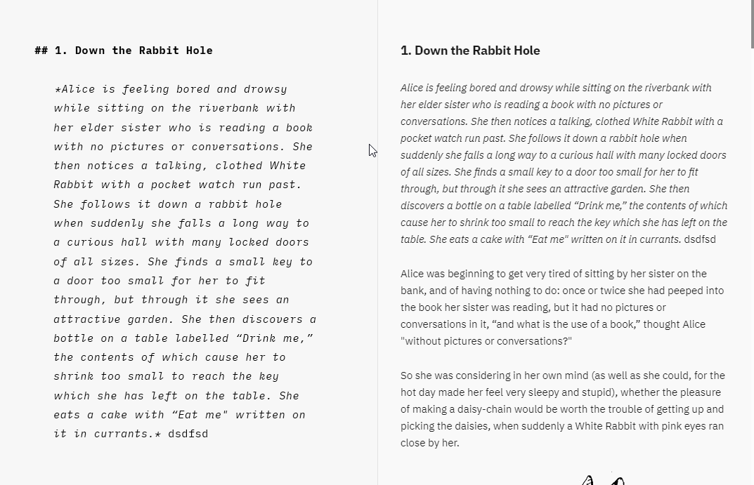
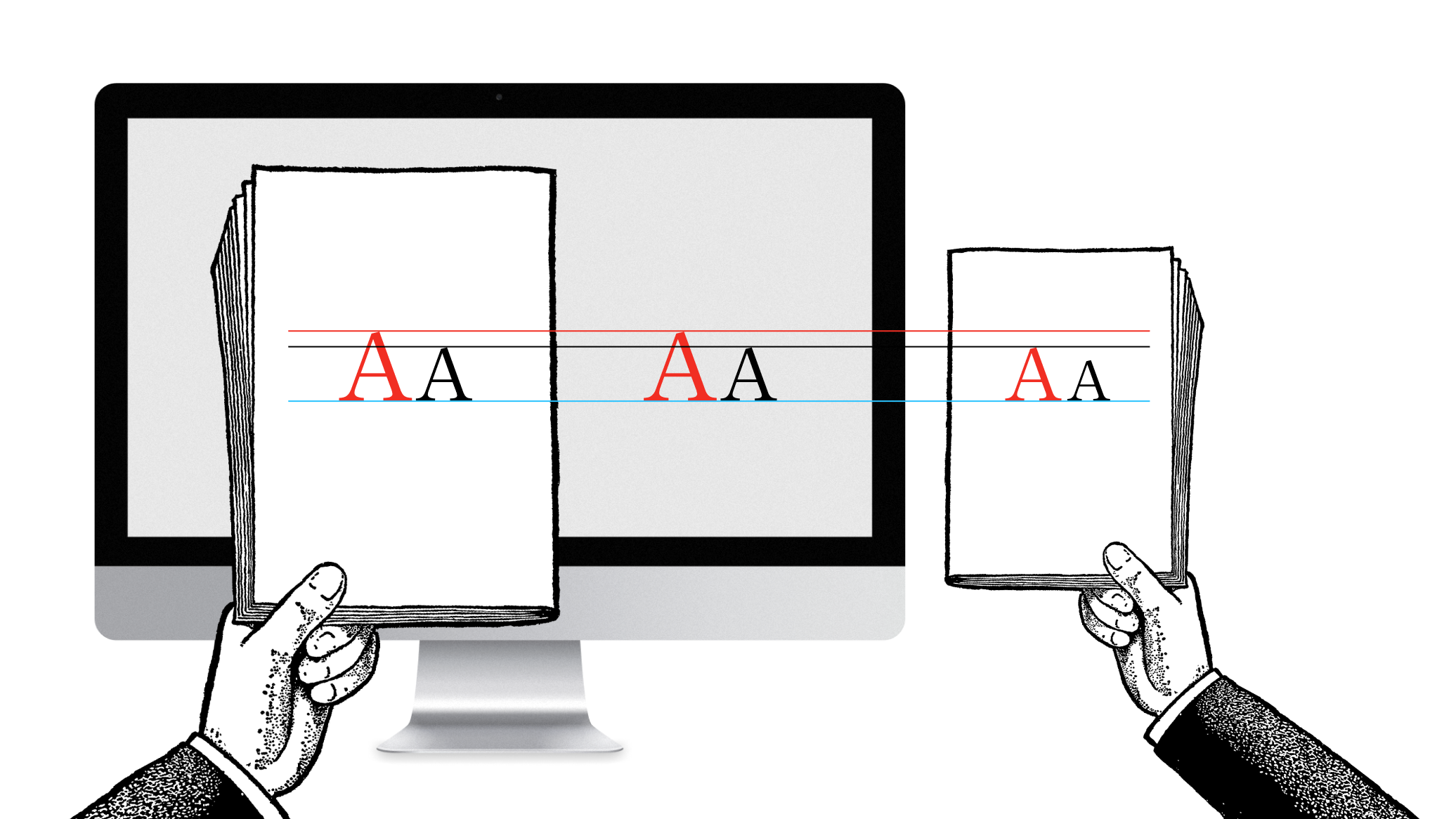
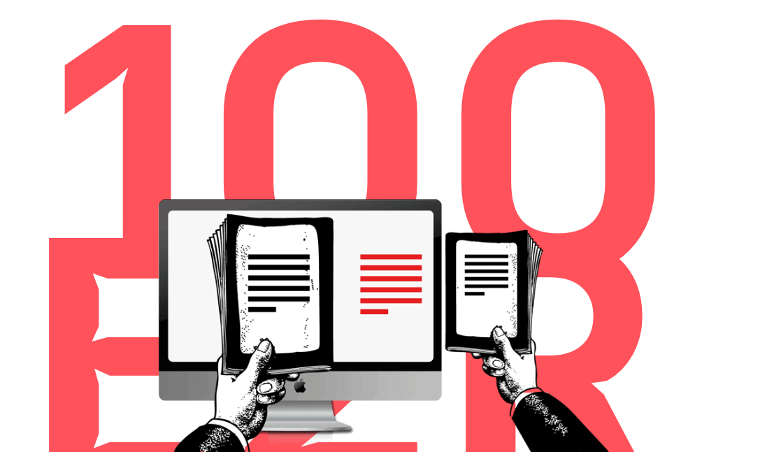
The next update of iA Writer does some extreme typographic acrobacy. It comes with three variable fonts which give us 1000s of grades. This allows us to adjust the weight of the font depending on size, device and background color. Additionally, we adjust the line height and spacing depending on column width and type size. The crazy part is that you probably won't see any of this. But you might feel it.
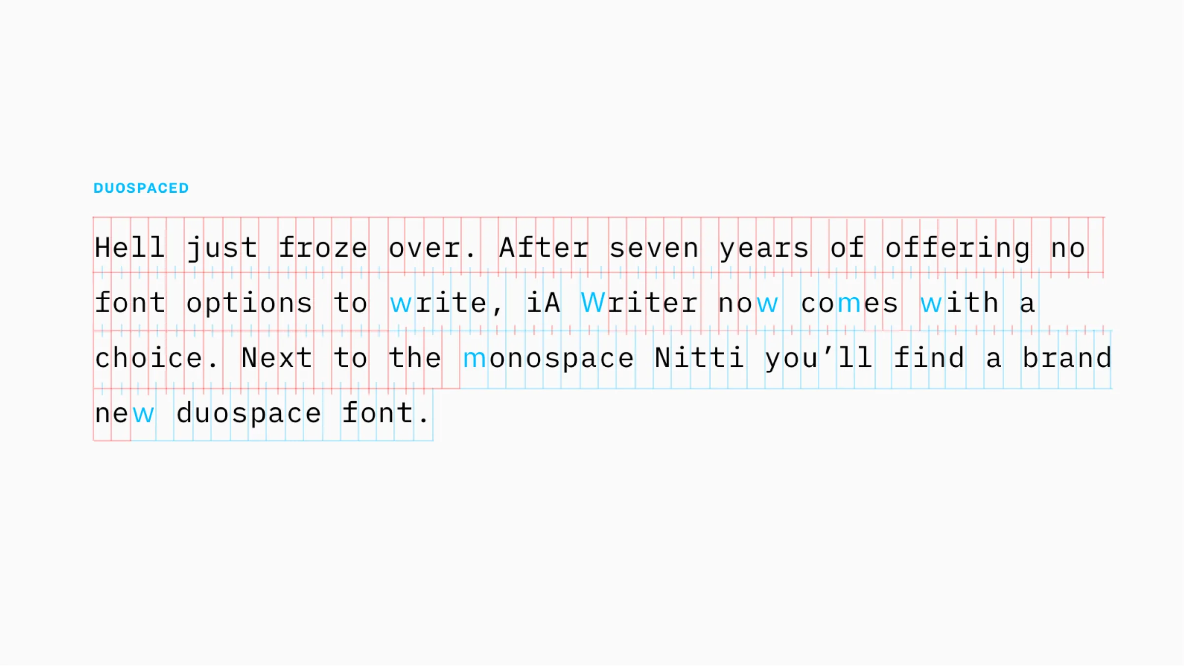
Monospace is the typical choice that communicates writing. With iA Writer Duospace, we went a step ahead. After seven years of offering no font options to write, iA Writer now comes with a choice. Next to the monospace Nitti you will now find a brand new duospace font. Duospace?
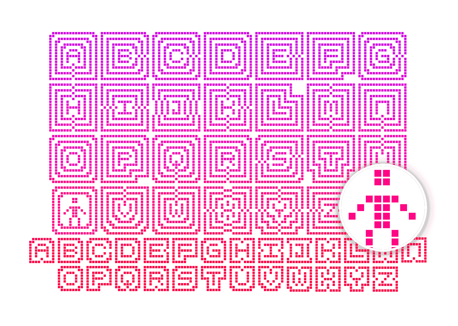
To spice up our monster essay on icons, we created an icon monster shooter arcade game. Planned as a one week hackathon, it turned into an amazing one year adventure. Here is what UX designers learned creating an arcade game.
Icons save space. Icons look crisp. Icons give quick answers to hard questions: How do we make it nicer? How can we brand it? How do we make it more fun? We ♥ icons. Until they start messing with our minds.
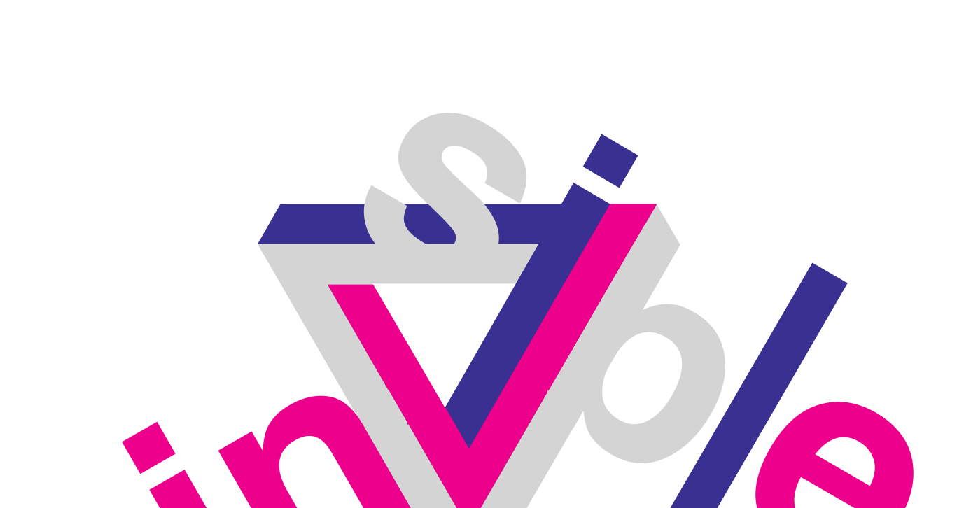
Everybody likes logos. Everybody wants their own logo. Everybody wants to make their own logo. Everybody has a computer and some fonts. Anybody can make a logo. What makes designers think they are so special?
Learning to design is learning to see, an adventure that gets more and more captivating the further you go. A love letter to my profession.
iA Writer for Mac is the first native text editor that uses a responsive design. Why did it take so long?
The following Interview on iA Writer and the secret of its success has appeared in Business Insider, who reached out to us, “to get the story on where his app came from, where it's heading, and what's wrong with contemporary text editors.”
Since iA's work is informed by its presence in Europe and Asia, The Verge wanted to know our thoughts on the differences between the two, and in particular where he sees the state of Japanese design right now.
When we built websites we usually started by defining the body text. The body text definition dictates how wide your main column is, the rest used to follow almost by itself. Used to. Until recently, screen resolution was more or less homogeneous. Today we deal with a variety of screen sizes and resolutions. This makes things much more complicated.
With the chaos of different screen sizes and a new generation of web browsers, the design paradigms of layout and typography have shifted away from static layouts and system fonts to dynamic layouts and custom web fonts. Screens are changing not just in size, but also in pixel density. Now we need not only responsive layouts, we also need responsive typefaces.
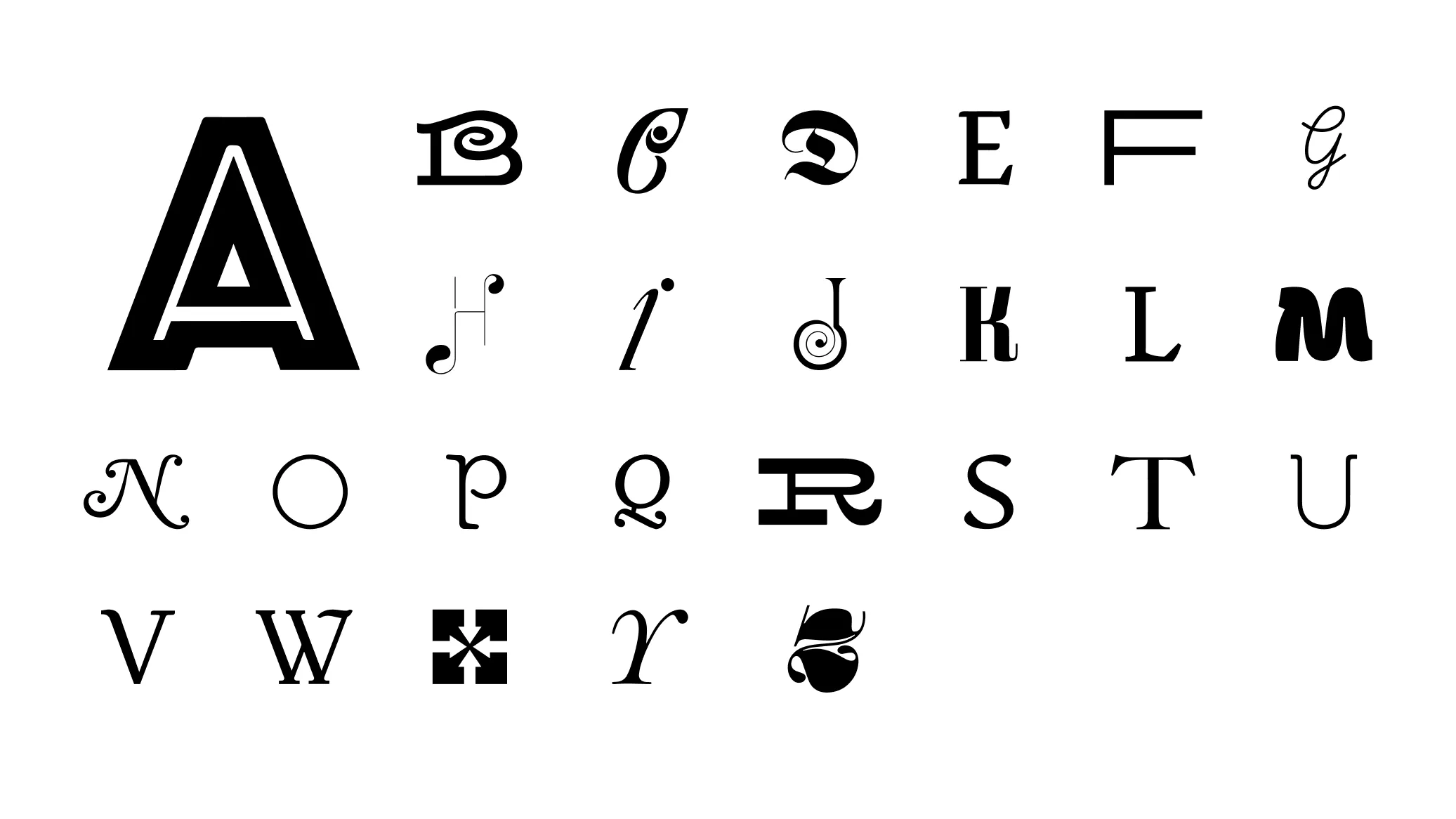
The idea: Look at the history, shape and sound pattern of each letter, sum it up in 140 characters, and collect a beautiful specimen for each letter.
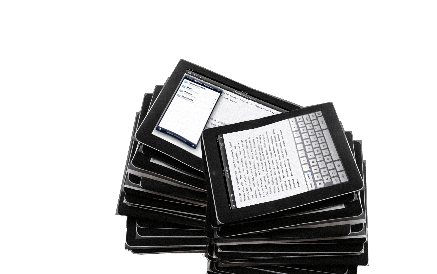
Over the last two months we have been working on several iPad projects: two news applications, a social network, and a word processor. We worked on iPad projects without ever having touched an iPad. One client asked us to “start working on that tablet thing” before we even knew whether the iPad was real.
I’ve been asked by the Italian magazine L’Espresso to write an article on The Future of Web Design. Here is the (longer) English text.
Using 10 pixel Verdana made sense in a time when screens were 640 pixels wide. Today it is a mistake.
Last Sunday, they started airing the "Hello, I'm a Mac… and I'm a PC" ads here in Japan. And here's a surprise: they're different. The Mac guy isn't particularly cool and the PC guy is a real "salary man" type. The ads aren't as obvious as the Western originals.
An avalanche of comments, hundreds of applauding blog entries, honorable mentions from cooler and more sublime and hotter and higher places, forum discussions, translations in Chinese and partially in Italian and even blunt plagiarism was incited by one of my recent notes.
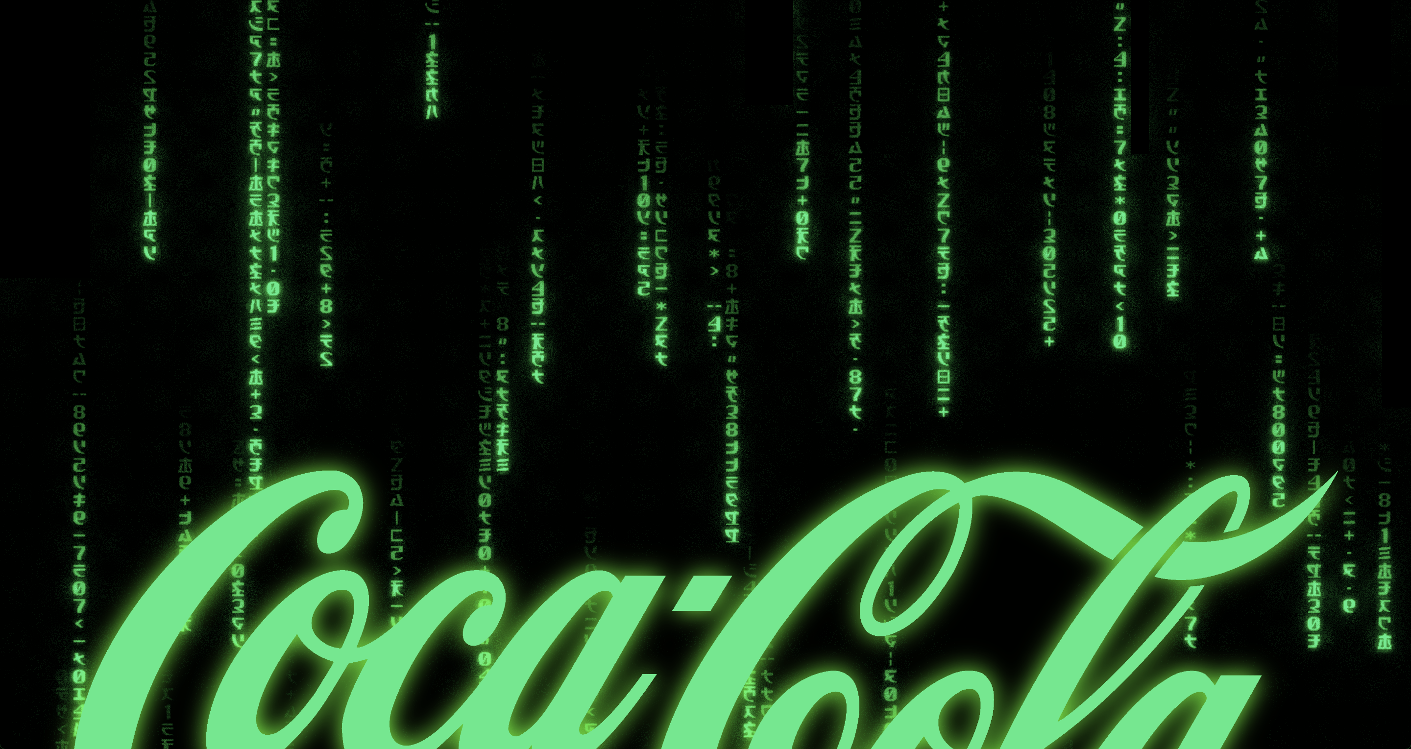
Brands make us associate positive values and positive experiences with the products they mark. Brand values are defined by the senior management in the “Brand Matrix”. Coca-Cola recently changed their brand matrix. Are we soon going to associate other things with Coca-Cola?
95% of the information on the web is written language. It is only logical to say that a web designer should get good training in the main discipline of shaping written information, in other words: Typography.
Simple websites are easy to use, easy to understand, nice to look at. In practice, websites are either unusable or ugly and filled with too many words. Why do designers have a hard time to keep it simple?