Articles related to Information Architects
New Site with Responsive Typography
We need not only responsive layouts, we also need responsive typefaces.
“Why Simplicity Creates Great User Experiences”
Interview with DRT.fm
Form and Information
A lecture

Can Information be Architected?
"iA on IA" from EuroIA 2010.

“Web design is engineering”
Interview with Jonny Holland
Cosmic 140
Art for Geeks

Designing for iPad
No iPad yet? Print it!
iA’s 2006 Facebook Designs, Redesigned
The contract was never signed, so we kept our designs in the drawer... Until now…
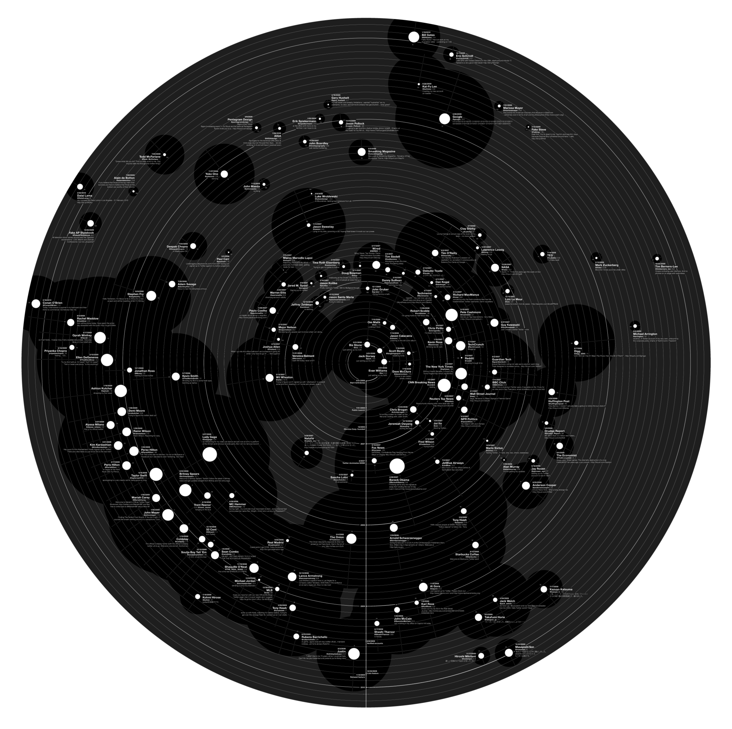
Our Next Trend Map
Meet the Cosmic 140
Web Trend Map Video Interview
An interview with GaijinPot.com
Can Experience be Designed?
On mind control
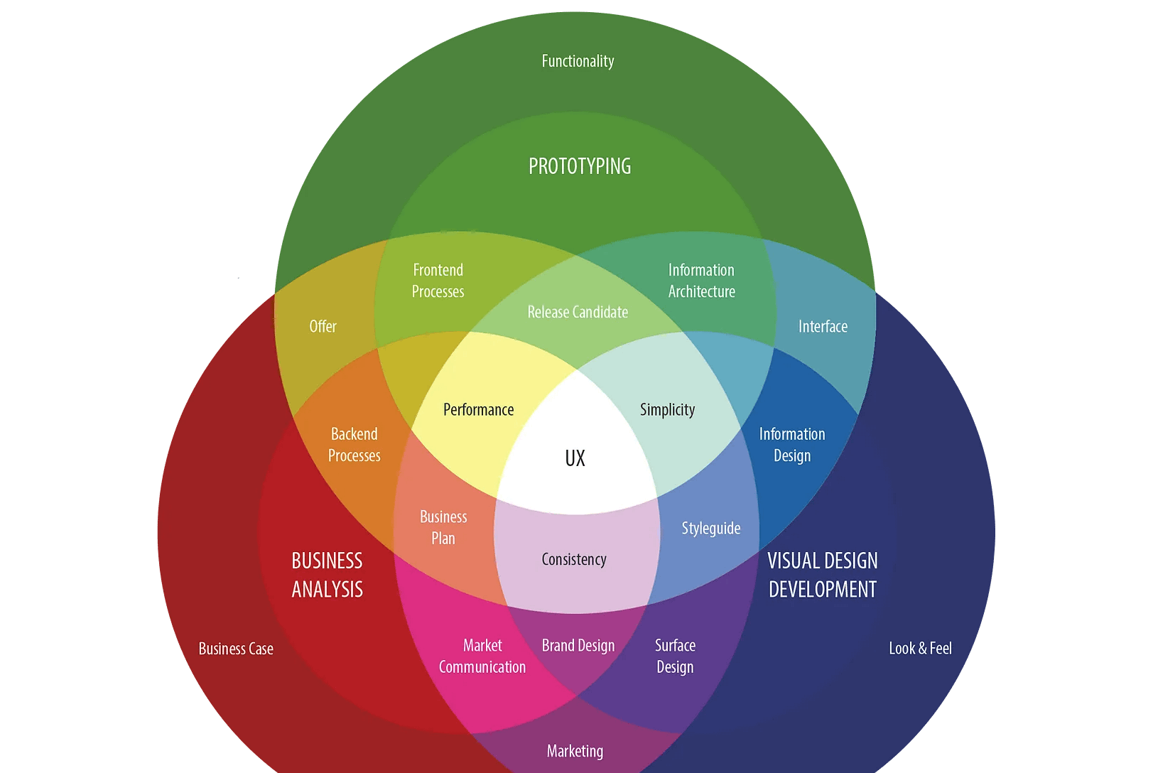
The Spectrum of User Experience
You gotta keep em separated
Web Trend Map 4
The coolest gift for geeks

Kill Blog Comments?
You can't discuss and moderate at the same time
Web Trend Map 4
A preview
iA Opens Second Office in Switzerland
Exciting news
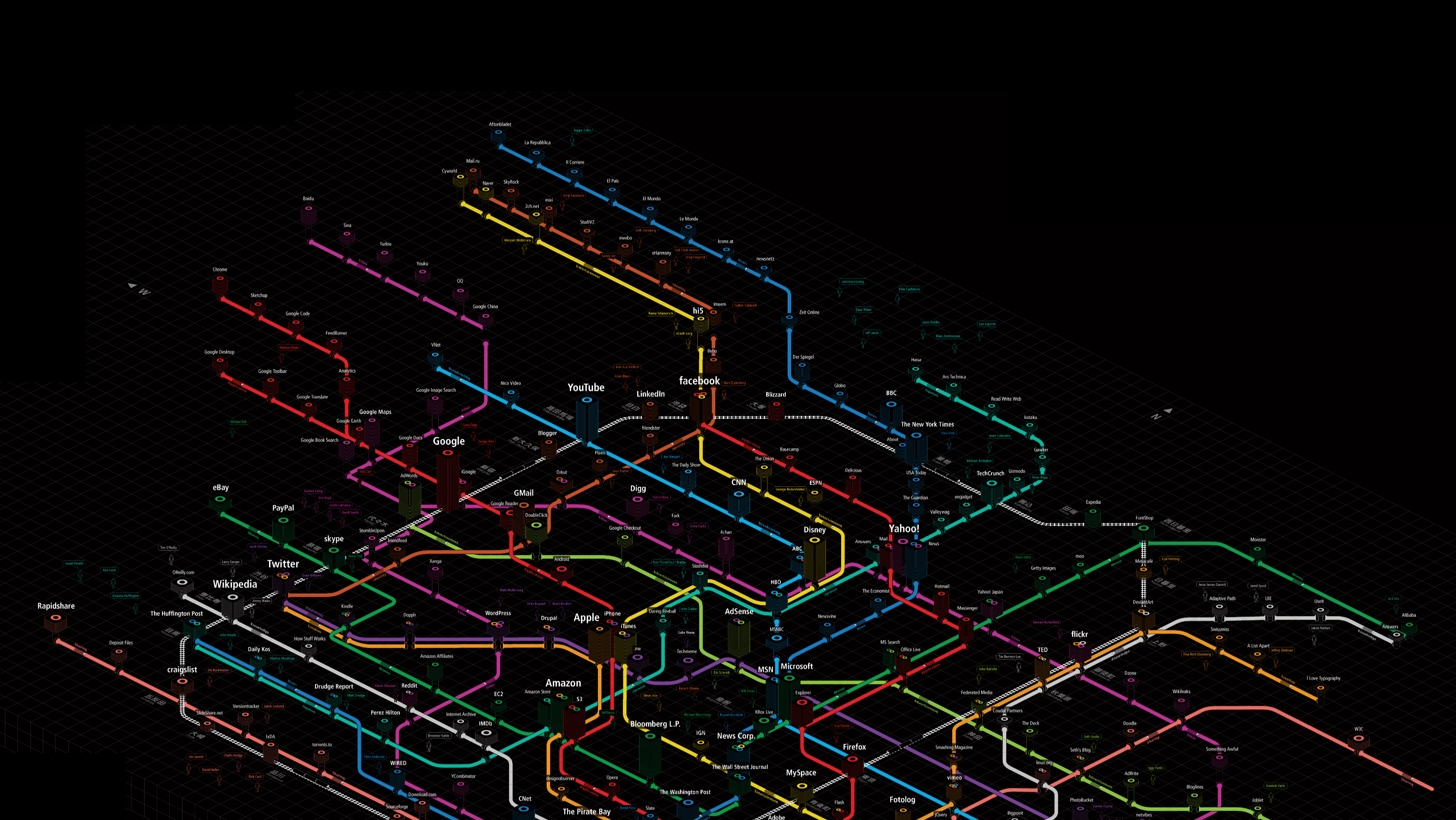
Web Trend Map 3
The coolest gift for geeks
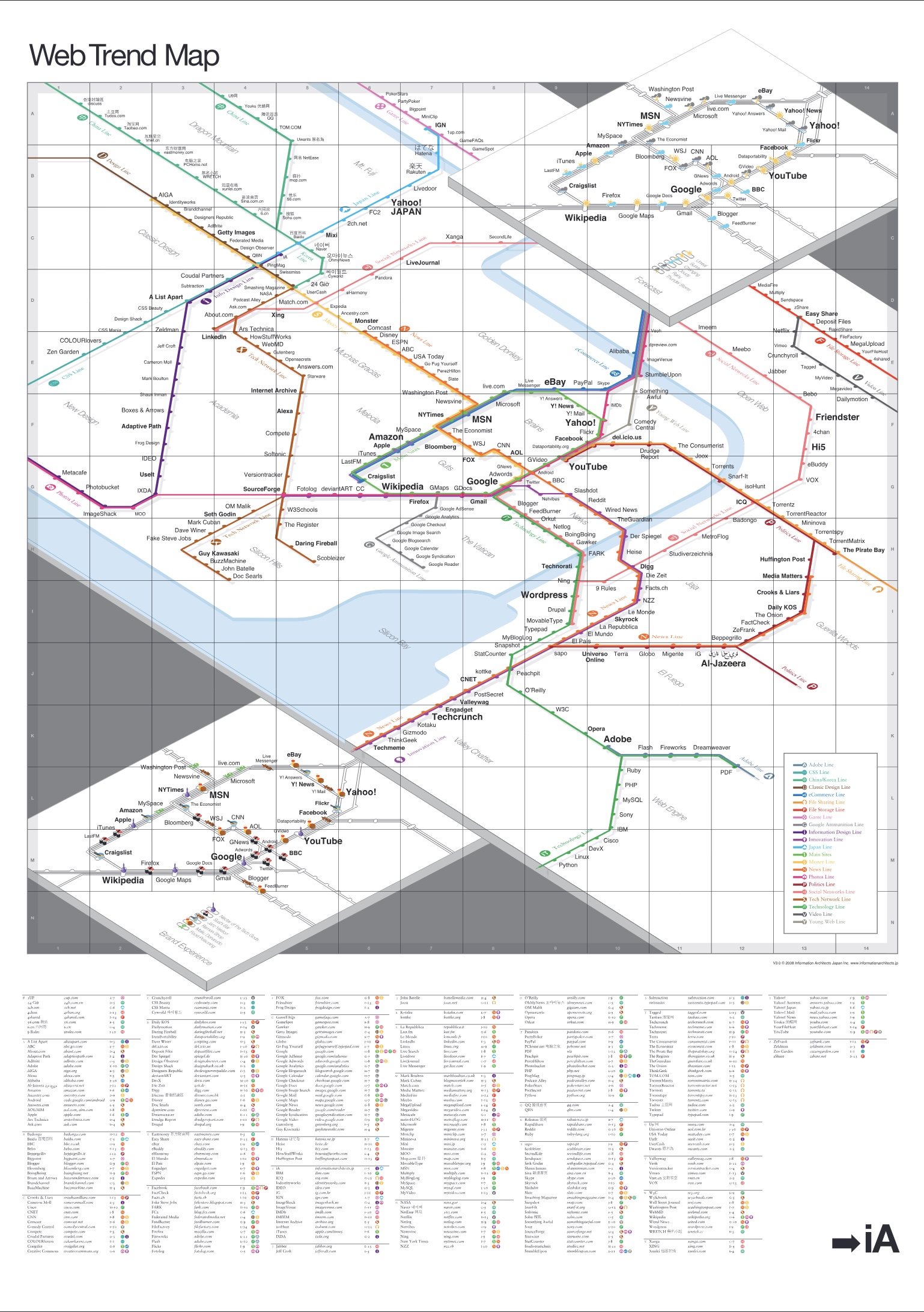
Web Trend Map 2008 Beta
We present you with the 2008 Web Trend Map, in all its beautiful beta glory. This time we’ve taken almost 300 of the most influential and successful websites and pinned them down to the greater Tokyo-area train map.
Web Trend Map 2008
New layers!
Trend Map 2008
What’s New?
The Essentials of Online Rebranding
Face Off
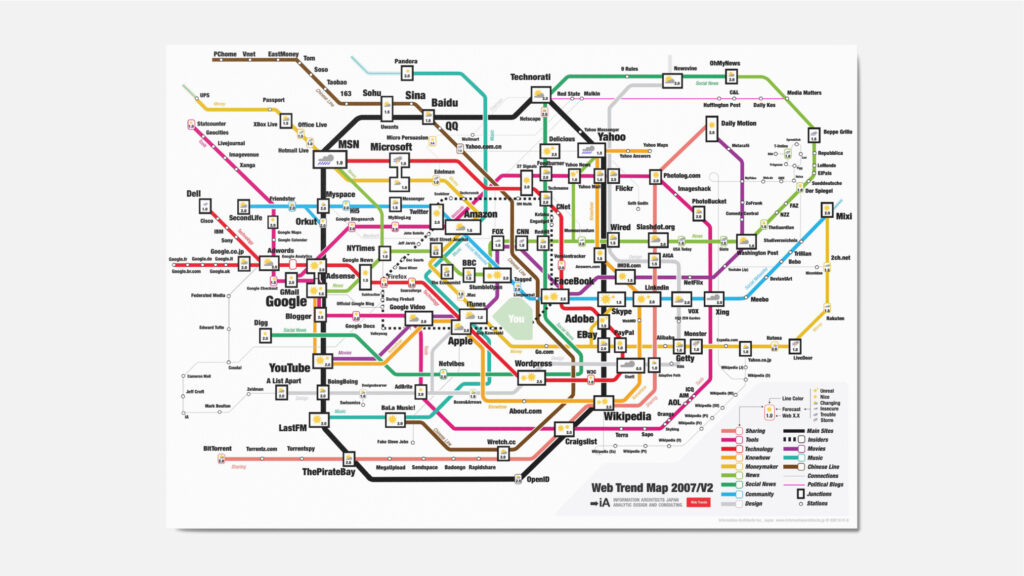
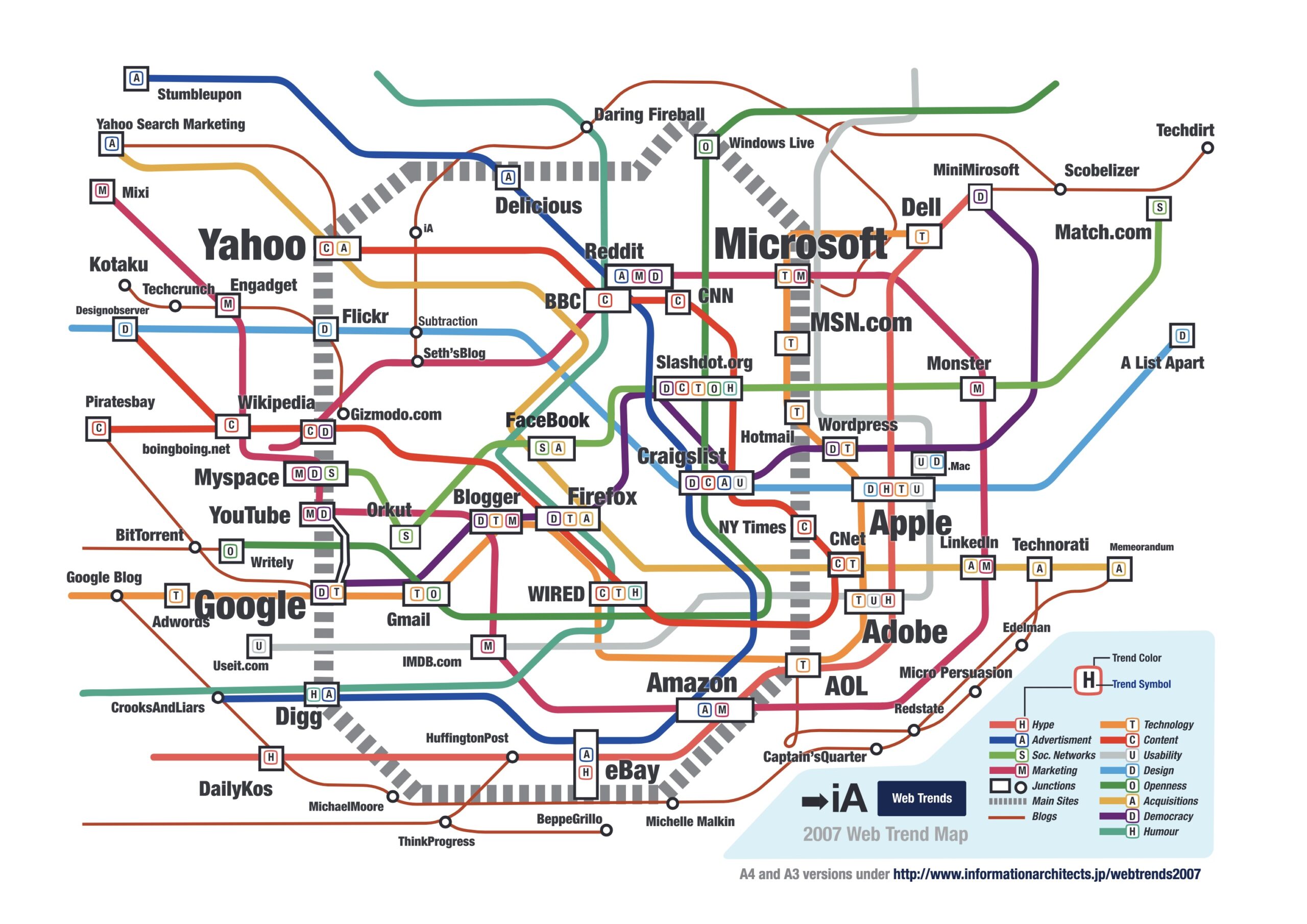
Web Trend Map 2007
Version 2.0

A Word on Design Value
Quality costs time and money

Newspaper Wiki
Schematics
Washington Post Redesign
...as a Wiki

Tirekickers & Co. Ltd.
There are three kinds
Web Trend Map 2007
Reactions
Web Trend Map 2007
All the big players


