Writer
Search to Navigate
iA Writer 8 combines search and outline into a faster way to move through your documents
Read Article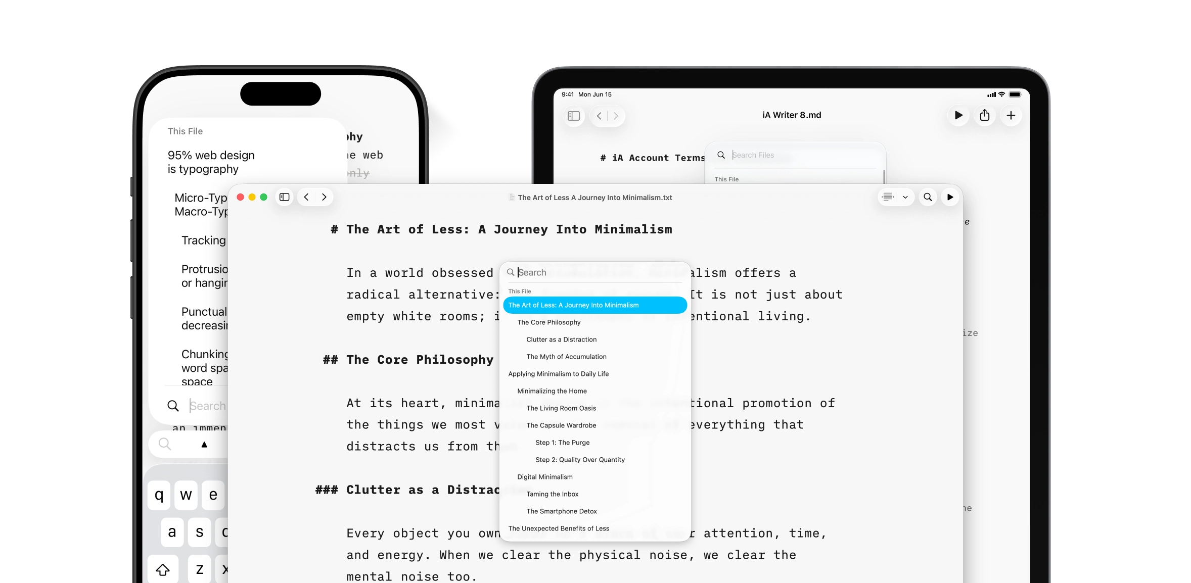
Writer
Authorship Arrives on Windows
Stay on top of changes and sources.
Read Article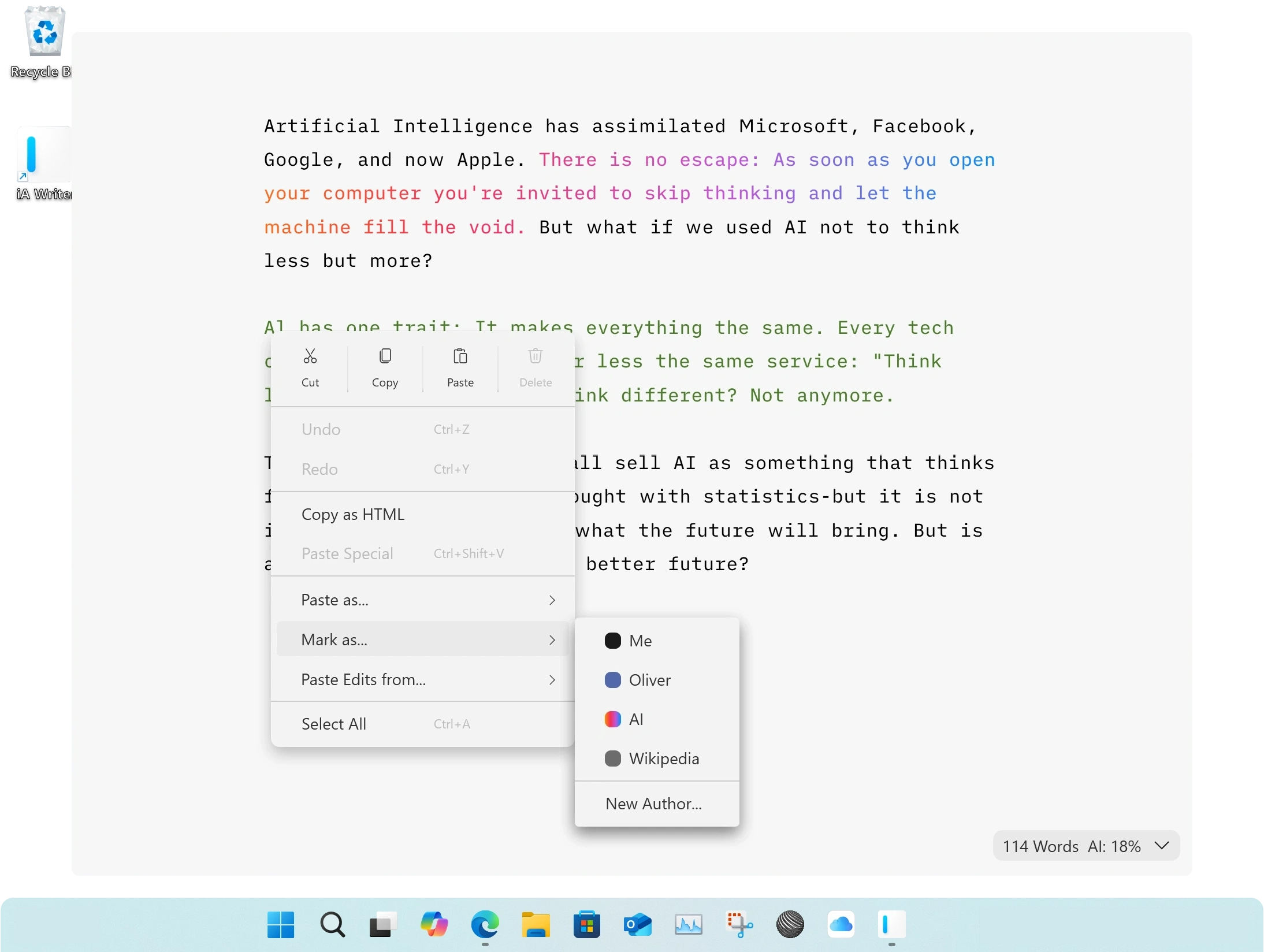
Writer
Buy Direct, Sign In Easy
Get iA Writer directly from us with iA Account.
Read Article
Writer
Tell Us Your Story
How has iA Writer changed your life?
Read Article
Presenter
Charts = Tables
iA Presenter 1.6 comes with charts, tables, and a faster way to edit images
Read Article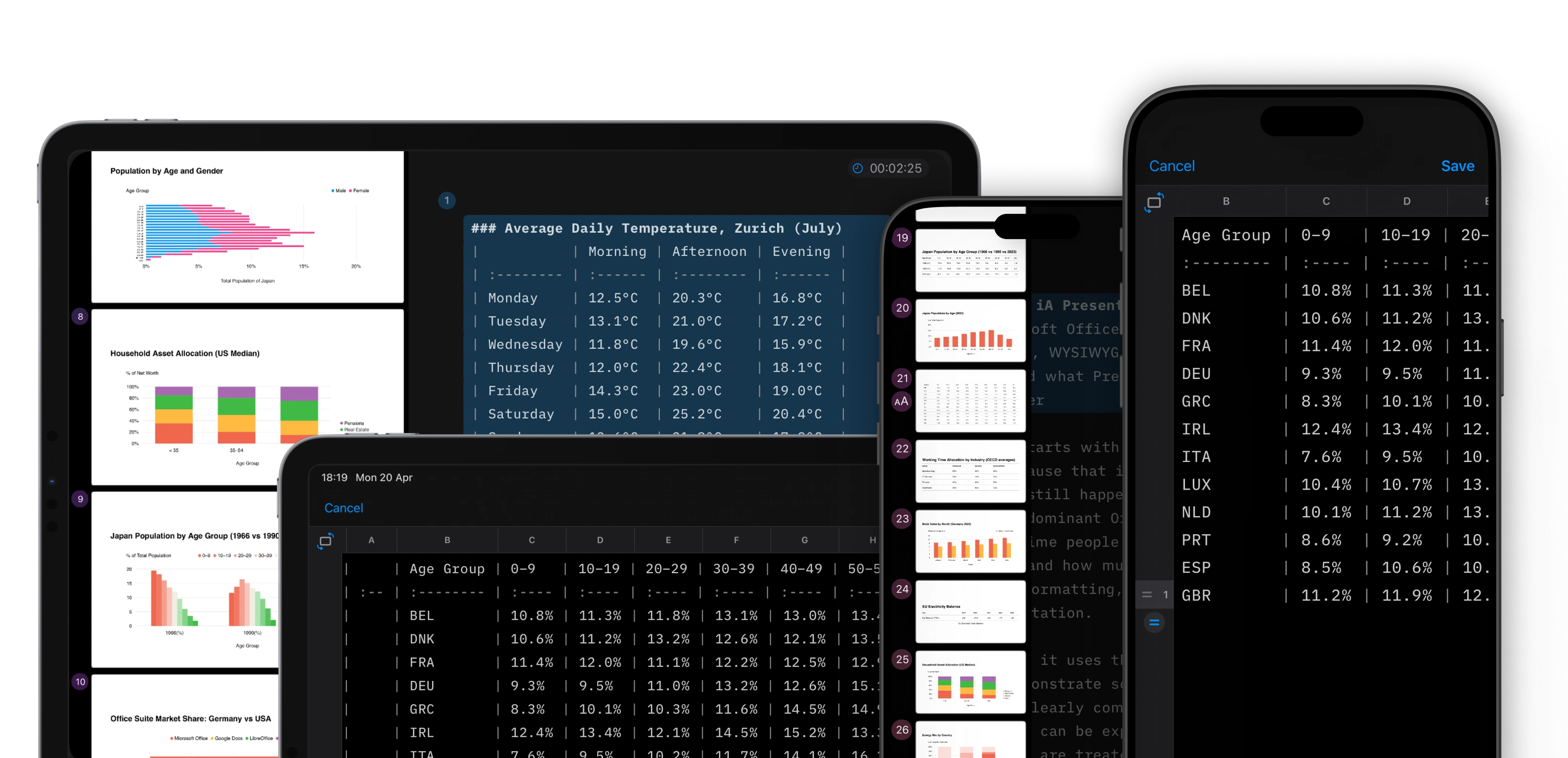
Design
Madness and Imagination
To improve anything, we need to dare to imagine and make what doesn’t exist.
Read Article
Writer
Who wrote this?
Authorship comes to iA Writer for Windows
Read Article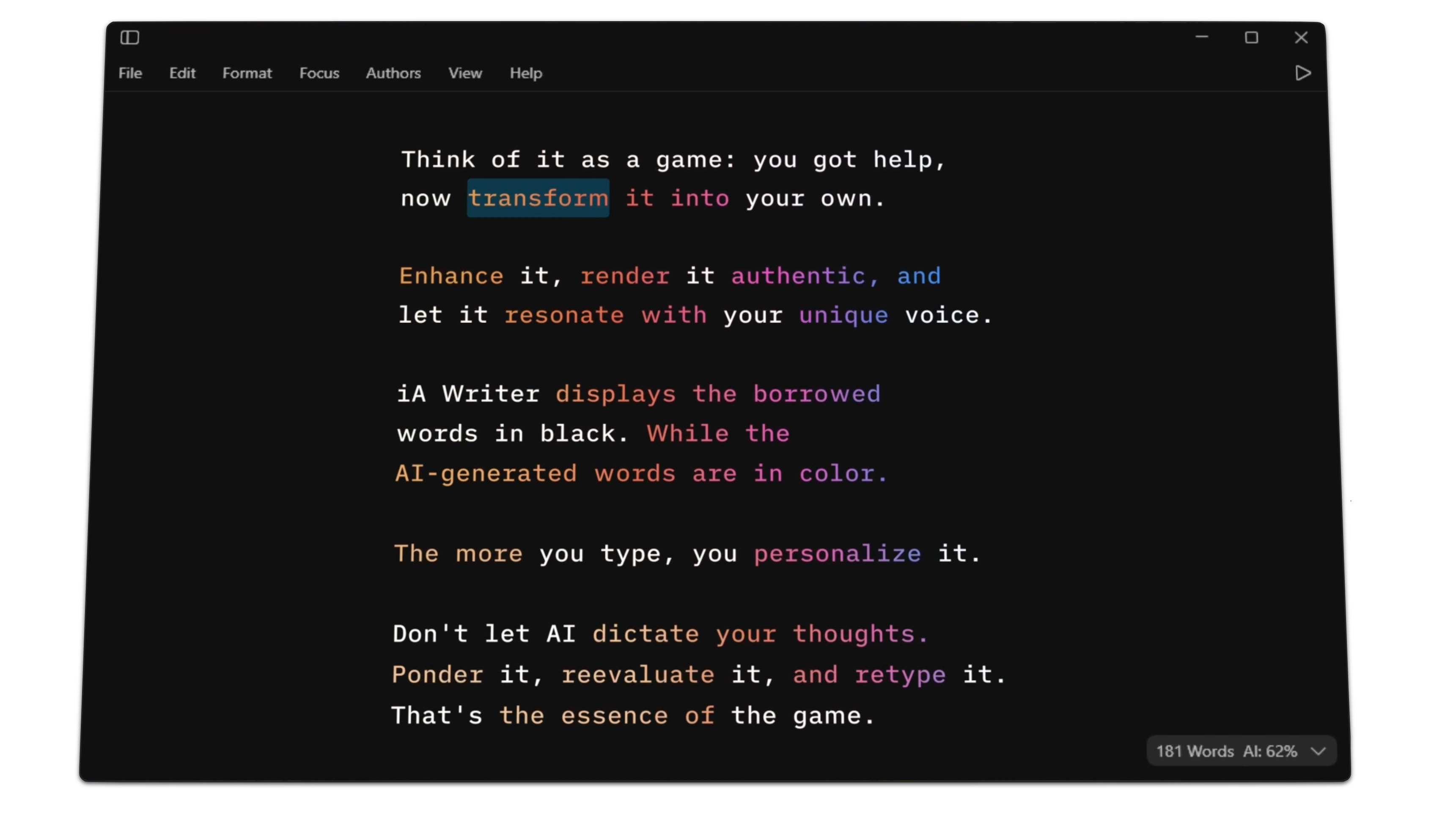
iA Notebook
Paper Alchemy
The making of iA Notebook
Read Article
Writer
Separate Writing and Formatting
How to get focused
Read Article
Design
Trapped in MS Office
Seeking IT independence, Europe wants to escape Microsoft Office. The question is: where to?
Read Article
Writer
NYC Midnight and iA Partner Again
Supporting aspiring writers worldwide
Read Article
About Us
Popping-Up in Roppongi
More pop-ups, and a new office around the corner of Roppongi Hills
Read Article
About Us
The 2025 iA Award Winners
And the winners this year are...
Read Article
About Us
The 2025 iA Recap
A year packed with awards, fairs, and conversations with our users
Read Article
Presenter
Charts in Slides
Debuting in Presenter. Designed to travel further.
Read Article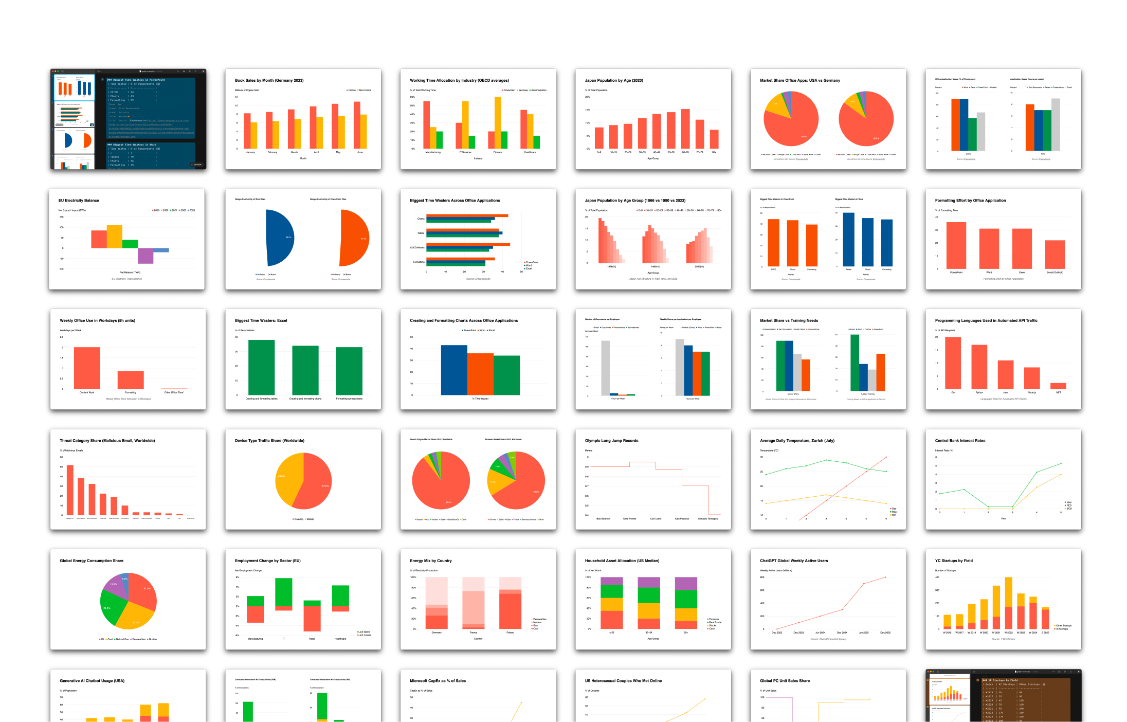
Presenter
Introducing iA Account
An easier way to sign in to our apps.
Read Article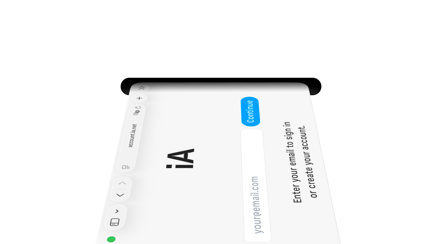
About Us
iA Winterfest 2025
Celebrating both Winterfest and 20 years of iA this year, with one gift to enjoy each day.
Read Article
Design
See What AI Wrote
Marking, tracking and spotting AI generated text
Read Article
About Us
The 2025 iA Awards
Our annual celebration of great writing and presenting
Read Article
iA Notebook
From Tokyo to MOMA
Better availability of iA Notebook in the the U.S.
Read Article
Presenter
A Presentation App That Works on Your Phone
iA Presenter is now available on iPhone, iPad and Mac
Read Article
Insights
Liquid Glass
Design or Kitsch?
Read Article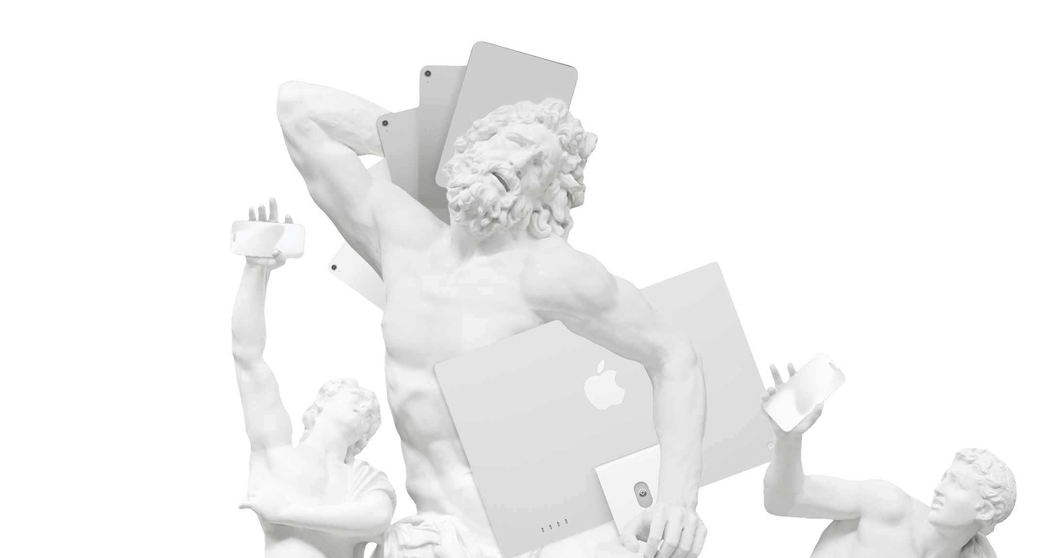
iA Notebook
Japan Stationery of the Year
iA Notebook wins its second award this year
Read Article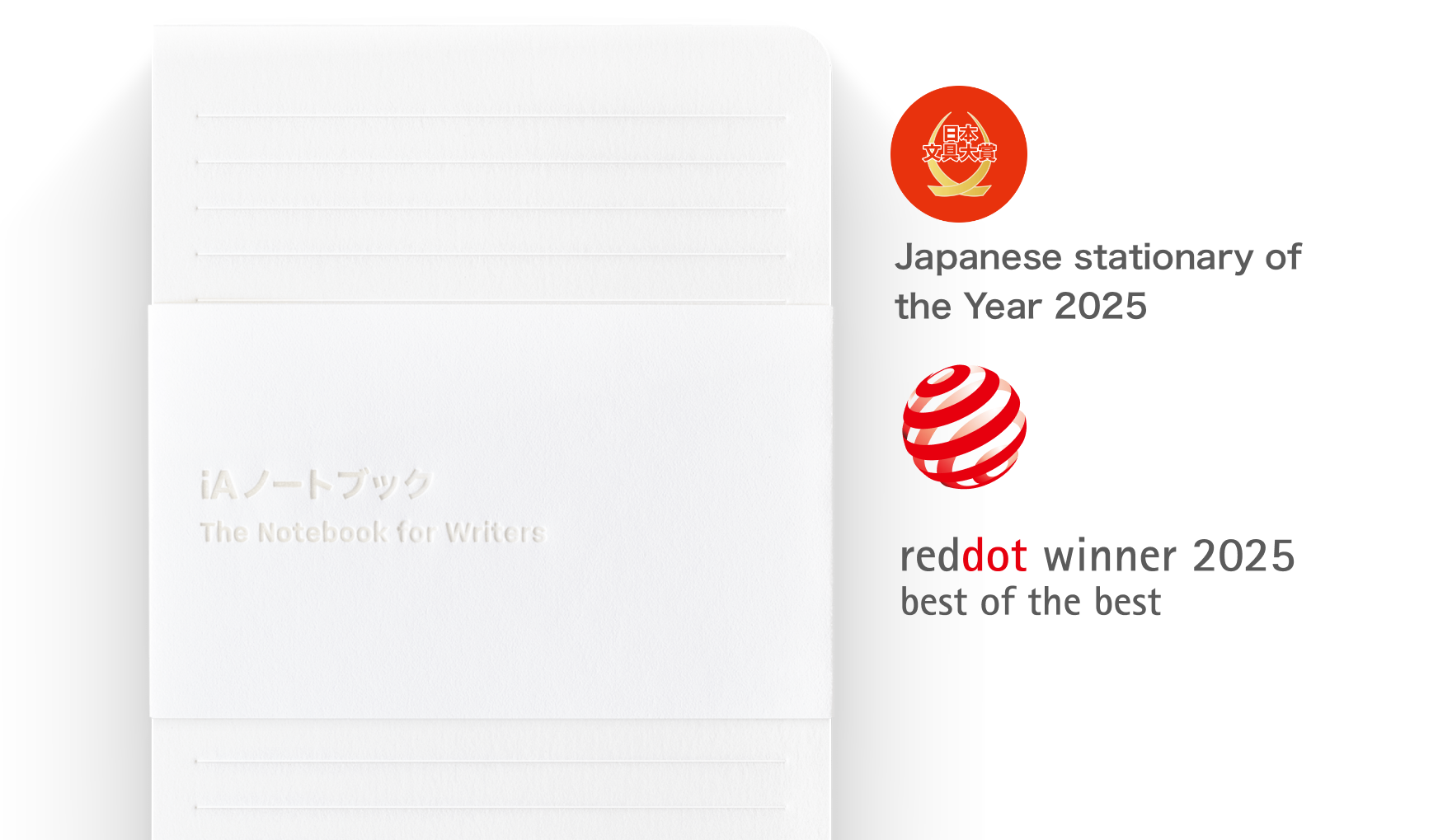
Writer
Apple Design Award Finalist After 15 Years
Good design is long-lasting
Read Article
Insights
Know How
Jony Ive’s Philosophy of Design
Read Article
Insights
Maker’s Knowledge
Giambattista Vico's Design of Philosophy
Read Article
About Us
Tokyo Focus Tracks
Soothing typographic train rides for chilled writing
Read Article
iA Notebook
iA Wins Red Dot Best of Best
The highest distinction for pioneering designs
Read Article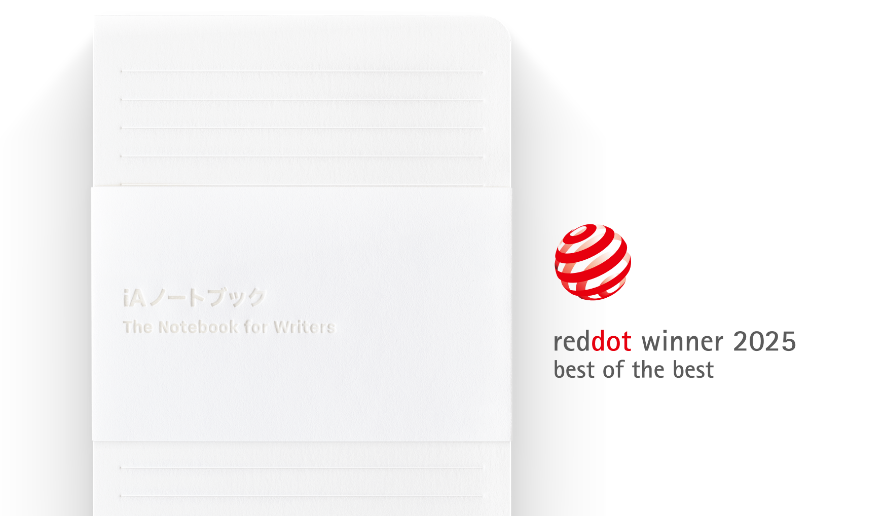
Writer
Markdown and the Slow Fade of the Formatting Fetish
Like moss on a star destroyer
Read Article
Writer
Simple, Slick & Smooth
The all new iA Writer for Windows
Read Article
Writer
Screenwriting Challenge
iA sponsors NYC Midnight 2025
Read Article
Presenter
How to Master iA Presenter
Tutorials, videos, and tips for story telling
Read Article
About Us
Unveiling the 2024 iA Award
And the winners are...
Read Article
Writer
Which Story Will Win?
The NYC Midnight 2025 Short Story Challenge
Read Article
About Us
New Year Recap 2024
Looking back before we look forward to the next year
Read Article
Presenter
Slowly Melting Eye Candy
The screen saver you always wanted
Read Article
Presenter
Share Your Presentation in One Click
Send the link—no login, no pinching, no squinting
Read Article
Writer
A Chess Template for iA Writer
Celebrating the 2024 FIDE World Championship
Read Article
Writer
iA Writer for Windows 2.0
In public beta, coming soon
Read Article
Presenter
New Wallpapers
For your phone, tablet or desktop computer
Read Article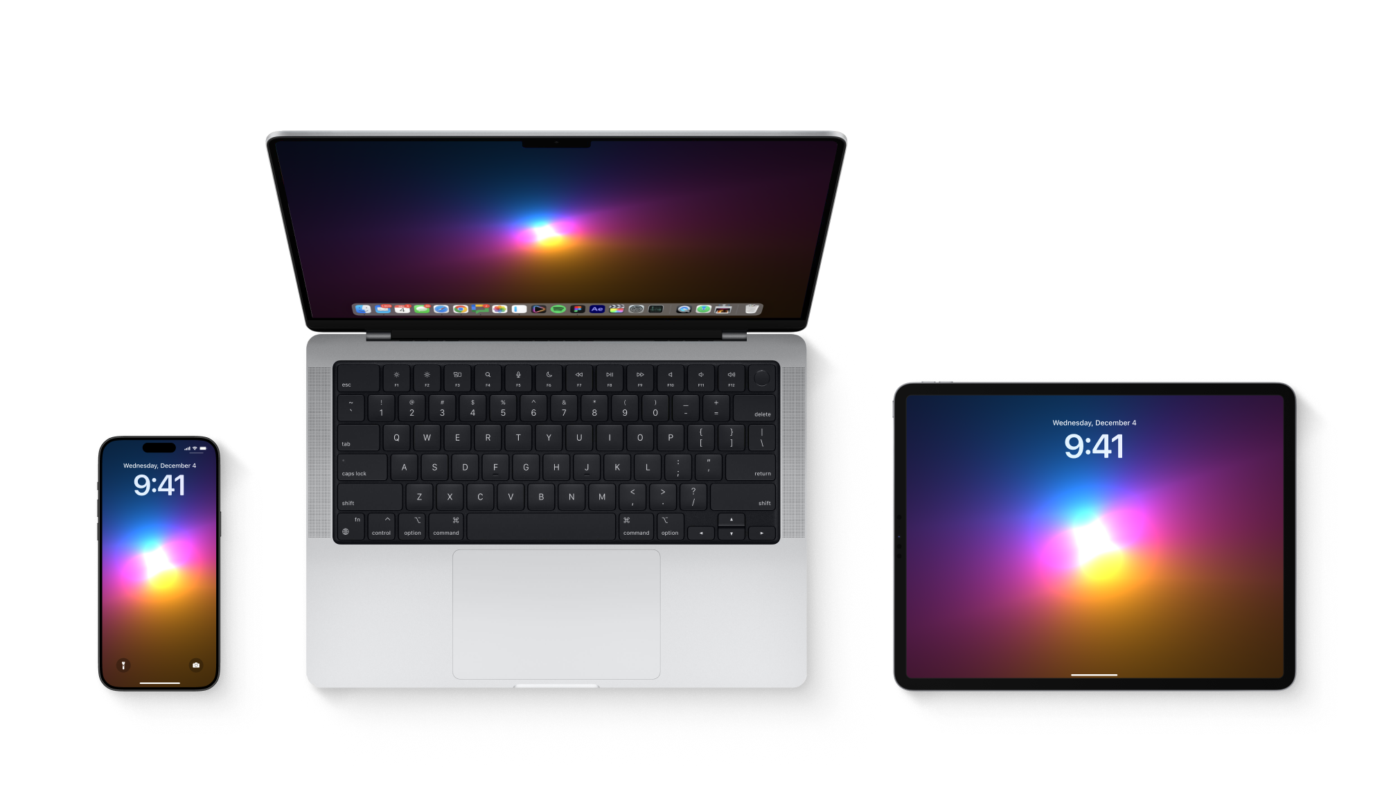
About Us
iA Winterfest 2024
A gift, every week, until Christmas
Read Article
About Us
The 2024 iA Awards
Share your best work and win an iA Notebook
Read Article
Writer
How to Master iA Writer
Tutorials, Tips, and Tricks
Read Article
iA Notebook
The Second Notebook Batch
Not sure what to get your friends for Christmas?
Read Article
Writer
On Writing Setups And Staying Motivated
The iA guide to writing your first novel, Part IV
Read Article
Writer
Story Outline and Research
The iA guide to writing your first novel, Part III
Read Article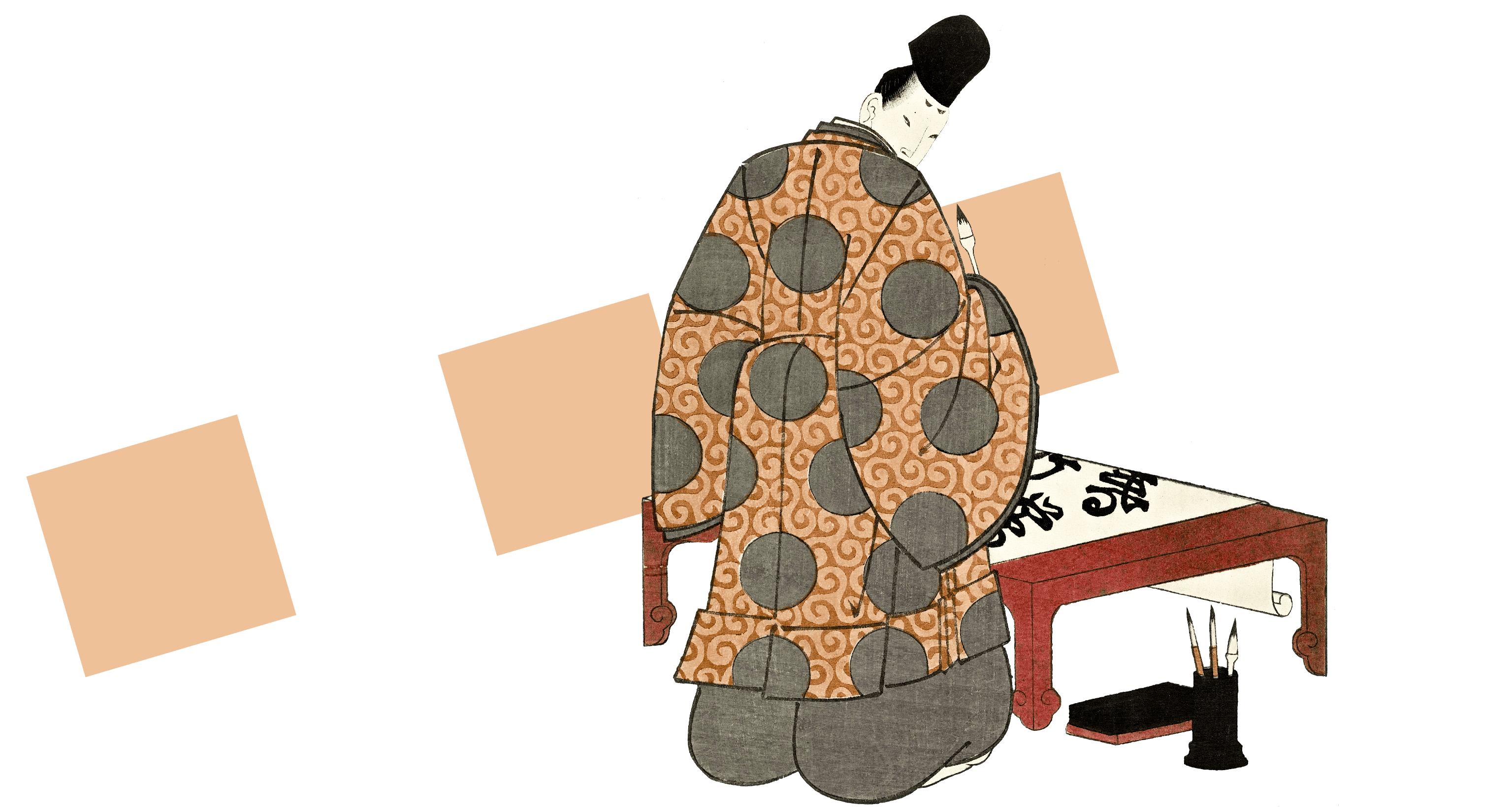
Writer
Memorable Characters and Unique Worlds
The iA guide to writing your first novel, Part II
Read Article
Writer
The Driving Question, and Your Daily Routine
The iA guide to writing your first novel, Part I
Read Article
Writer
Stay in control of Apple’s AI Writing Tools
iA Writer highlights the additions made by Apple's AI
Read Article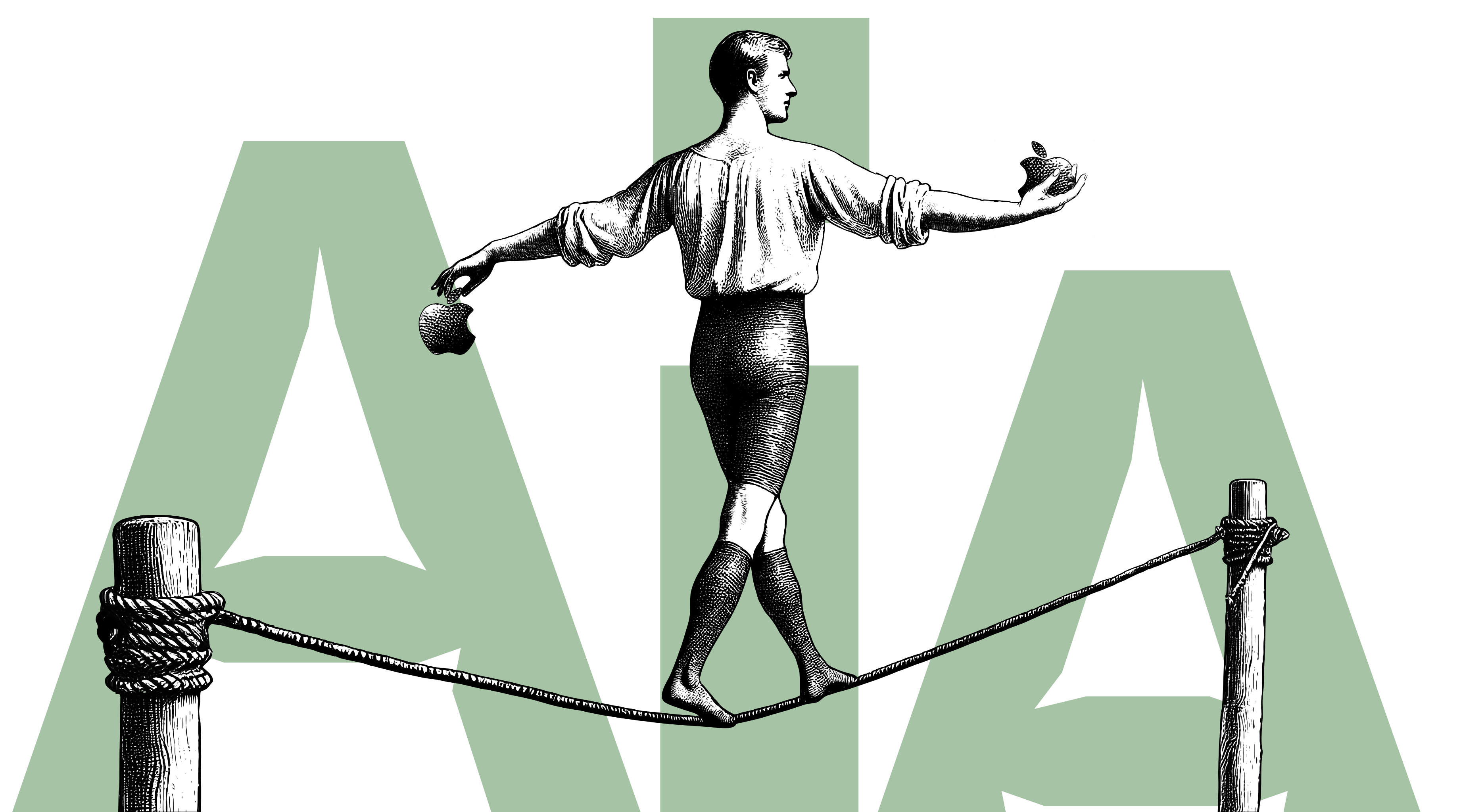
Presenter
The Five Canons of Rhetoric
Create, structure, design, prepare—the rest is easy
Read Article
Writer
Our Android App is Frozen in Carbonite
Google altered the deal
Read Article
Presenter
Your speaking voice
Timeless advice
Read Article
Writer
Faster Filing With Tree View
A step forward for large writing projects
Read Article
Design
Making Icons Fresh
Simple is never easy.
Read ArticlePresenter
Add Images Fast With Unsplash
High-quality images for iA Presenter
Read Article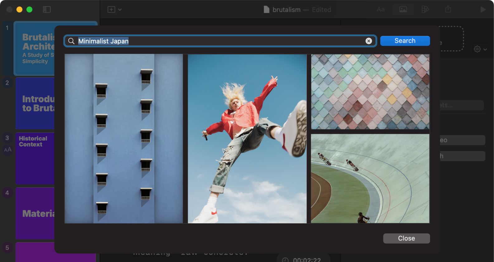
Insights
Books That Shaped iA
Five books that helped us improving our writing, presenting, and design skills.
Read Article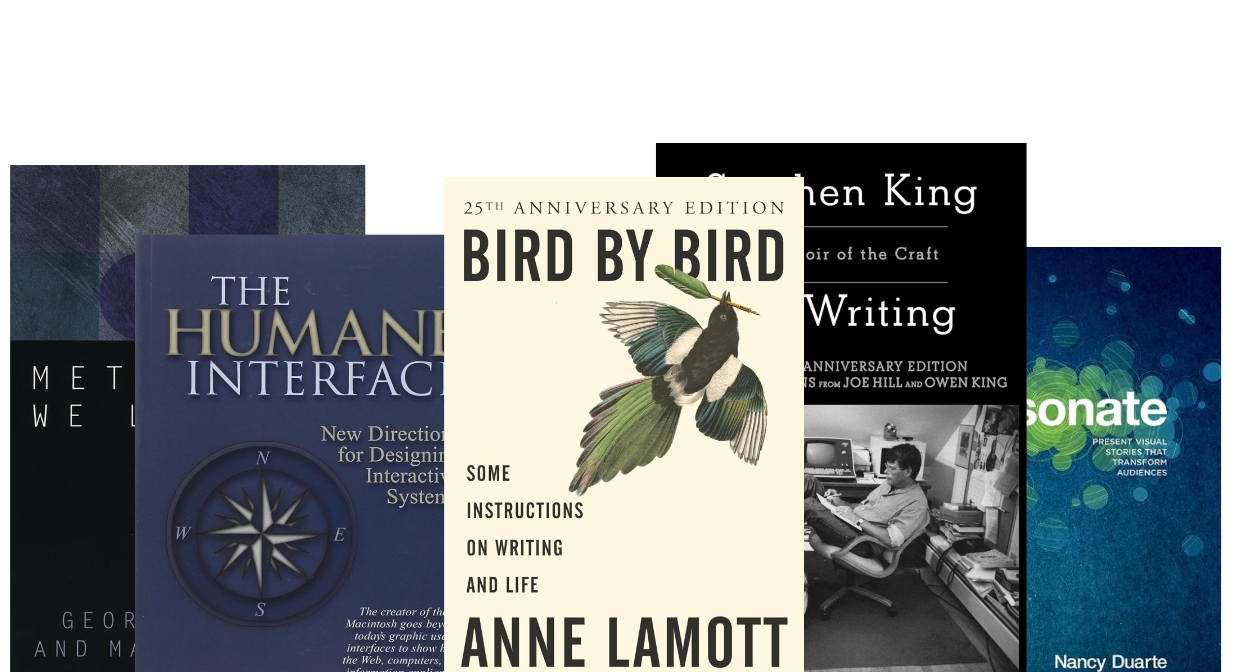
Writer
The Art of Screenwriting
Interview with a script doctor
Read Article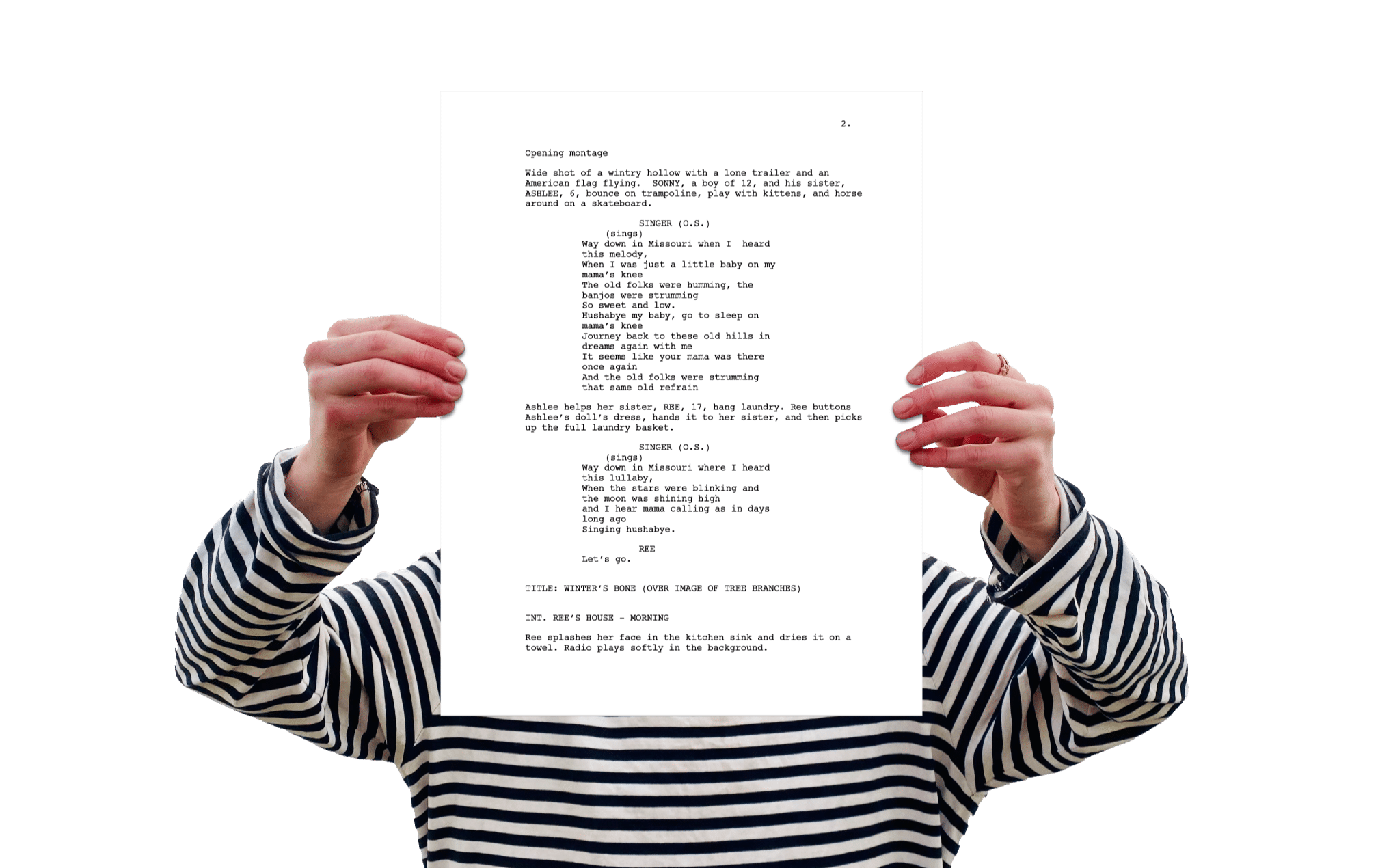
Writer
How to Build Worlds, and Why...
...and where to begin?
Read Article
About Us
iAlice
The fourth of July is also Alice Day
Read ArticleAbout Us
Books That Made Us
A selection of books about writing, presenting and design
Read Article
Writer
Why write?
A lifelong learning process that keeps us awake, sharp and connected
Read Article
Writer
Turning the Tables on AI
How about using it not to think less but *more*?
Read Article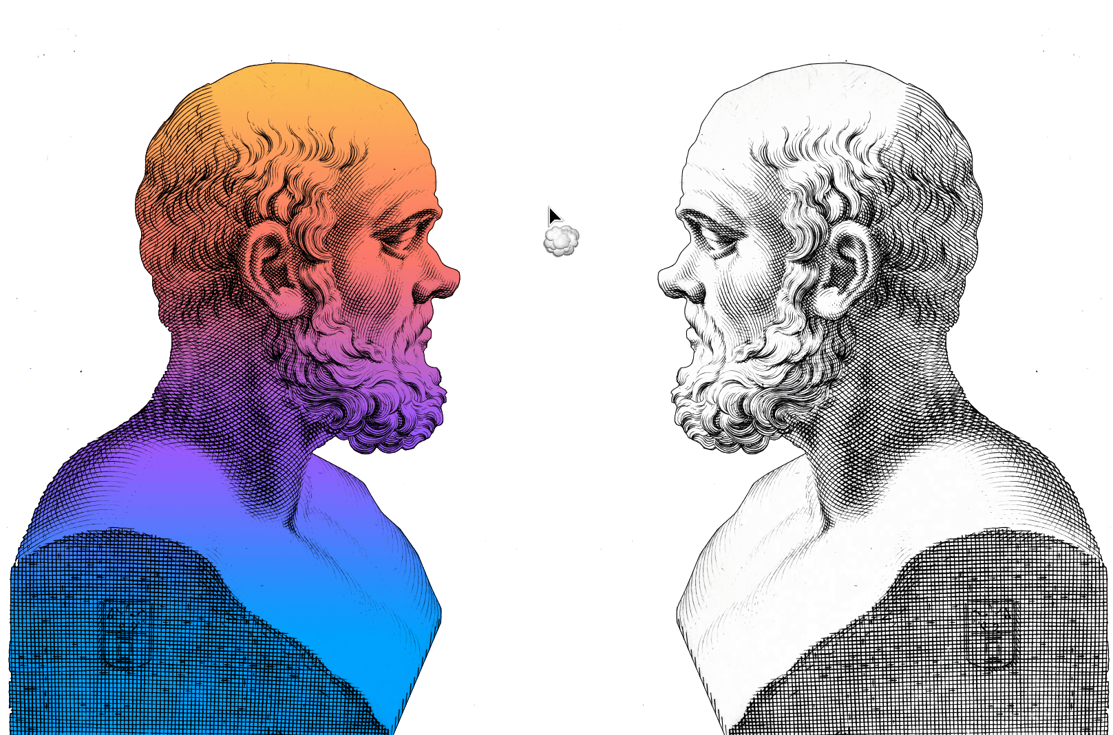
Presenter
Finding confidence
Practice, practice, practice
Read Article
Design
Design as Thought
AI and the Future of Design
Read Article
Presenter
Behind the gesture
Where do I put my hands while I speak?
Read Article
Writer
I Want You Back
(The Dropbox Remix)
Read Article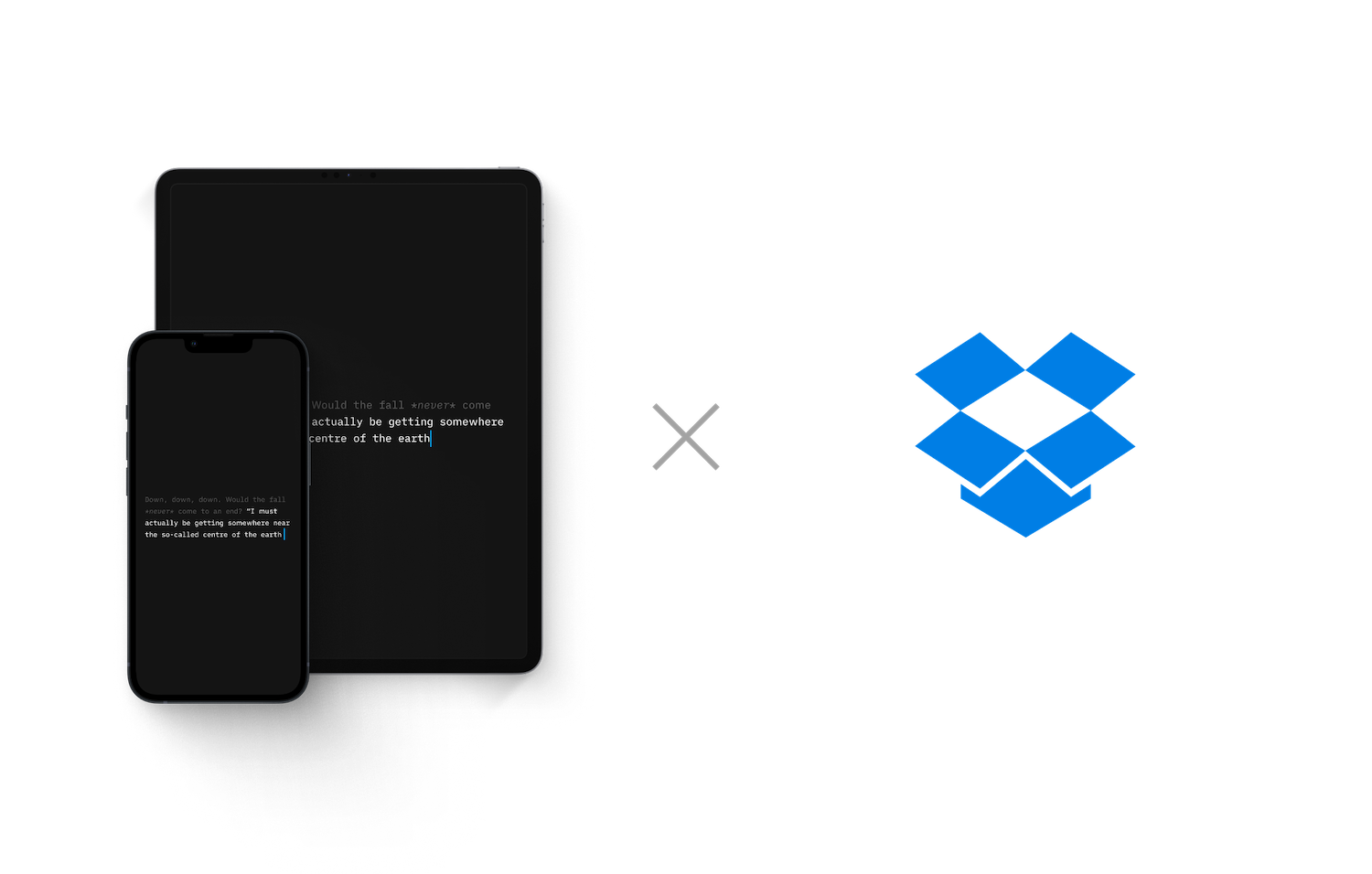
Insights
No Thanks
Apple makes the greatest ads... but not always
Read Article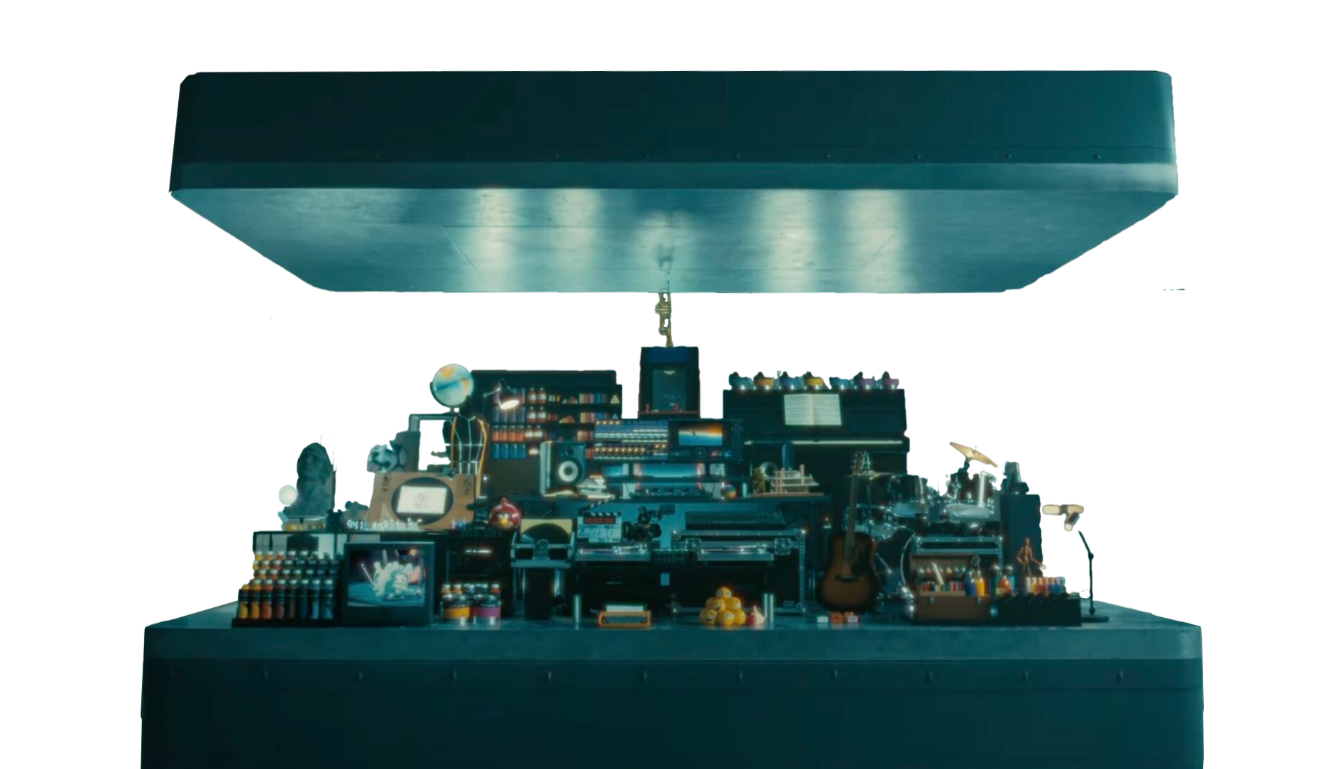
Presenter
Sharing Presentations Made Easy
iA Sharing is now available in iA Presenter for Mac (beta)
Read Article
Presenter
A Good Image Tells a Good Story
What Does it Say?
Read Article
Insights
AI and the Beauty of Human Flaws
On the Aesthetics of AI
Read Article
iA Notebook
iA Notebook Preorders
Preorders are open
Read Article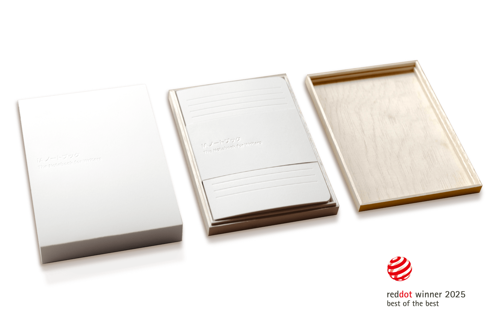
Writer
Avoid Repetitive Busywork
iA Writer 7.1 with new Shortcuts
Read Article
Presenter
Successful Methods of Public Speaking
Never imitate
Read Article
Insights
AI Videos: ******* Psychotic
Reflecting the unreflected horrors of AI animations
Read Article
Presenter
Improved Image Handling
Update 1.2 for iA Presenter's first birthday
Read Article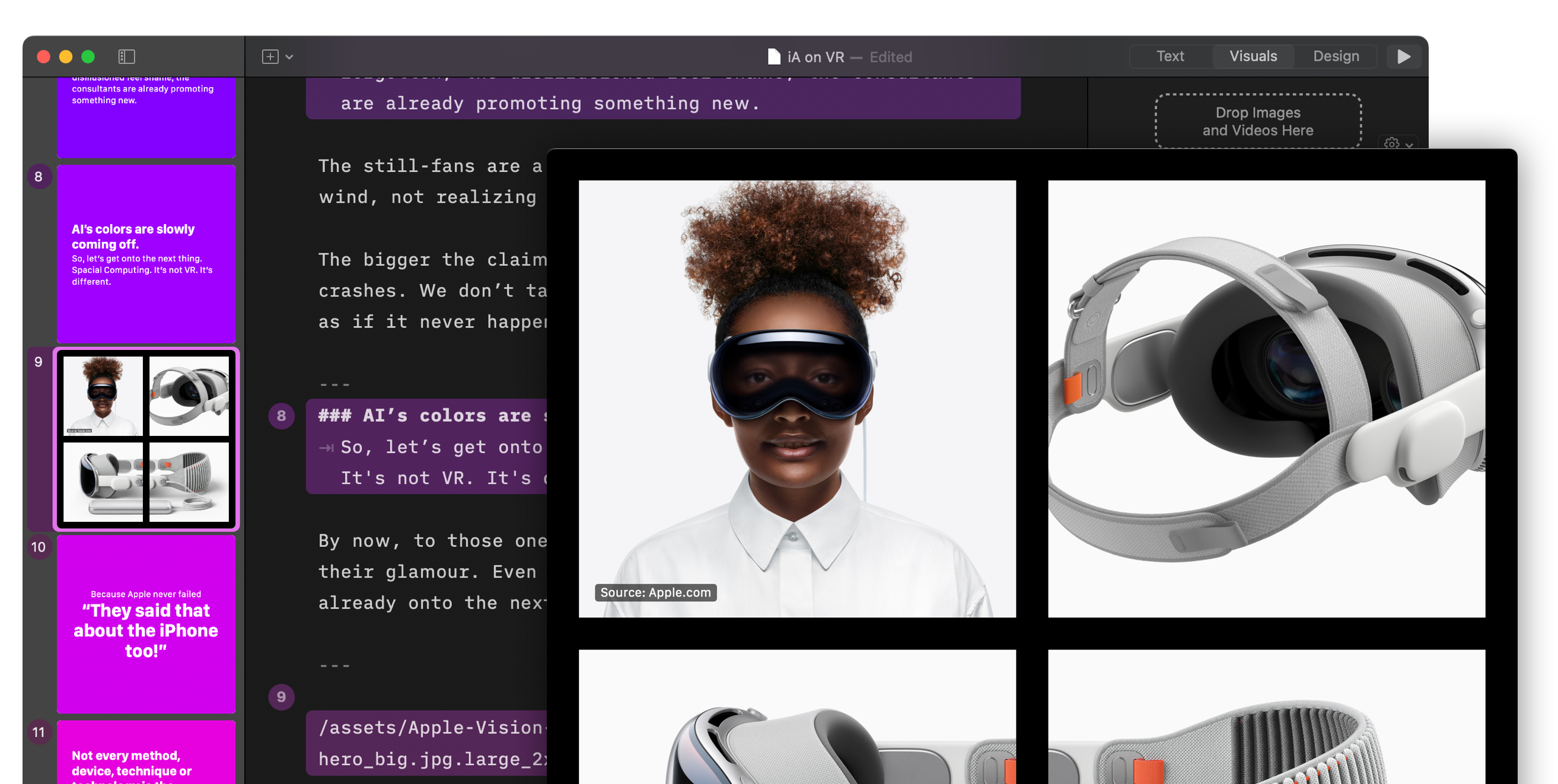
Writer
NYC Midnight 2024
iA sponsors the Screenwriting Challenge
Read Article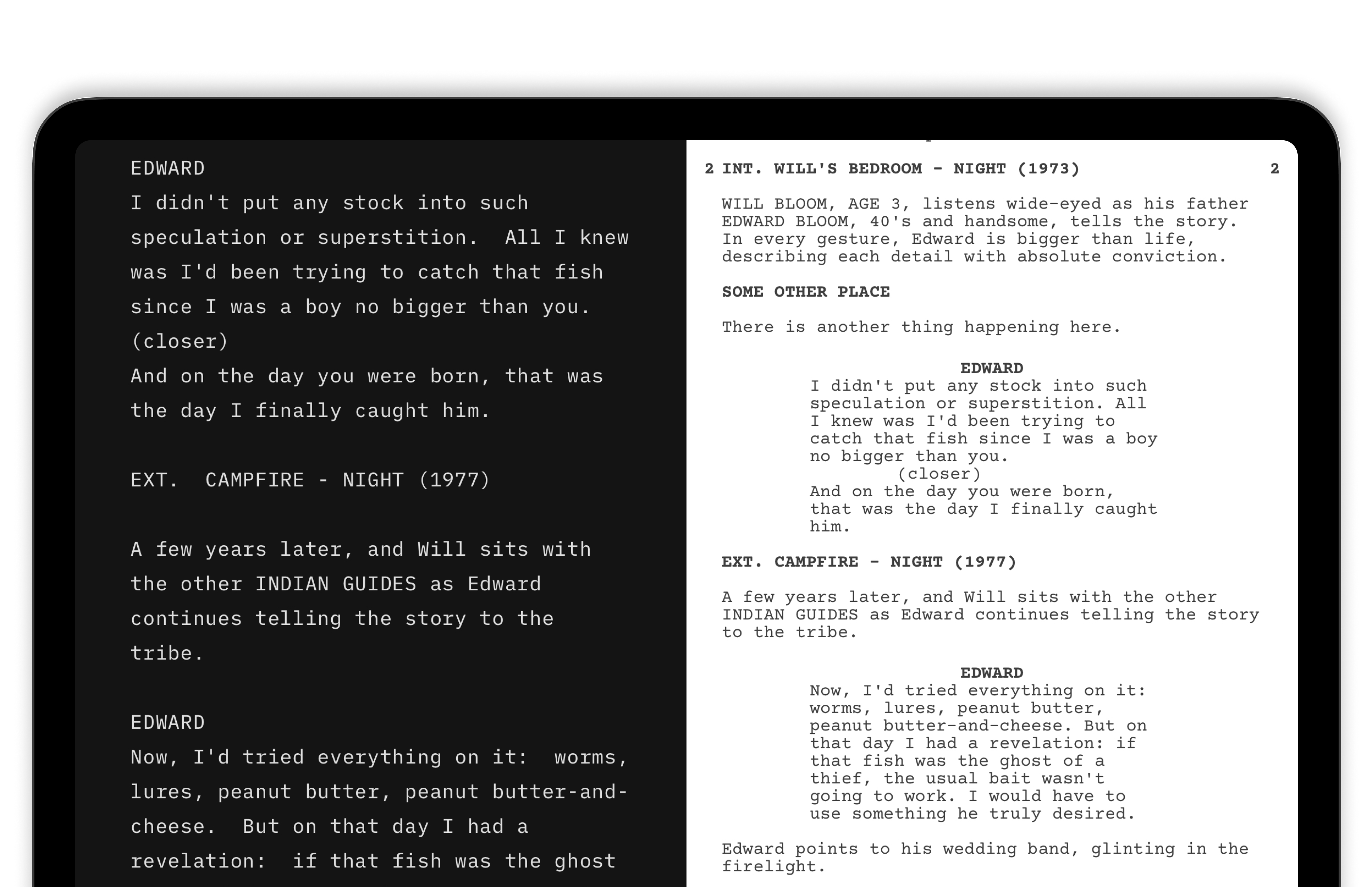
Design
AI Art is The New Stock Image
Critique of the pure AI image
Read Article
Insights
Is Every Picture Worth 1,000 Words?
Critique of the pure stock image
Read Article
Writer
NYC Midnight 2024
iA sponsors the Short Story Challenge
Read Article
Presenter
Finishing your speech
The conclusion is not a formality
Read Article
Information Architects
The 2023 Recap
From a single app to three products
Read Article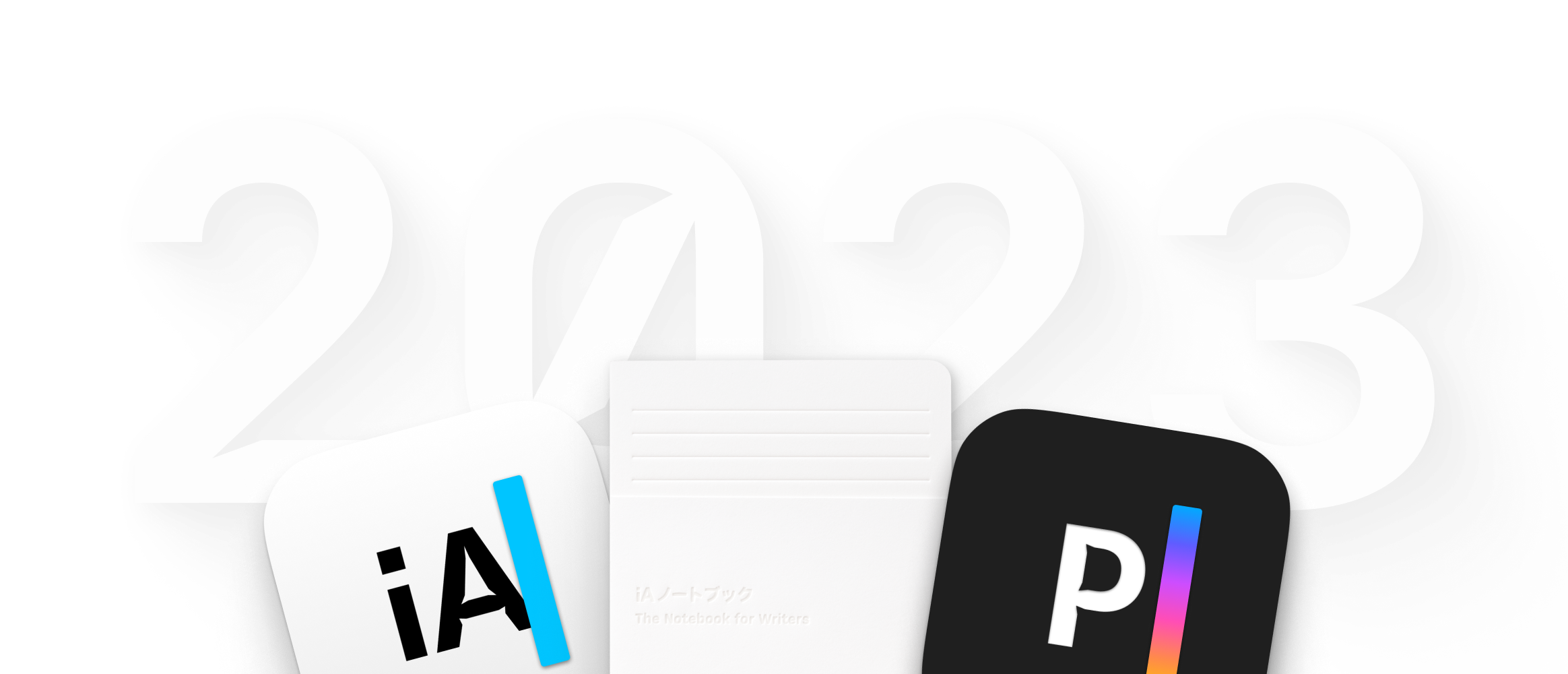
Presenter
iA Presenter Beta for iPad and iPhone
The final gift of this year’s Winterfest
Read Article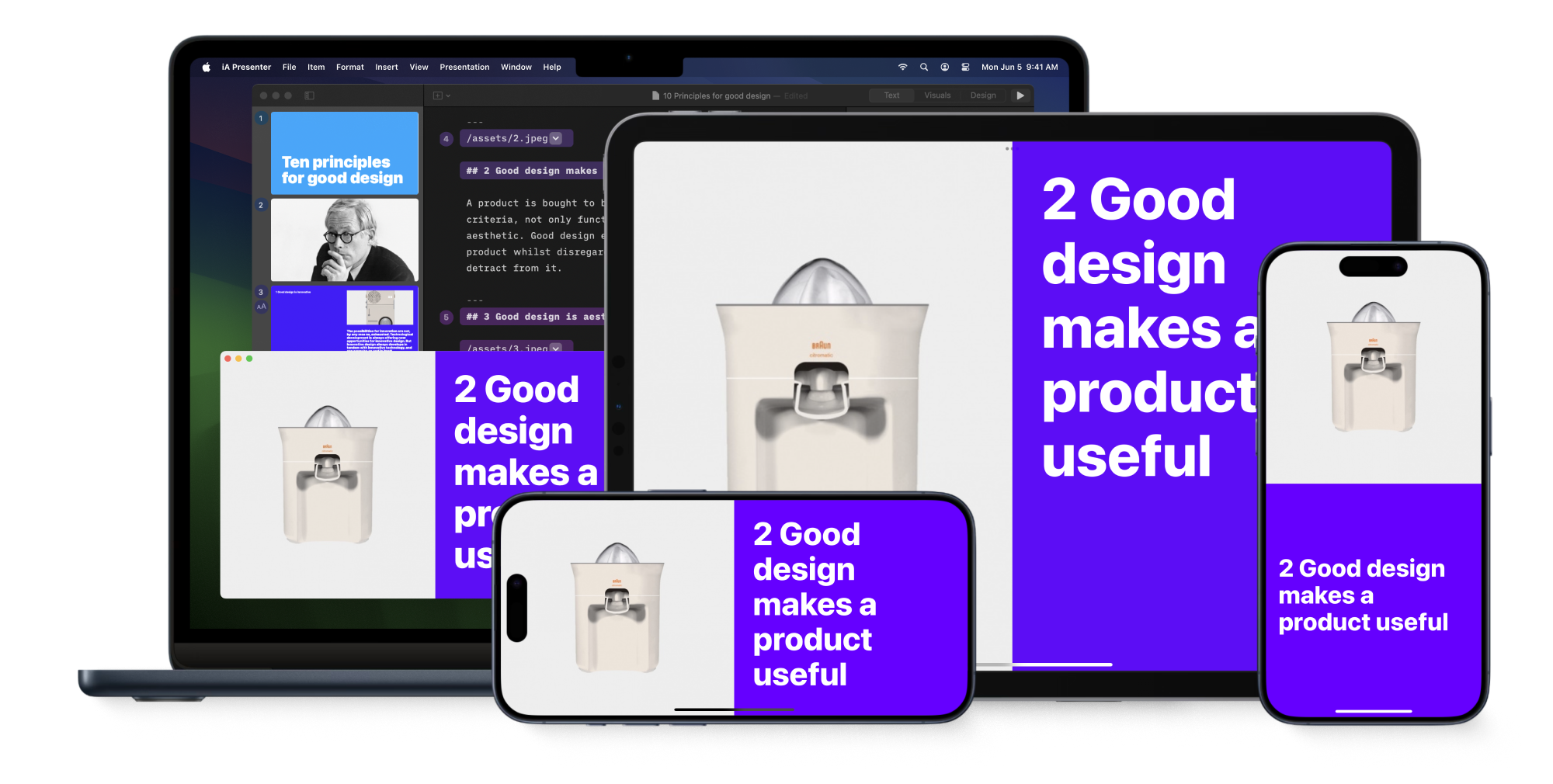
Presenter
iA Markdown Dictionary
Right click syntax in your editor, any editor
Read Article
Writer
The iA Writer Template for Screenwriters
Writing your screenplay, 100% focused
Read Article
iA Notebook
iA Writer in Paper
iA Writer in the form of a physical notebook
Read Article
Writer
Whoa, Feedback!
iA Writer 7
Read Article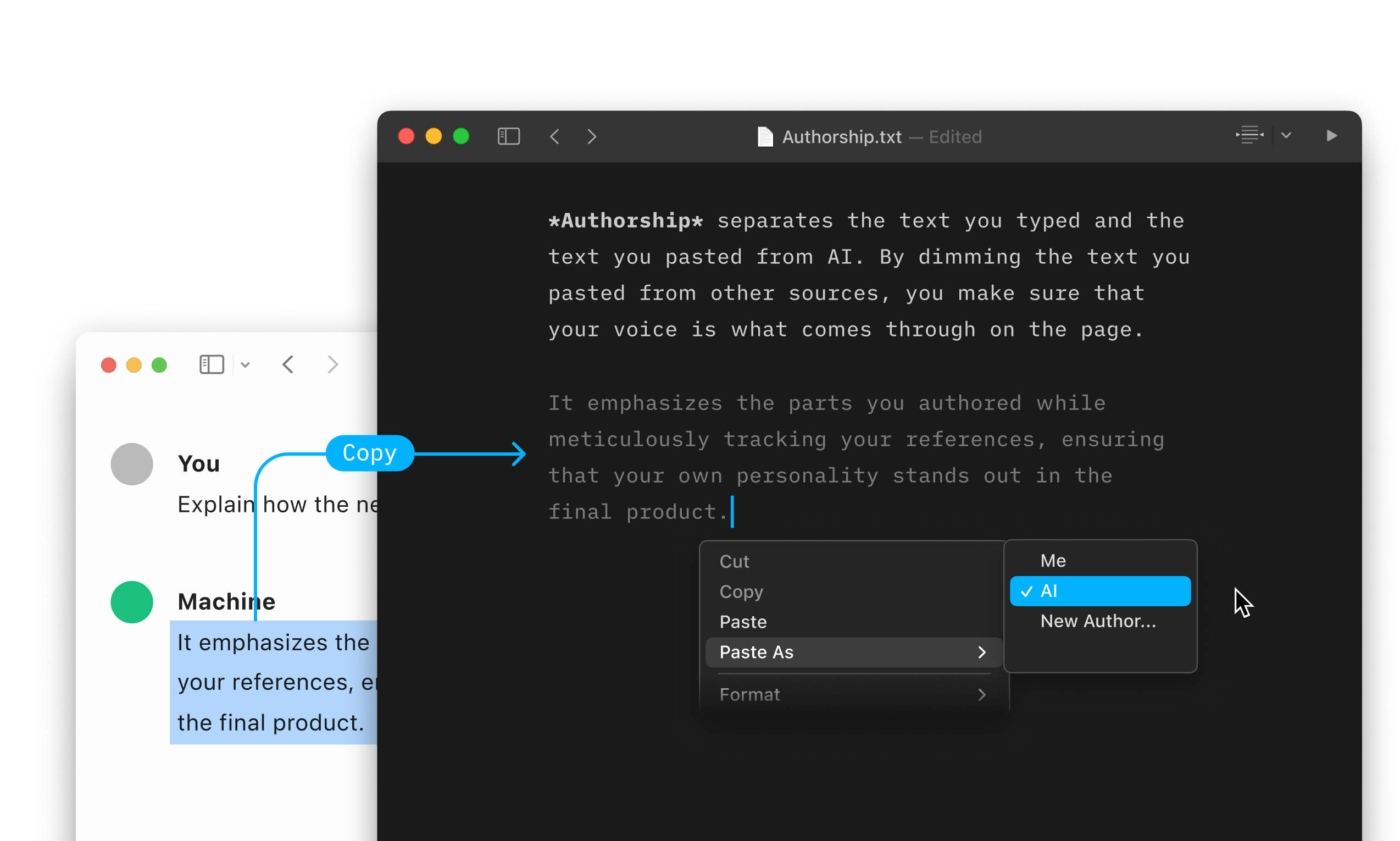
About Us
iA Winterfest 2023
Enter our raffle to get one of the first iA Notebooks
Read Article
Writer
Authorship in Times of Artificial Intelligence
iA Writer now dims the text you paste from AI tools
Read Article
Writer
Writing with AI
We put ChaptGPT to the test
Read Article
Writer
No AI Feature
As everyone does the same thing, we try to get one step ahead
Read Article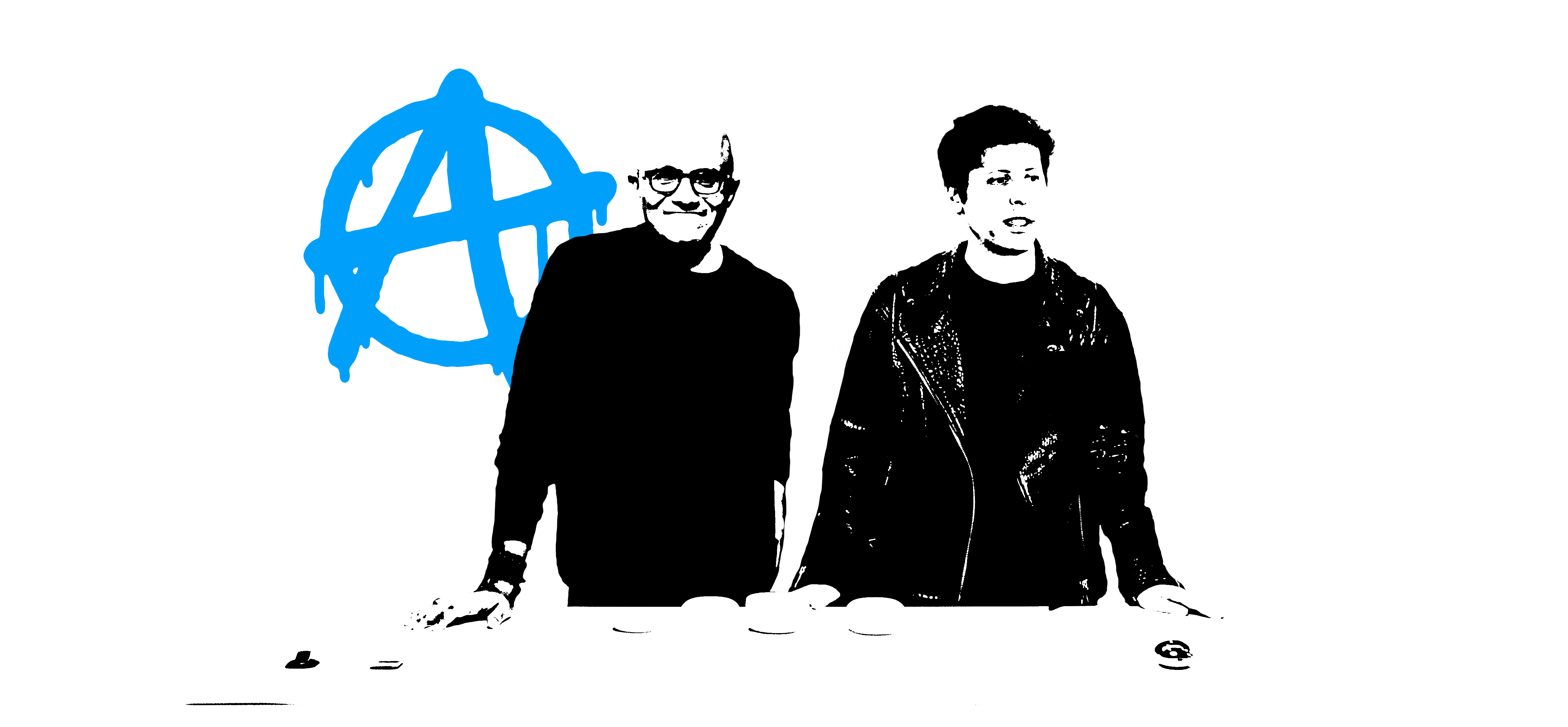
About Us
Copycats & Other Monsters
Things can be replaced—lost time, however, is forever lost
Read Article
Writer
The Daily Writing Habit Emergency Kit
Five hacks for creative writing
Read Article
Insights
The Limits of Design Automation
On Artificial Intelligence and Information Architecture
Read Article
Writer
Writing by Numbers
A fun game to plan, start and guide your writing
Read Article
Insights
Unraveling the Digital Markets Act
We read and analyzed it from beginning to end
Read Article
Presenter
Launch Day
Fixitfixitfixit
Read Article
Presenter
Presentation Tips
The five key points to holding a moving presentation
Read Article
Presenter
Presenter Pricing (II)
How many Big Macs for an app?
Read Article
Insights
AI and the End of Writing
What should we do with all the free time?
Read Article
Writer
Ho Ho Ho
A letter template for iA Writer
Read Article
Insights
Design Takes Time
Like all good things
Read Article
Presenter
Presenter Pricing (I)
We could just ask you how much you would pay, but...
Read Article
Insights
Secret Sauce and Future Music
On the limits of sharing in business communication
Read Article
Presenter
The Story-Based Presentation App
iA Presenter cuts creation time to a minimum
Read Article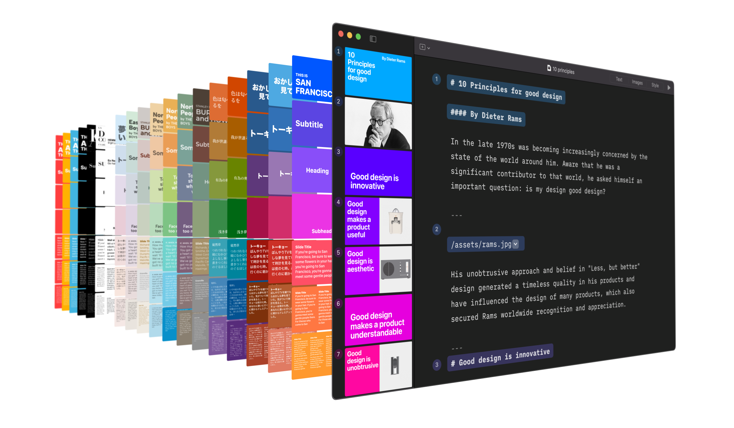
Insights
Designing with Emoji
Used everywhere, they just decorate boredom
Read Article
Presenter
How Can We Make Presentations Better?
You just need a good story and an app that lets you tell it
Read Article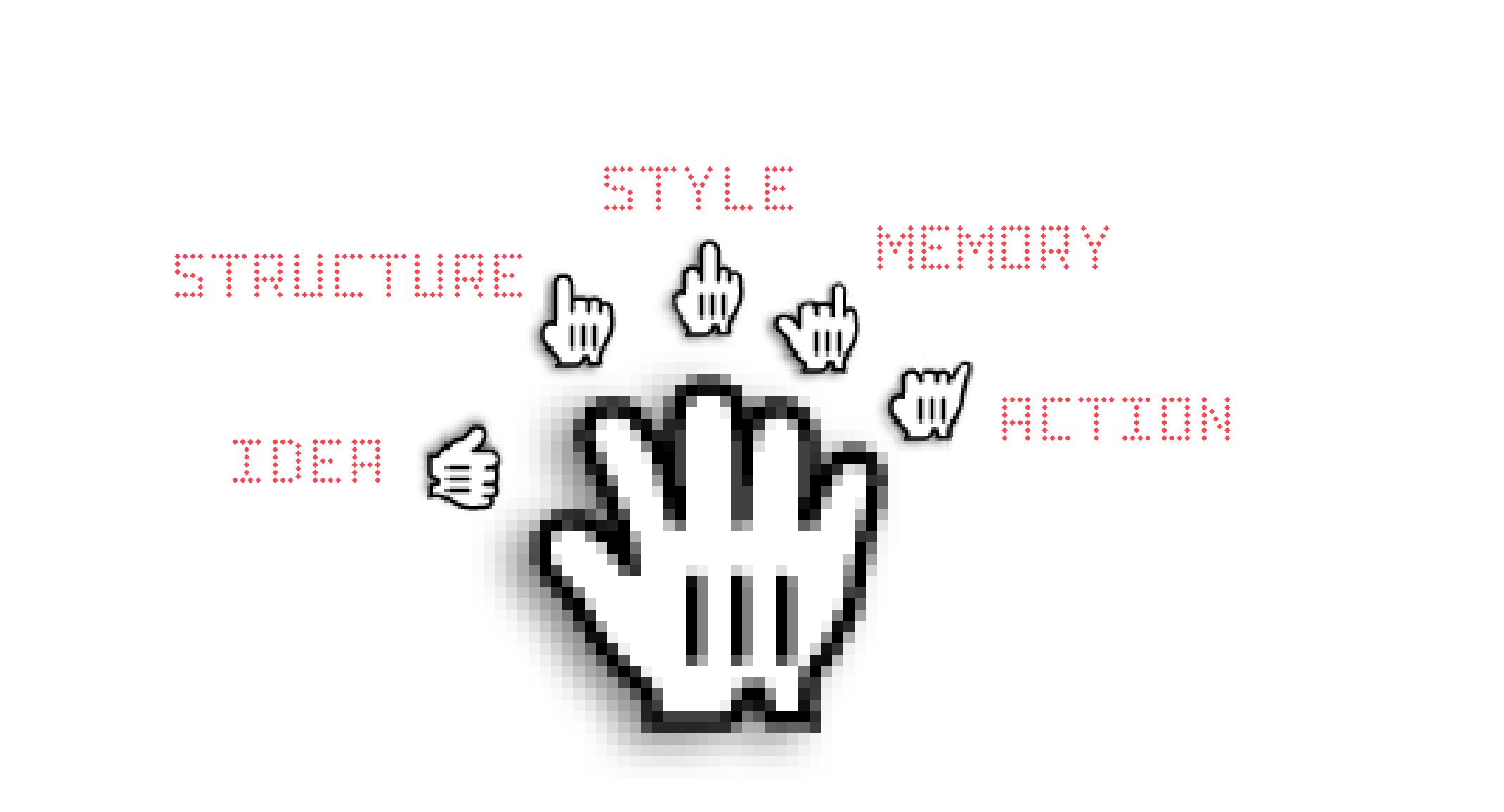
Presenter
Being Boring
What's Wrong With PowerPoint?
Read Article
Writer
Now with Lasers
iA Writer 6 opens the doors to wikilinks
Read Article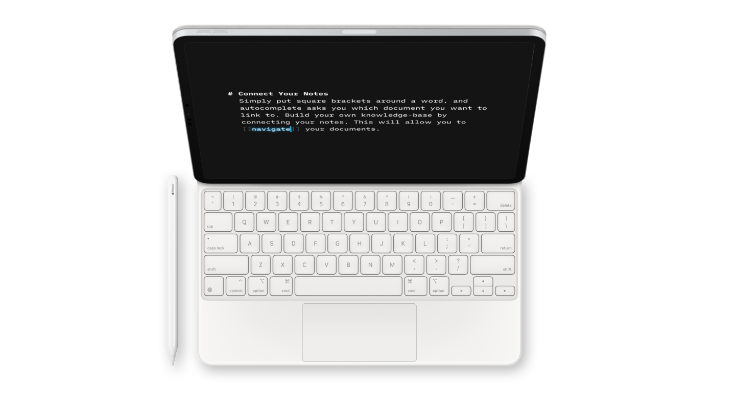
Writer
End Procrastination
How do you beat it and get things done?
Read Article
Insights
On Apps and Coffee
How many apps does a cup cost... that is here the question
Read Article
Writer
Focused, Structured, and Future-Proof
Markdown in Academic Writing
Read Article
Writer
Everyone is Distracted Once in a While
How iA Writer helps with ADHD
Read Article
Writer
Style Check on Android
Your most requested feature
Read Article
Writer
Focus Mode
iA Writer is an ADHD-friendly Writing App
Read Article
Writer
Windows Style Check
iA Writer for Windows 1.4 is here
Read Article
Insights
Apple cuts commission to 15%
...f you make under one million US dollars per year
Read Article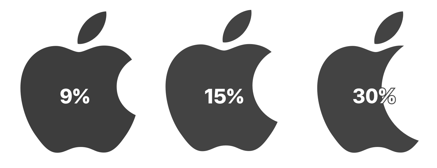
Insights
Facebook avoids the Apple Tax...
...while small devs get milked
Read Article
Insights
How to Think Different
True respect is mutual
Read ArticleInsights
Subscription or no Subscription?
That is not the question
Read ArticleInsights
On Monopolies, Apple, and Epic
The game is rigged
Read ArticleWriter
The Power of Style Check
A personal editor-in-chief... on your device
Read Article
Writer
Syntax Control, Individual Scroll, Snippets
iA Writer for Windows 1.3 is here
Read Article
About Us
A New Site
We redesigned everything.
Read Article
Writer
PDF Preview, Web Publishing, And Killer Editing
iA Writer 5.5 for Mac and iOS
Read Article
Writer
MacStories App Of The Year and Custom Backup
2019 in review
Read Article
Writer
PDF Preview, New Typography, Preferences
1.2 of iA Writer for Windows
Read Article
Writer
Multi-window, Dark Mode, Content Block Flexibility
iA Writer 5.3
Read Article
Insights
Useful macOS Tricks
Seven designer hacks
Read Article
About Us
The Nice Place
What can you do in 2019 to get the word out?
Read ArticleWriter
Music in Writing
Do you wonder sometimes about sound and letters?
Read Article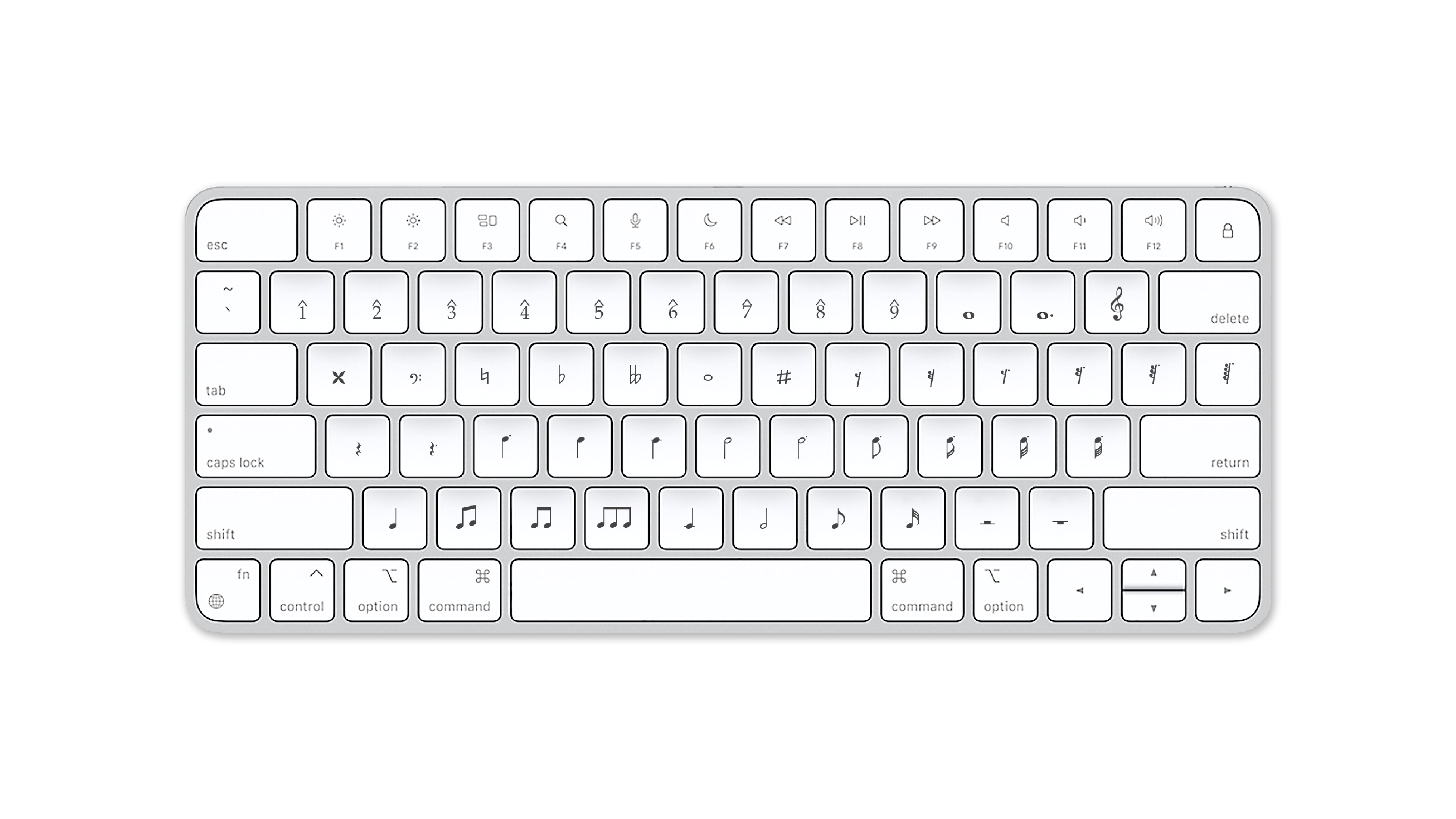
Writer
New File Library for Windows
iA Writer for Windows 1.1
Read Article
Insights
Ethics for Designers
There is a connection between good and beautiful.
Read Article
Writer
Word Export and GitHub on iOS
iA Writer 5.2
Read Article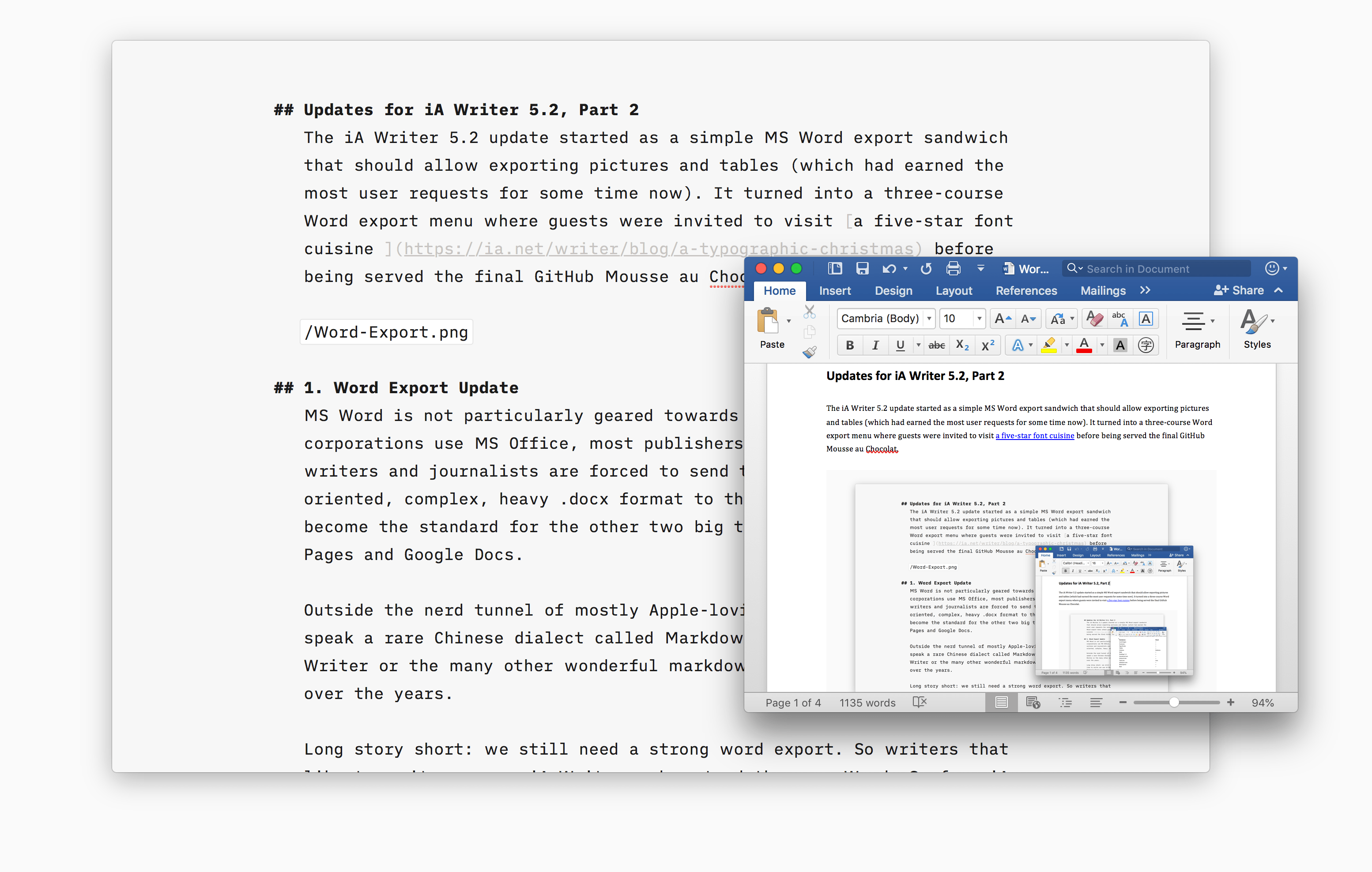
Writer
A Typographic Christmas
iA Writer now offers three custom designed writing fonts
Read Article
Writer
Write to Organize
With tags and x-callback-urls
Read Article
Insights
Ethics and Aesthetics
The most precious things cannot be measured, counted or weighed
Read Article
Insights
Designed in China, Assembled in California
We don’t resist because we don’t care
Read Article
Writer
Hokusai Desktop Backgrounds
17 wallpapers
Read Article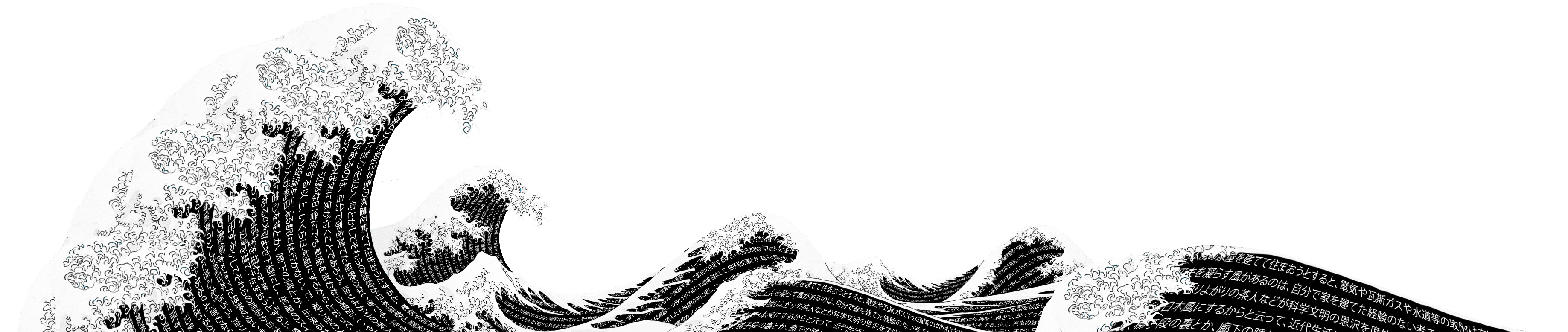
Writer
A New Document Library
iA Writer for Mac 5.0
Read Article
Writer
Politics and the English Language
An essay by George Orwell
Read Article
Writer
The Elements of Style
A timeless guide to clear and effective writing
Read Article
Writer
Good Writing is Good Thinking
by Karl Philipp Moritz
Read Article
Writer
Using Parts of Speech to Improve Your Writing
iA Writer’s Syntax Highlight
Read Article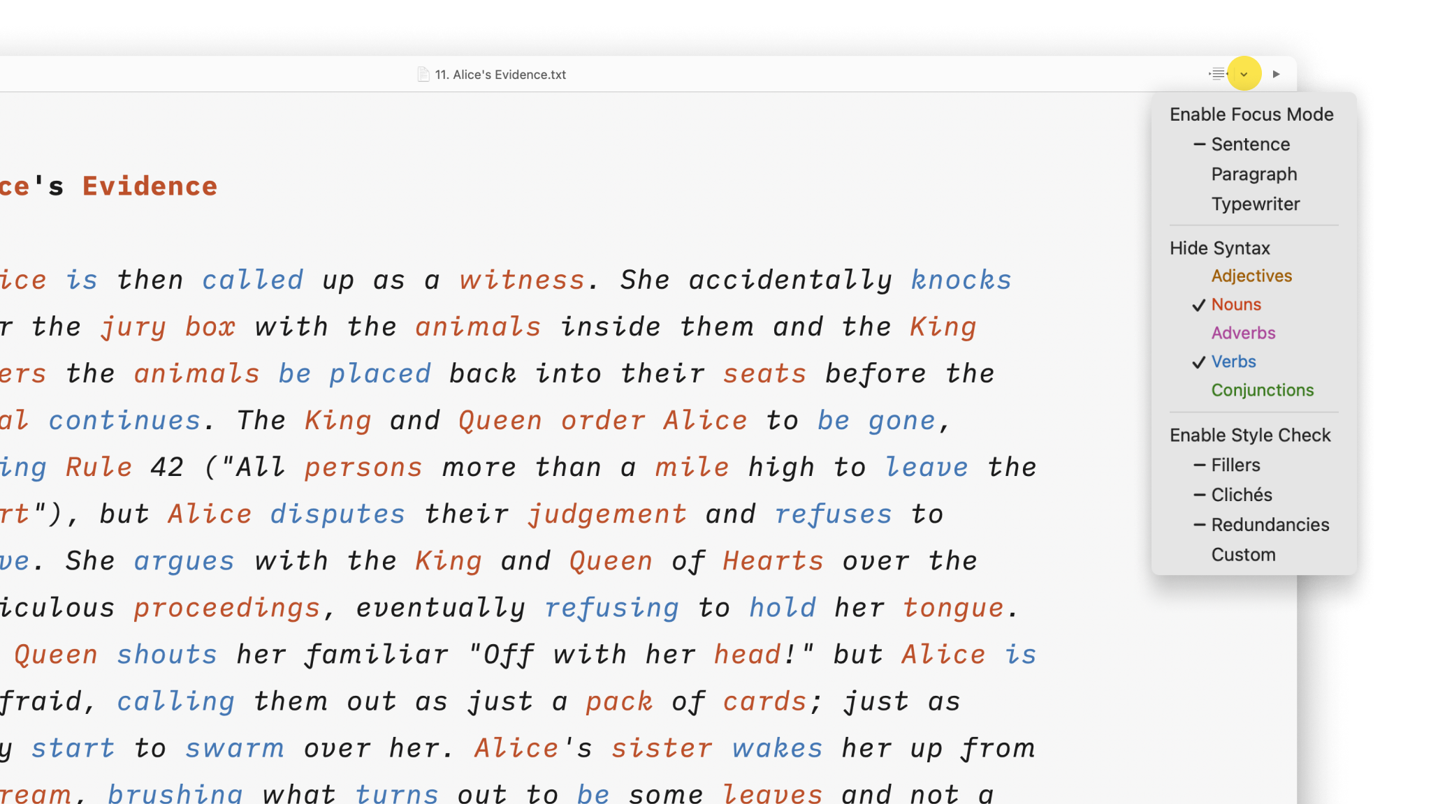
Writer
Writer vs. Word
A death match
Read Article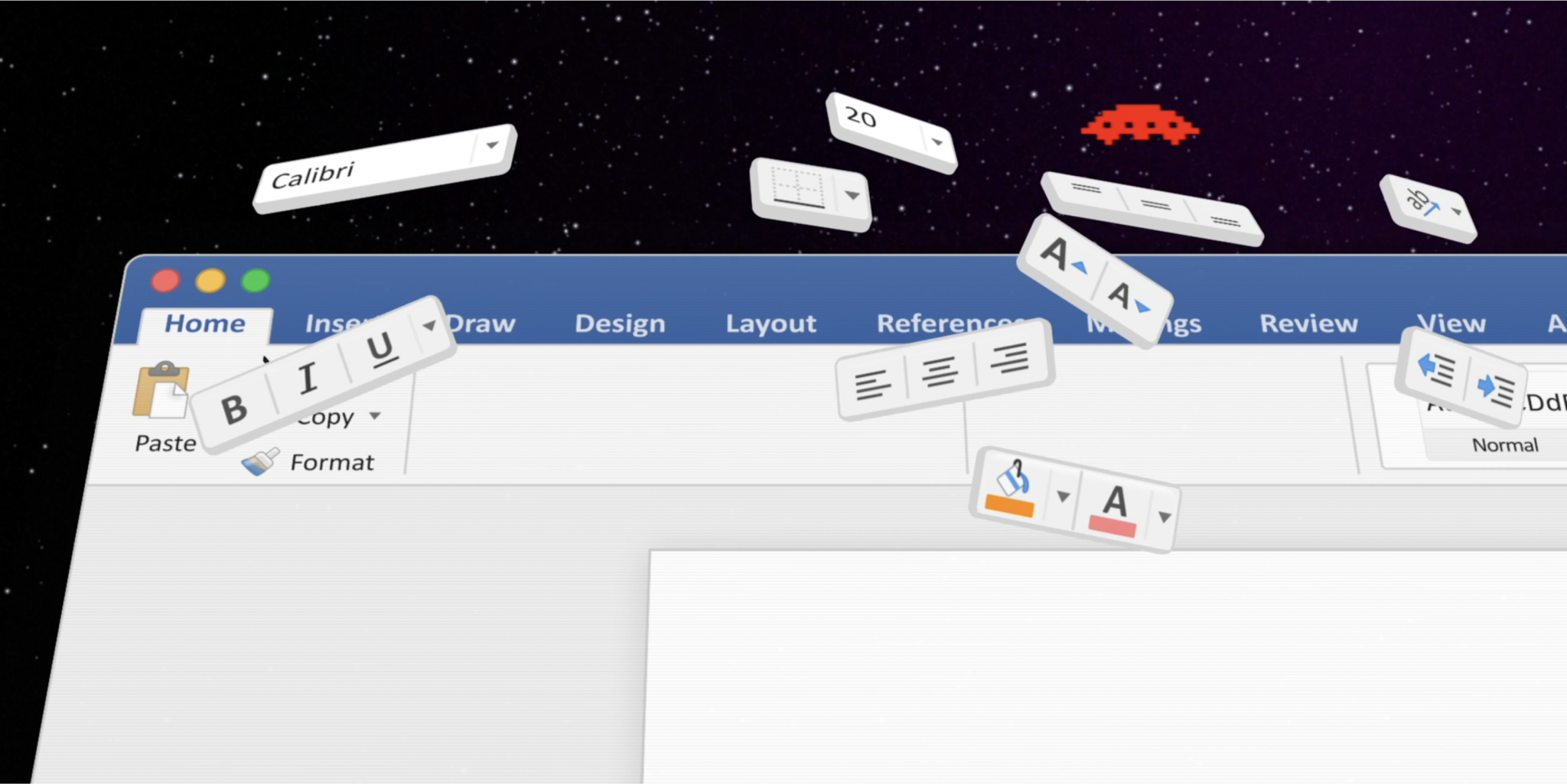
Writer
Mac with Tabs
iA Writer 4.2
Read Article
Design
Take the Power Back
Let's move from passive to active
Read Article
Writer
iOS: Backups for Dropbox, Google Drive and Co.
iA Writer 5.0.5
Read Article
Insights
Computer Poetry
Every time we read a computer-generated text, part of our life gets sucked into a little black electric hole
Read Article
Insights
Make Bots Identifiable
Propaganda has become too cheap and easy to resist
Read Article
Insights
How does sending traffic to the App Store...
...affect your App Store ranking?
Read Article
Insights
Is Time Money?
What happens to people’s time when Bitcoin falls?
Read Article
Insights
Design is Political
And Hillary Clinton uses iA Writer
Read Article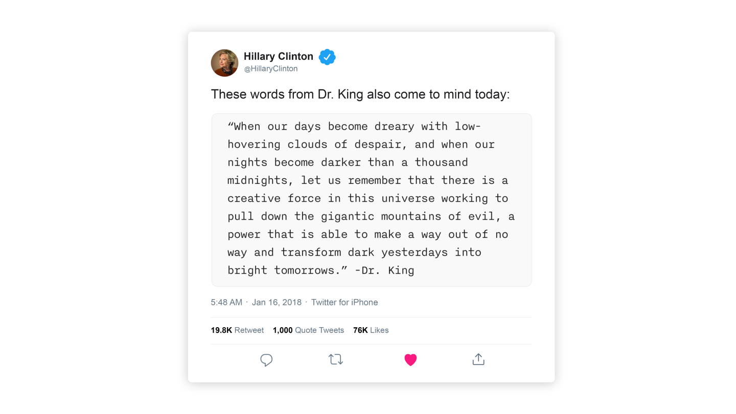
Insights
Web Trend Map 2018
The key ingredient is missing
Read Article
Design
News from Facebook
A brief history of lost time
Read Article
Design
Why we like distractions
And what we can do about it
Read Article
Writer
Kickstarted
iA Writer for Windows
Read ArticleDesign
The Ideal Paragraph
On thoughts made of thoughts
Read Article
Insights
Who serves whom?
When AI things go wrong and no one is responsible
Read Article
Design
“Art at scale”
Excerpts from Alan Kays emails
Read Article
Writer
Boom! Boom! Boom!
A big year for iA Writer
Read Article
Insights
Duospace Fonts
In search of the perfect writing typeface
Read Article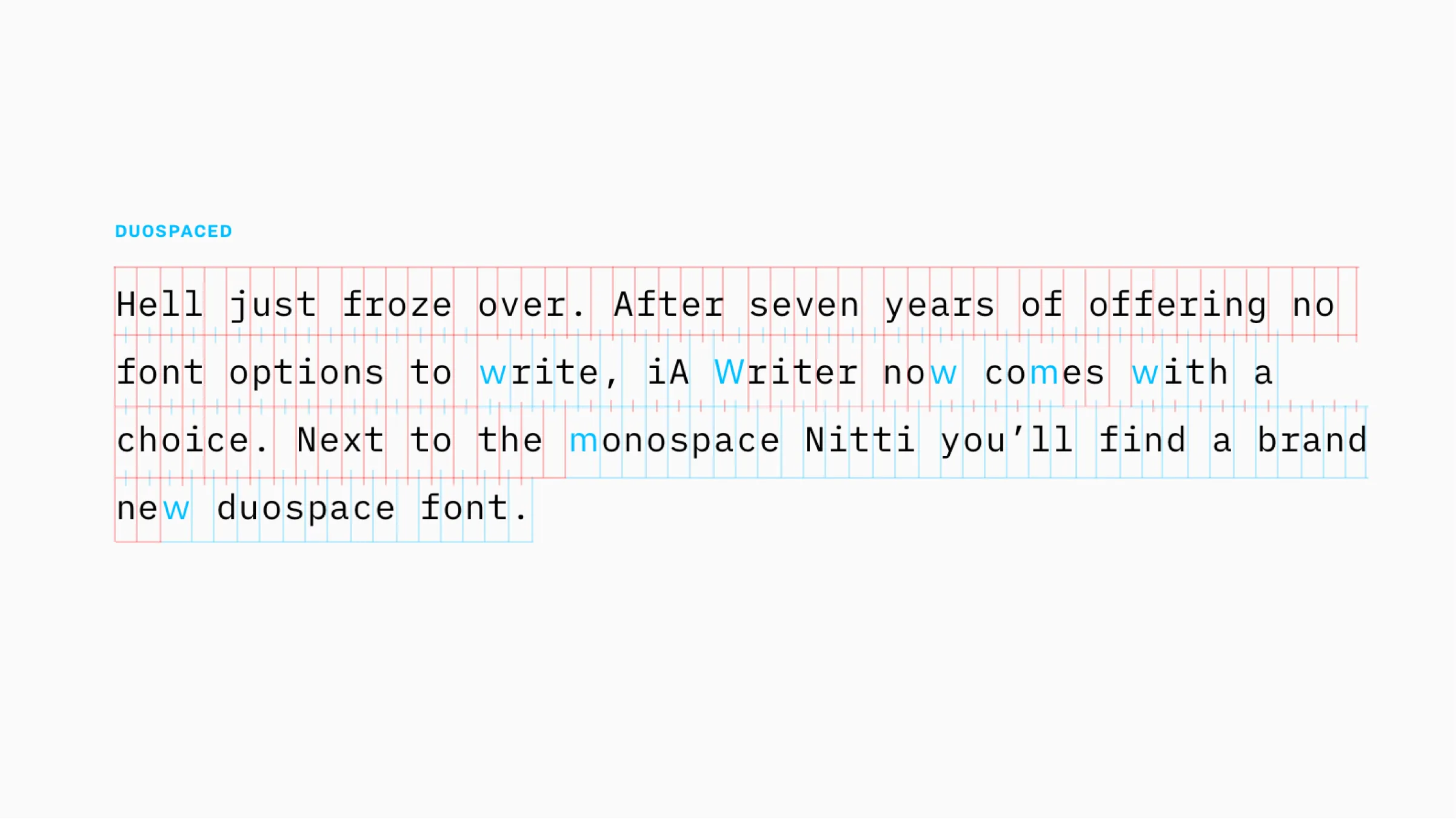
Writer
95% Keyboard
iA Writer 5
Read Article
Writer
Files in iOS11
A new Files app integration in iA Writer 5
Read Article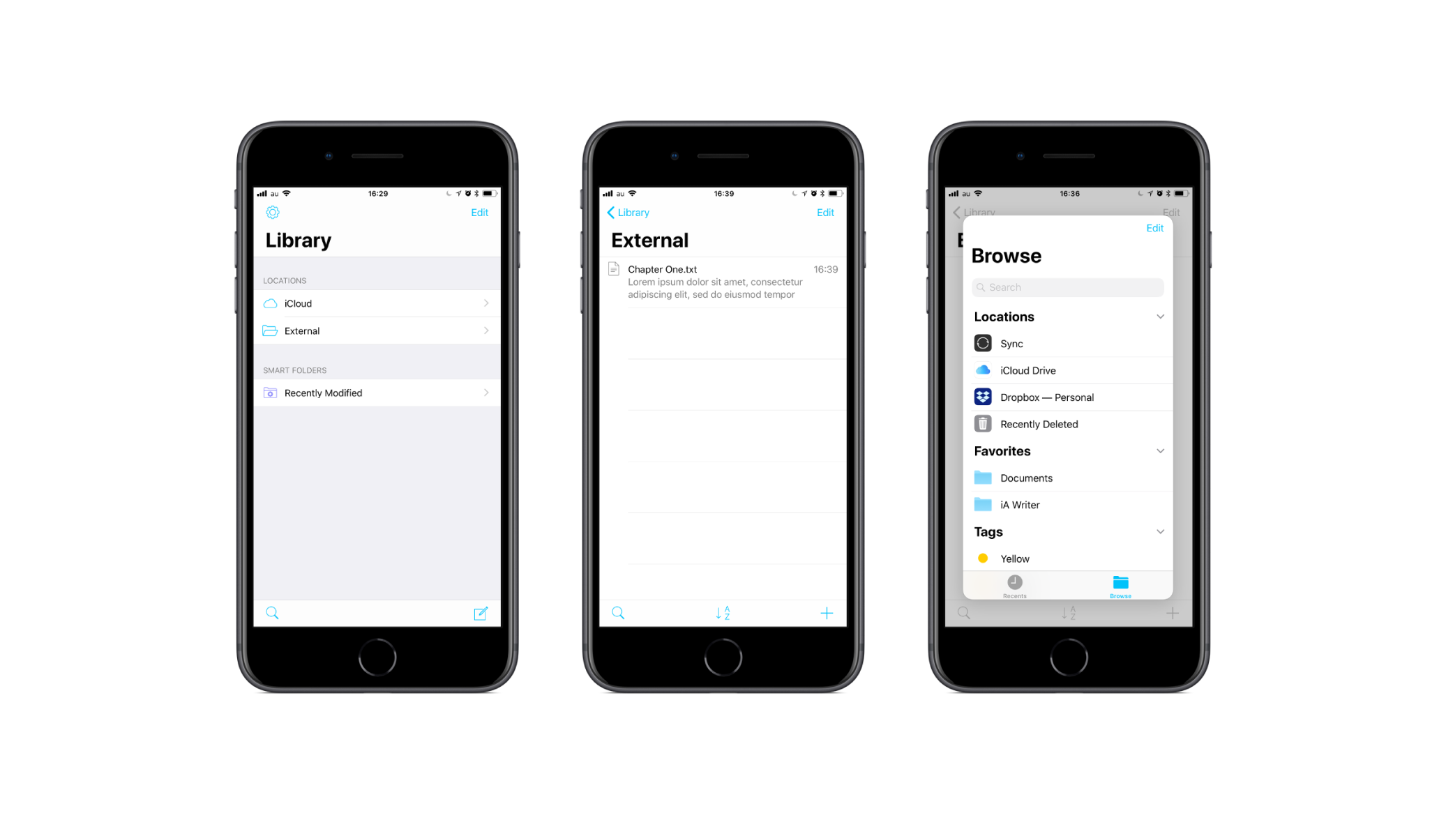
Writer
42,000 Different Phones and Tablets
iA Writer for Android Oreo
Read Article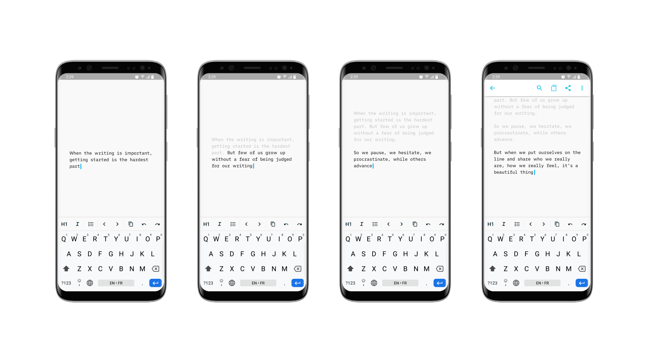
Writer
iA Writer 5 for iPad
A sneak peek
Read Article
Writer
iA Writer 5 for iPhone
A sneak peek
Read Article
Writing
Math With Words
On Using Numbers to Write
Read Article
Writer
Forging the Hammer
iA Writer 5
Read Article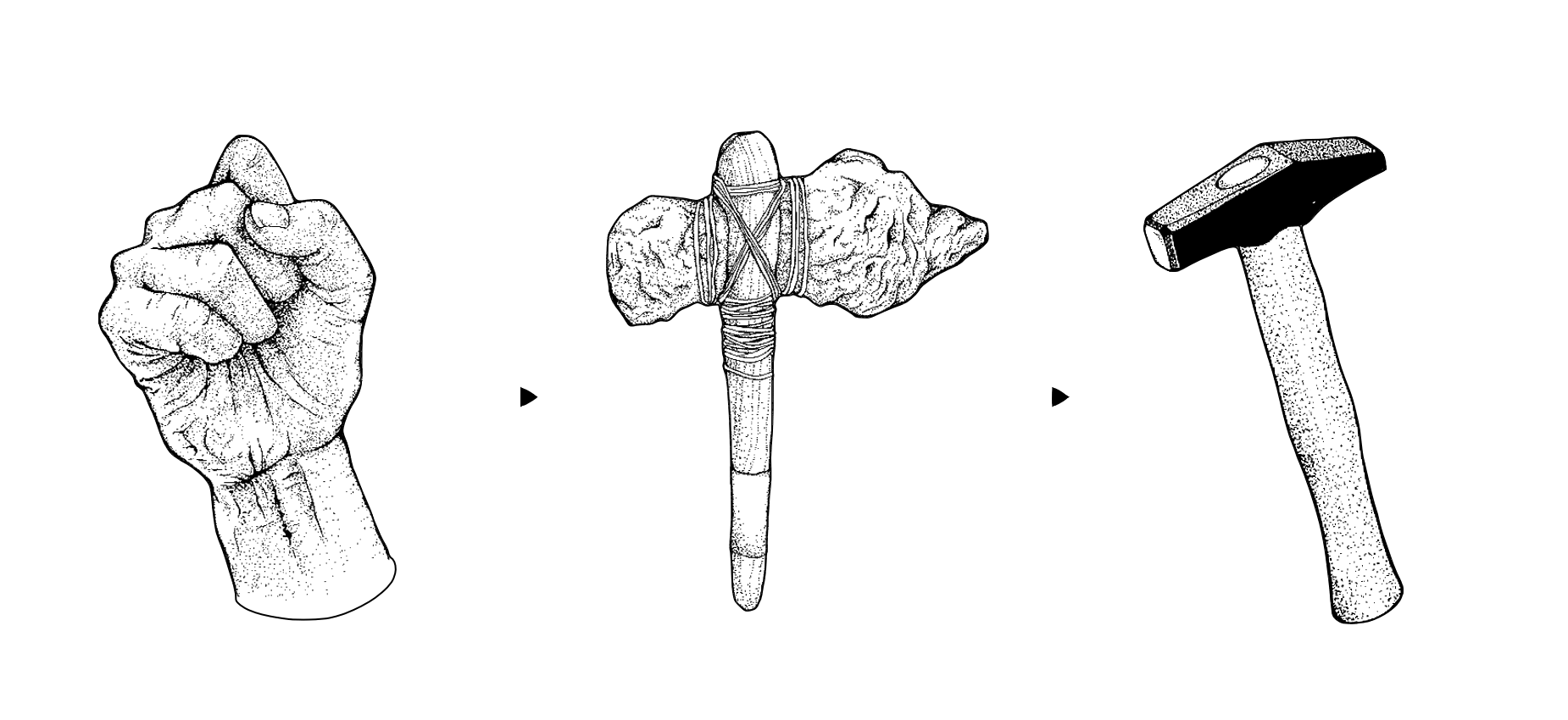
Writer
From Raw to Cooked to Sushi
iA Writer 5: From raw to complex to simple
Read Article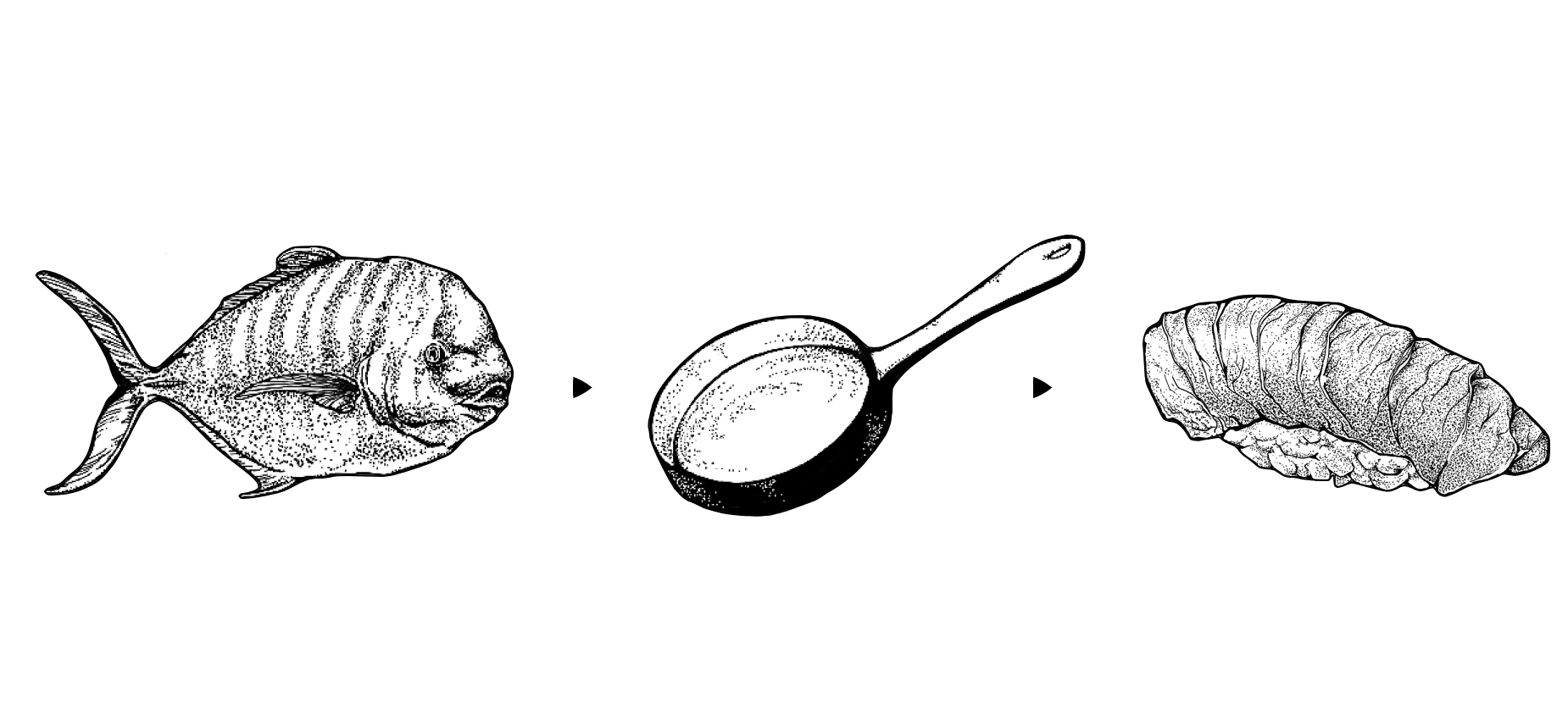
Writer
Content Blocks!
iA Writer 4
Read Article
Insights
UX Lessons In Game Design
What designers can learn from games
Read Article
Design
Multichannel Text Processing
The many benefits of using Markdown
Read Article
Design
On Icons
We ♥ icons, madly
Read Article
Writer Tutorials
iA Writer Video Tutorials
Tips and tricks
Read Article
Writer
She's a Rainbow
iA Writer's Syntax Control comes in colors
Read Article
Writer
The Third Generation of Our Writing Machine
iA Writer 3
Read Article
Writer
Starting Out On Android
An adventure
Read Article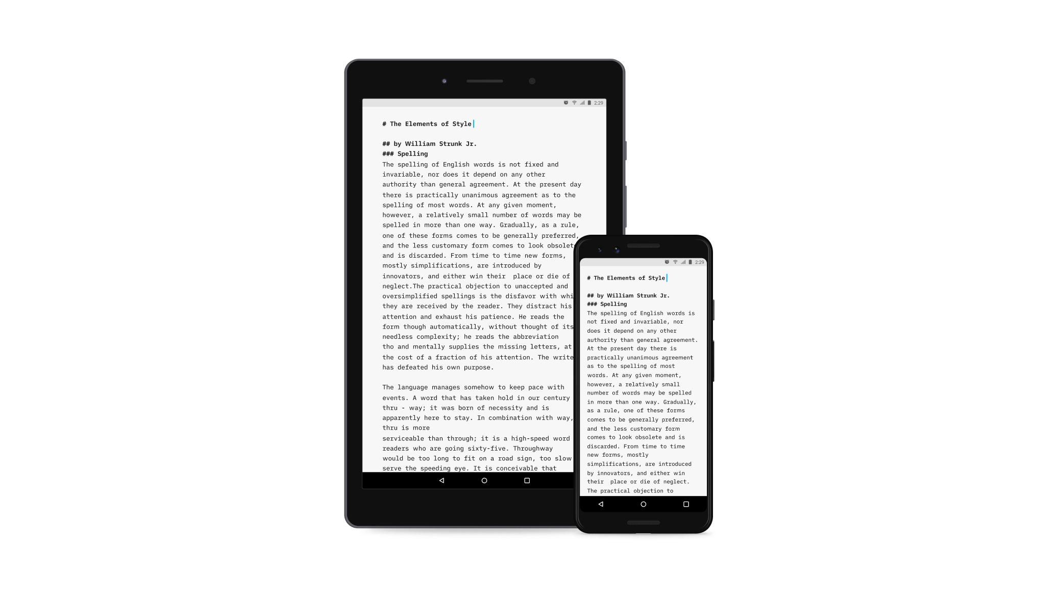
Design
Information Entropy
The Great Internet Garbage Patch
Read Article
Design
Putting Thought Into Things
On quality
Read Article
Writer
Introducing iA Writer Pro
An app that boldly goes where no one has gone before
Read Article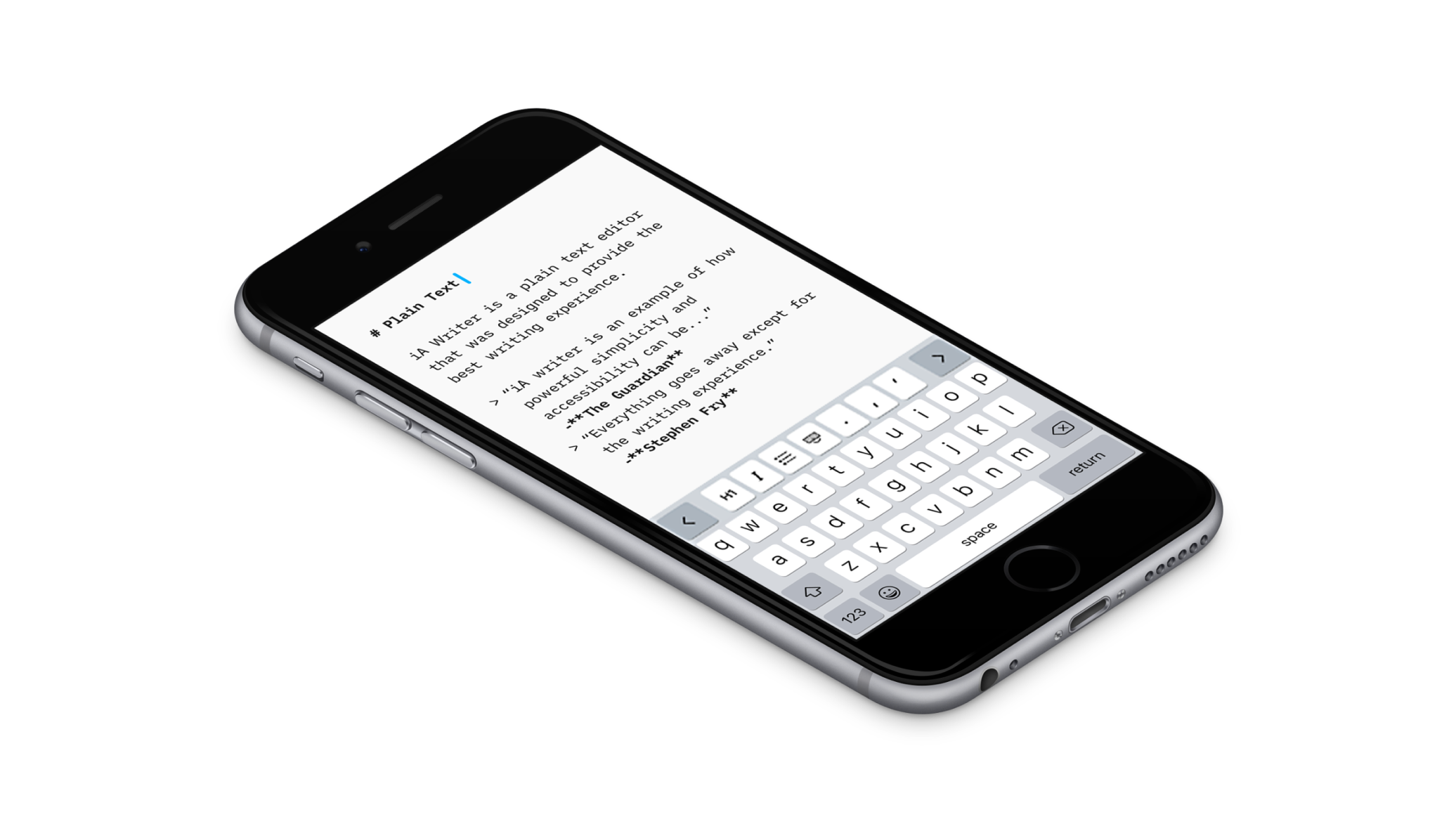
Insights
Logo, Bullshit & Co., Inc.
What makes designers think they are so special?
Read ArticleDesign
Learning to See
A love letter
Read Article
Information Architects
“Law and Society, Technology and Power”
Oliver Reichenstein at Keio University
Read ArticleWriter
Bringing Responsiveness to Apps
Why did it take so long?
Read Article
Writer
“400,000 downloads with a super simple app”
Interview with Business Insider
Read ArticleDesign
“Good design is invisible”
Interview with The Verge
Read ArticleWriter
Introducing iCloud
iA Writer for Mac, iPhone and iPad updates
Read Article
Design
Twitterror
How do you deal with erroneous tweets?
Read Article
Design
Responsive Typography: The Basics
How to deal with a variety of screen sizes and resolutions
Read Article
Design
Follow-up to “Sweep the Sleaze”
We are onto something
Read Article
Design
Sweep the Sleaze
Do social media buttons actually work?
Read Article
Design
New Site with Responsive Typography
We need not only responsive layouts, we also need responsive typefaces.
Read Article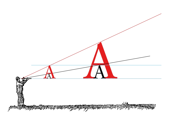
Design
Improving the Digital Reading Experience
Digital vs analog reading
Read Article
Design
“Why Simplicity Creates Great User Experiences”
Interview with DRT.fm
Read Article
Design
iA BC
The history, shape and sound pattern of each letter
Read ArticleWriter
On Prices and Features
Somehow almost everything is always too expensive
Read Article
Writer
iA Writer for Mac
A good tool turns working into pleasure
Read Article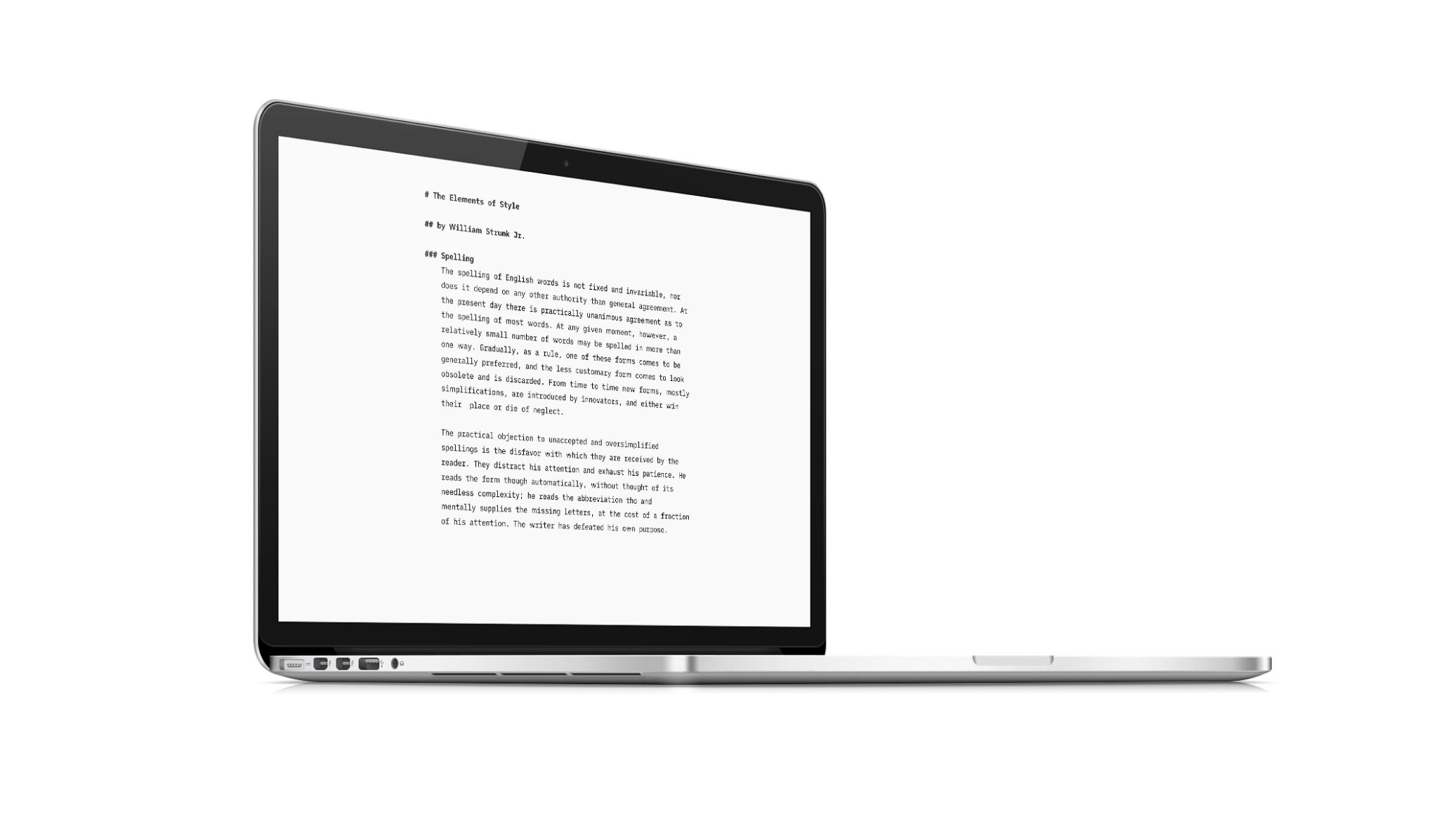
Design
Business Class
Freemium for News?
Read Article
Design
A Web Designer on Fukushima
Technology and Hubris
Read Article
Digital Strategy and Design
iPad App Sales Numbers
WIRED vs. Writer
Read ArticleDesign
Form and Information
A lecture
Read ArticleWriter
Stephen Fry on iA Writer
“Astonishingly simple."
Read Article
Design
iPad: Scroll or Card?
“Card Sharks” vs “Holy Scrollers”
Read Article
Writer
A. Burroughs on iA Writer
"It is tiny but it is huge"
Read Article
Branding
Gap: Controlled Brand Demolition? No.
A marketing stunt, or mere tomfoolery?
Read ArticleInformation Architects
Can Information be Architected?
"iA on IA" from EuroIA 2010.
Read Article
Writer
Writer for iPad
“Writer has out-innovated Apple.” —Fast Company
Read Article
Design
Can Experience be Designed?
Rhetoric and reality
Read Article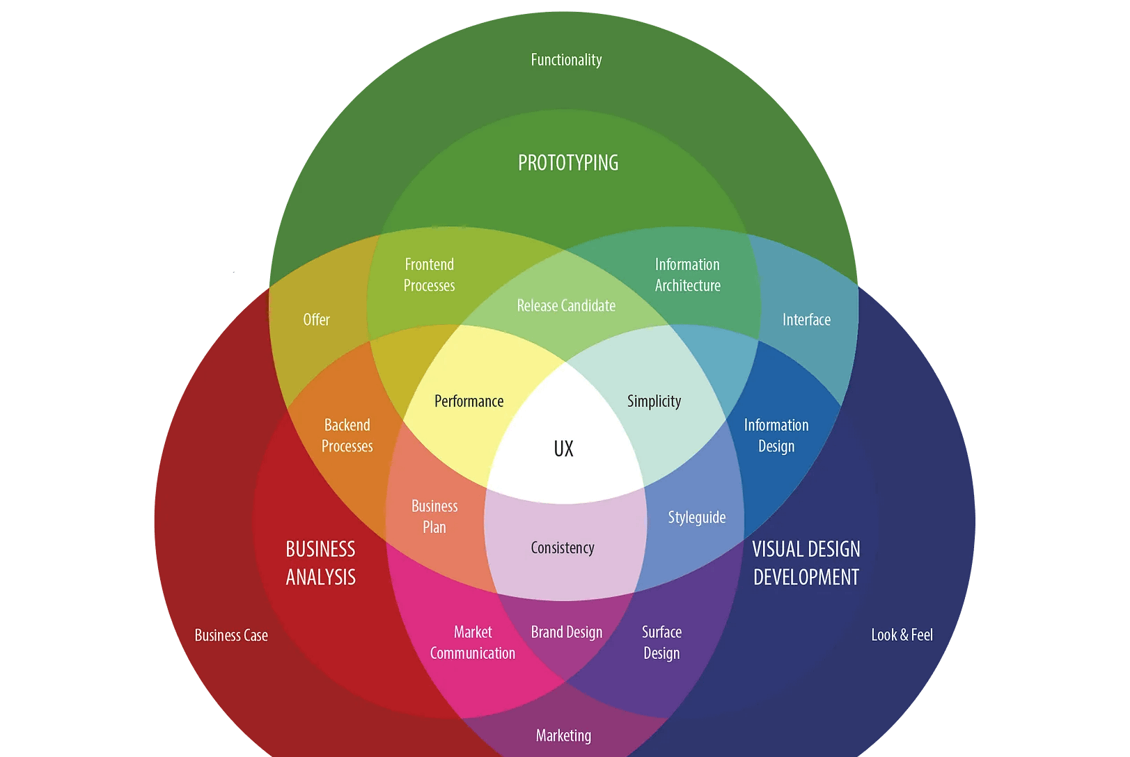
Design
“Web design is engineering”
Interview with Jonny Holland
Read Article
Design
Just like a Paper Tiger…
WIRED on iPad
Read Article
Design
Cosmic 140
Art for Geeks
Read Article
Design
Cosmic 140
Per Anhalter durch die Twitter Galaxis
Read Article
Design
Designing for iPad
No iPad yet? Print it!
Read Article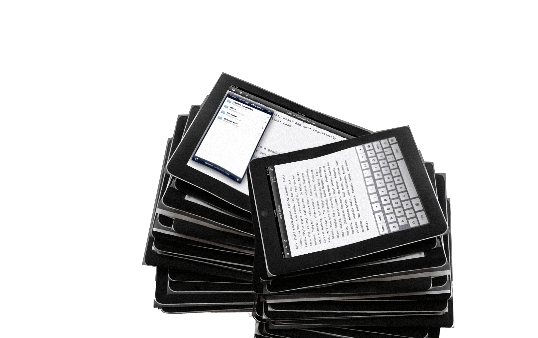
Design
iA’s 2006 Facebook Designs, Redesigned
The contract was never signed, so we kept our designs in the drawer... Until now…
Read Article
Design
Our Next Trend Map
Meet the Cosmic 140
Read Article
Design
API for News?
Reuters, NYT & iA Inc.
Read Article
Design
What’s Next in Web Design?
An outlook for L’Espresso
Read Article
Technology and Web Trends
Web Trend Map Video Interview
An interview with GaijinPot.com
Read Article
Design
Can Experience be Designed?
On mind control
Read Article
Digital Strategy and Design
Dynamic Pricing for Digital Goods
We decided to try something new
Read Article
Design
Kenya Hara On Japanese Aesthetics
What makes Japanese design so special?
Read Article
Design
The Value of Information
The faster you entertain, the faster you must monetize
Read Article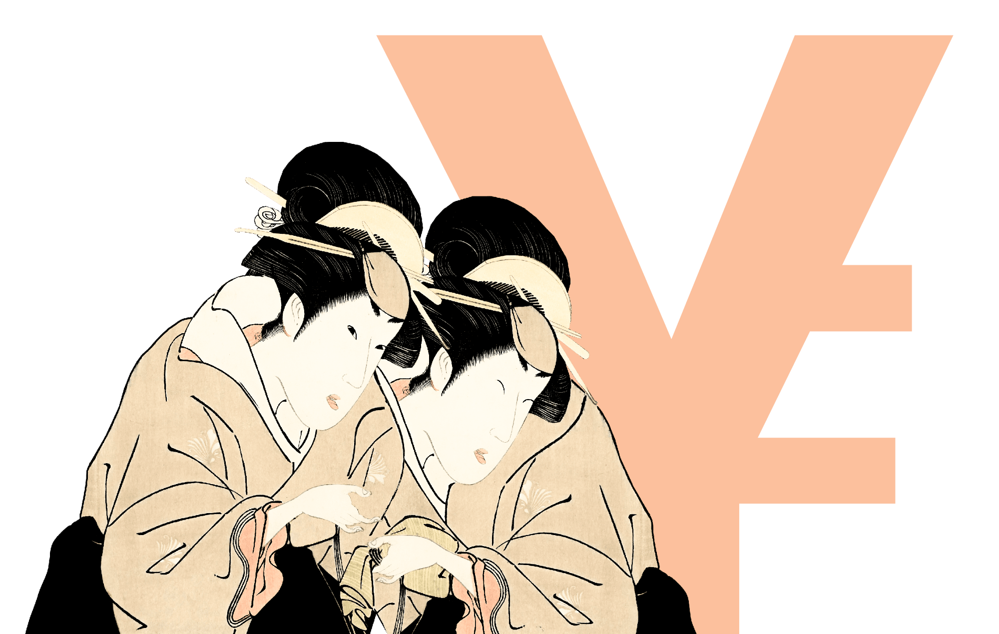
Design
Future of Journalism
A little bit of everything, please
Read ArticleDesign
The Spectrum of User Experience
You gotta keep em separated
Read Article
About Us
Web Trend Map 4
The coolest gift for geeks
Read Article
Design
Kill Blog Comments?
You can't discuss and moderate at the same time
Read Article
Design
Social Media Marketing?
Kaboom, Baby!
Read Article
Design
New and Dirty
Tweet Blogging
Read ArticleInformation Architects
Web Trend Map 4
A preview
Read Article
Design
The Age of Digital Baroque
After all, blogging is over now, isn't it?
Read Article
Design
Webapp Death Match
Google vs. Apple
Read Article
Design
Elvis and the Opposite
Something random
Read Article
Design
iA Opens Second Office in Switzerland
Exciting news
Read Article
Design
Data Gourmet
Bon appétit
Read Article
Design
Surfing the Avalanche
Emporte-moi dans ta chute!
Read Article
Technology and Web Trends
Web Trend Map V3
Das ultimative Tool für Internetfreaks, die Web Trend Map 2008, ist nun als A0-Poster erhältlich.
Read Article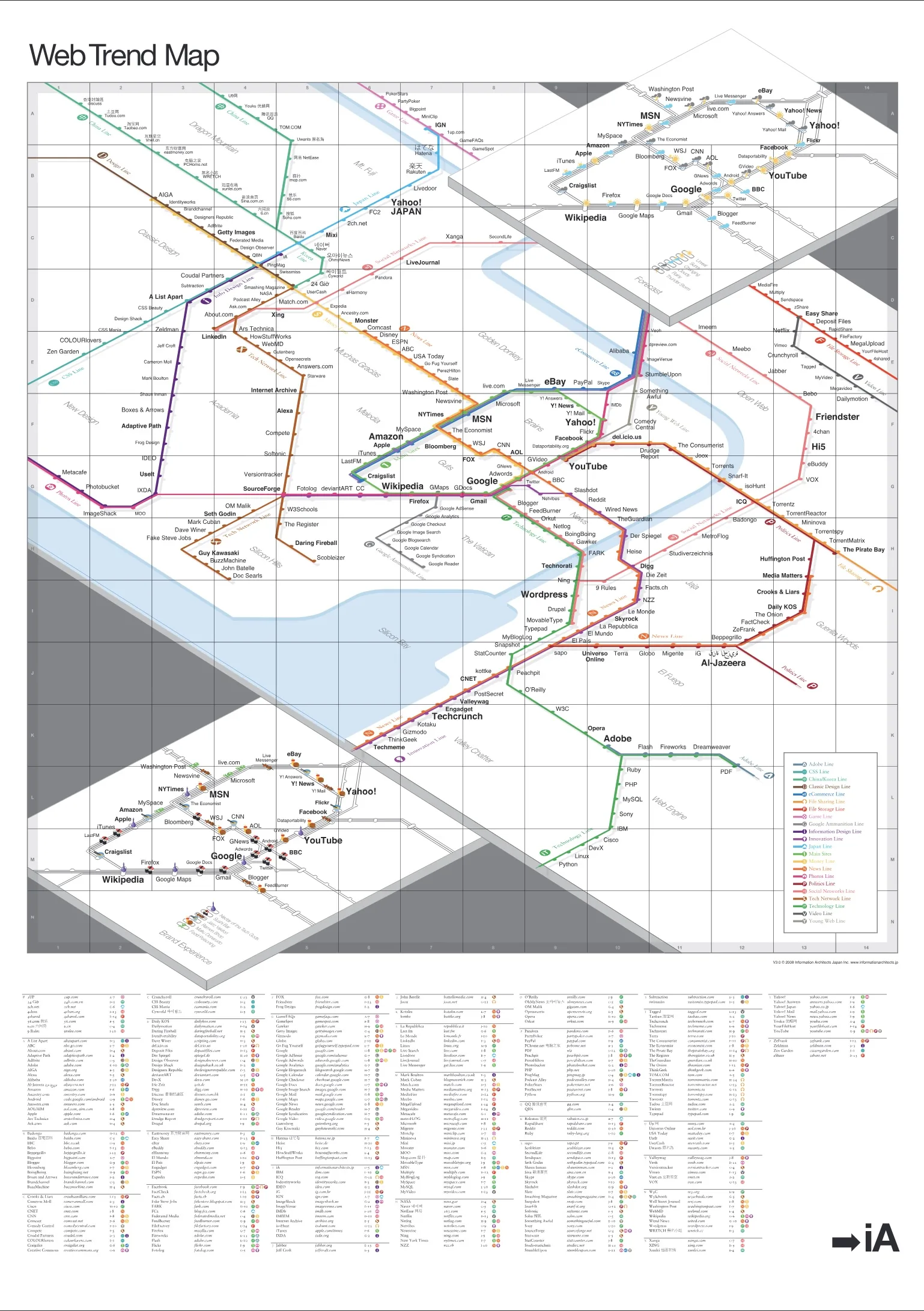
Branding
Use Your Real Name When You Comment
If you're our guest, act like a guest
Read Article
Technology and Web Trends
Web Trend Map 3
The coolest gift for geeks
Read Article
Technology and Web Trends
Web Trend Map 2008 Beta
We present you with the 2008 Web Trend Map, in all its beautiful beta glory. This time we’ve taken almost 300 of the most influential and successful websites and pinned them down to the greater Tokyo-area train map.
Read Article
Technology and Web Trends
Web Trend Map 2008
New layers!
Read Article
Digital Strategy and Design
Trend Map 2008
What’s New?
Read Article
Technology and Web Trends
Predictions for 2008
Don’t take this too seriously
Read Article
Design
Looking Back on 2007
And a summer of love it was
Read Article
Branding
This is madness!
No, this is Radiohead
Read Article
Branding
The Start-Button
Branding Crimes
Read Article
Branding
Stealing Interfaces
Creation = Copy + Improve²
Read Article
Branding
Missing Logo
Branding Crimes
Read ArticleDesign
The Essentials of Online Rebranding
Face Off
Read Article
Design
Web Trend Map 2007
Version 2.0
Read Article
Design
A Word on Design Value
Quality costs time and money
Read Article
Design
Newspaper Wiki
Schematics
Read Article
Design
Washington Post Redesign
...as a Wiki
Read Article
Design
Web Ad Spend Overtakes Newspapers
"This is our salvation." Is it?
Read Article
Design
The Future of News
How to Survive the New Media Shift
Read Article
Design
10 Newspaper Myths
Deconstructed
Read Article
Design
Understanding New Media
Engage in its dialogue
Read Article
Digital Strategy and Design
USA Today
Mission Accomplished
Read ArticleInsights
Pushers and Spammers Should Pay
Postage stamps for emails
Read Article
Insights
How to Compete With Free
It is a lot of work
Read Article
Insights
Tirekickers & Co. Ltd.
There are three kinds
Read Article
About Us
Web Trend Map 2007
Reactions
Read Article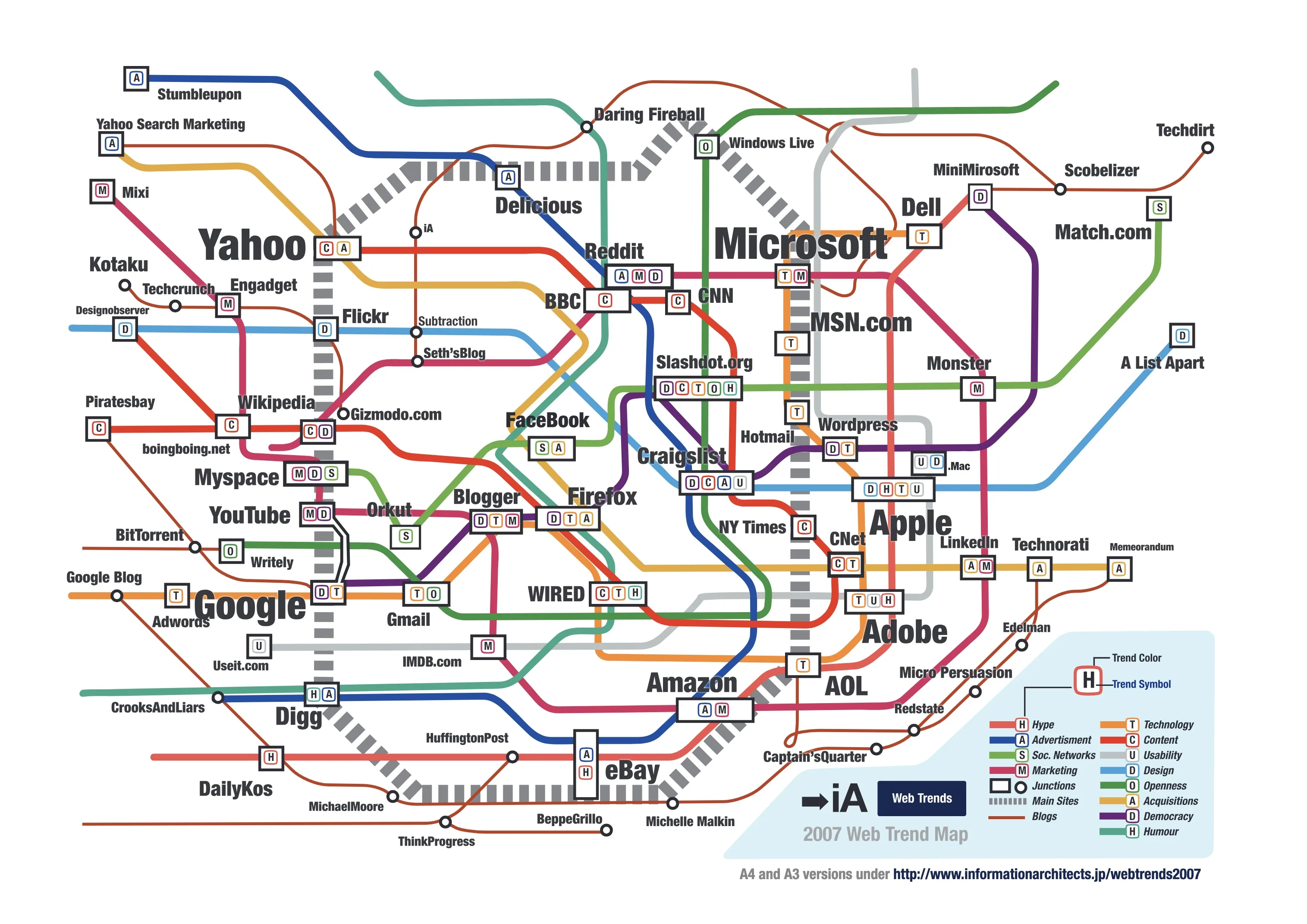
Insights
Introducing iPhone Nano & Shuffle
Switch into shuffle mode to call a random dude
Read Article
Design
Web Trend Map 2007
All the big players
Read Article
Design
Internet 2007 Predictions
Apple, Google, and Co.
Read Article
Design
Technorati
Big business with bogus data
Read ArticleDesign
Partner in Astroturfing
Boycott Technorati?
Read ArticleDesign
Web 3.0
You Say You're on a Revolution?
Read Article
Writing
Good Books Want to be Read...
...and re-read
Read Article
Design
Build a Plane and Fly to Sicily
Never underestimate the artist
Read Article
Design
The Electronic Gentleman
Inspiration is interactive, respect is reciprocal
Read Article
Design
The 100% Easy-2-Read Standard
Don't be lazy
Read Article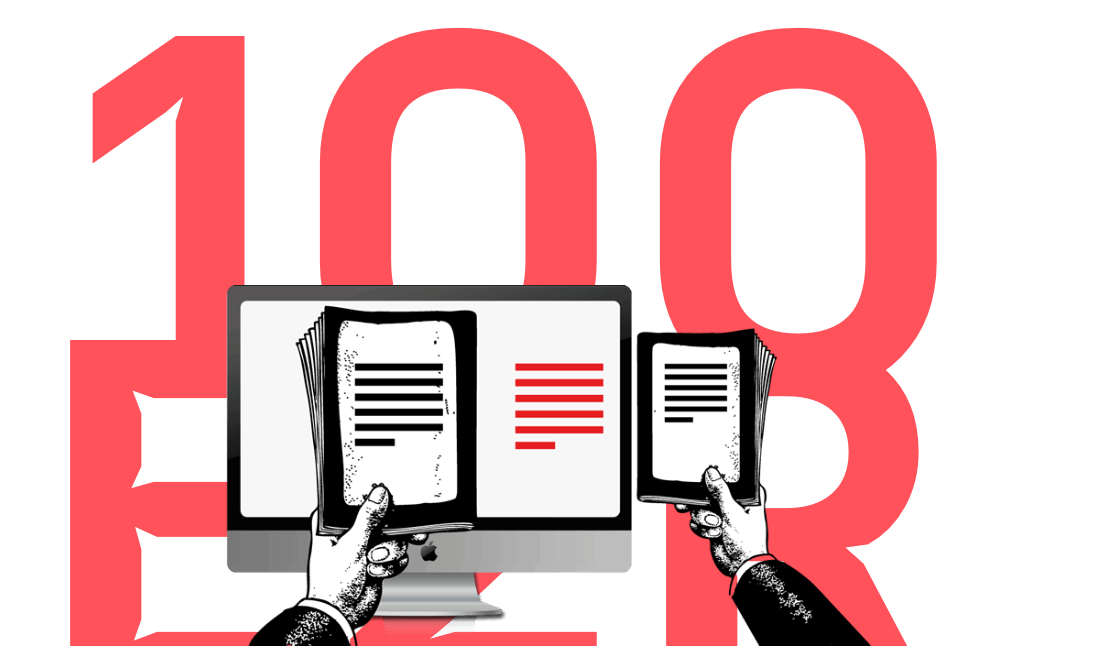
Design
Read Different
Apple Ads in Japan
Read Article
Design
New Athens
The old Greeks brought me here
Read ArticleDesign
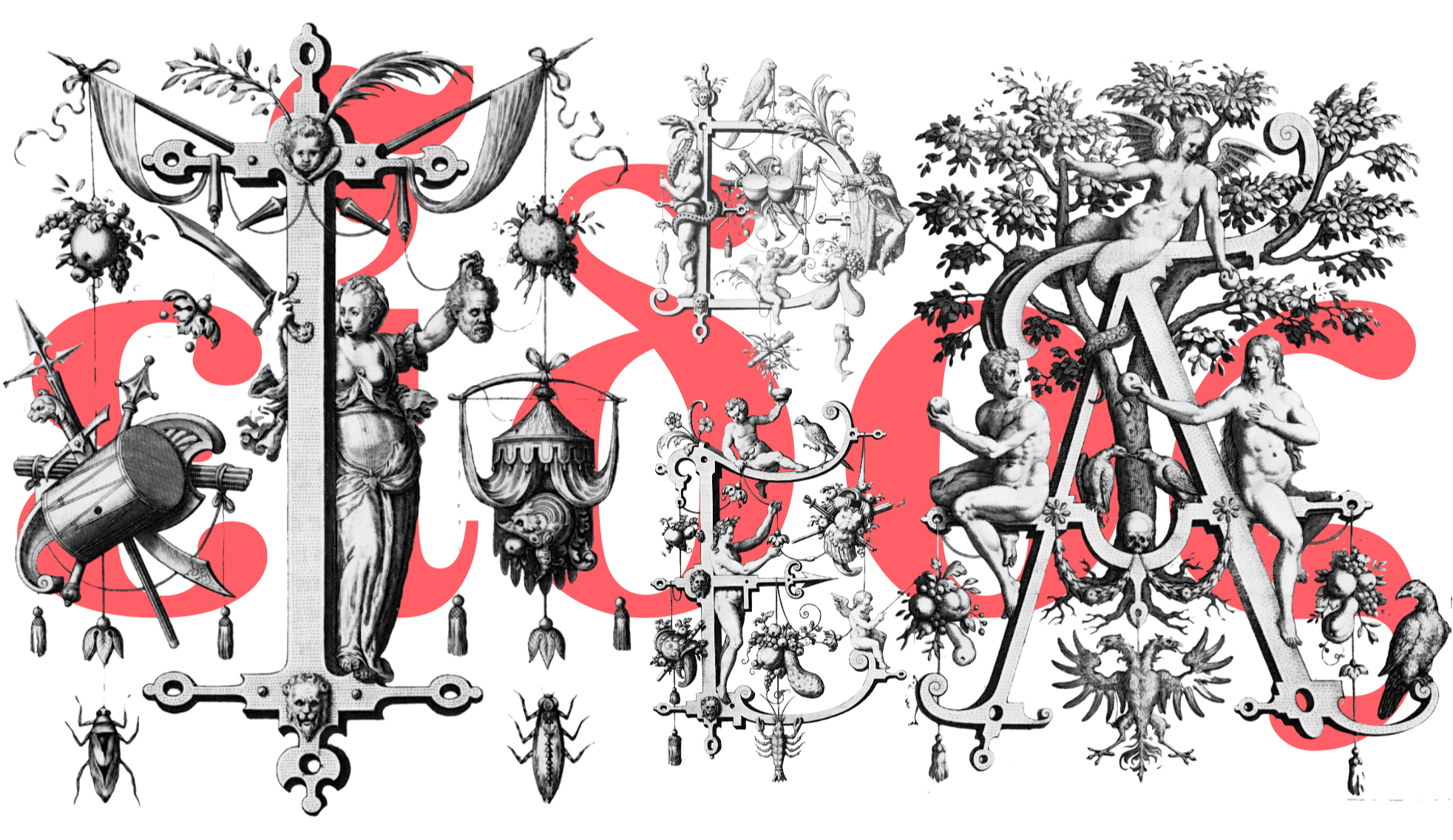
Webdesign is 95% Typography
Reactions
Read Article
Design
Jakob Nielsen, Time Machine?
An interview with the usability guru
Read ArticleBranding
Coca-Cola and The Matrix
Signals work best if they're bold
Read Article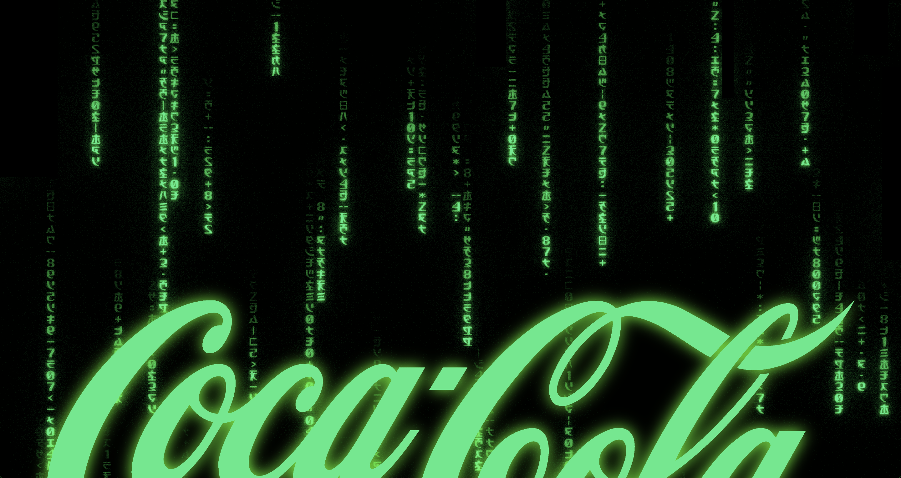
Insights
The Interface of a Cheeseburger
Brand = UI
Read Article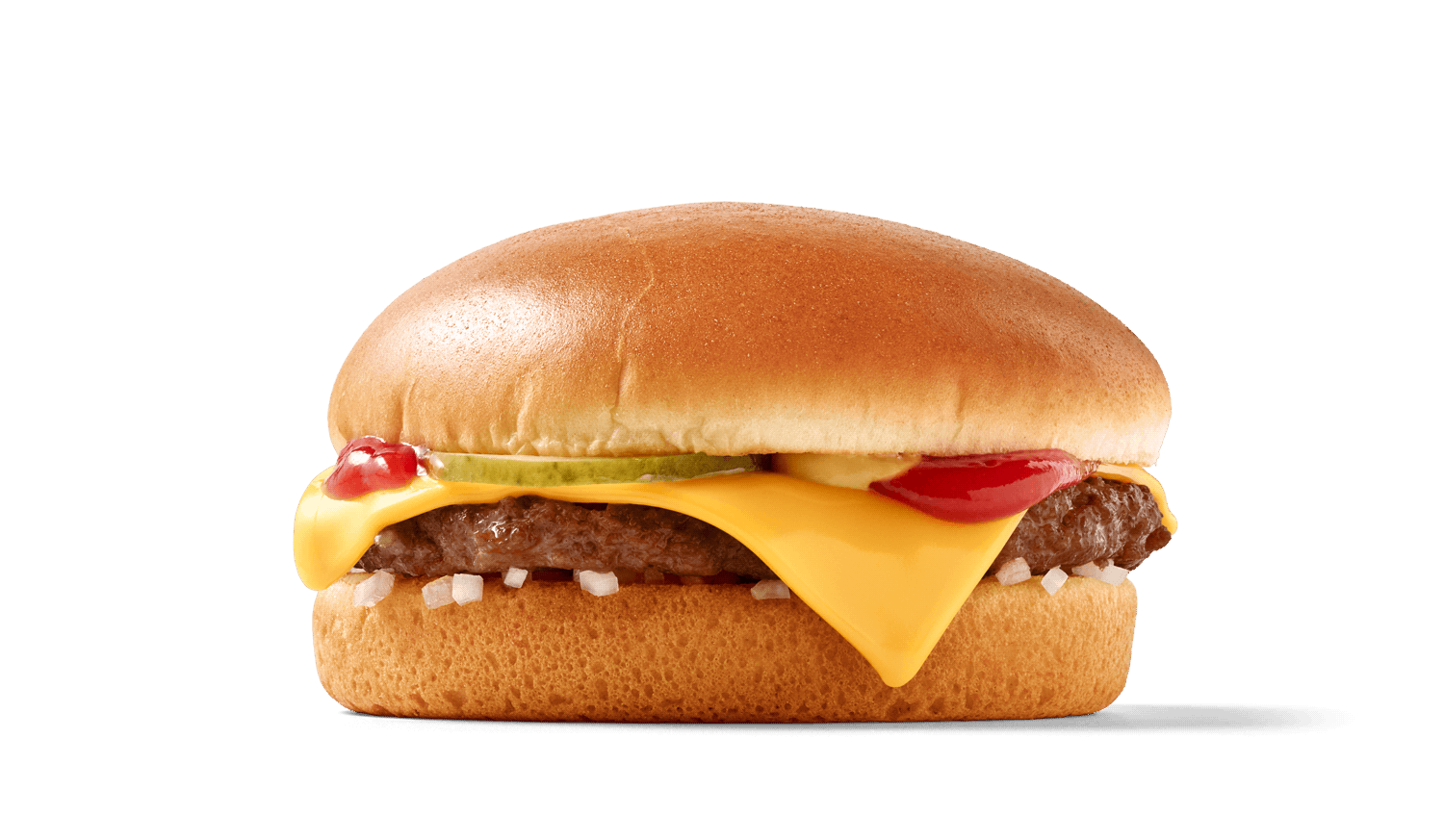
Insights
Web Design is 95% Typography
Text as UI
Read Article
Design
Design is How it Works
Deeper beauty
Read Article
Design
CI and CSS
Cool stuff
Read Article
Design
Why is Simplicity Difficult?
Style is easy, ease is hard
Read Article
Insights
Internet Consulting
Or the rare art of being clear
Read Article
Design
Usability News
The F-Pattern
Read Article
Insights
Internet Users Visit Only 6 Websites
So what?
Read Article
Design
Usability and Branding
Webdesign is Product Design
Read Article
Design
Usable Interface Design
Why are Computers not Flying?
Read Article
Design
The Right-Side Column
Just Noise?
Read Article
Design
Do We Really Need a Site Navigation?
It's not useless, but almost
Read ArticleDesign
How Important is Design on the Web?
Do pretty websites work better than ugly ones?
Read Article
Insights
Find an Accountant
Startup in Japan II
Read Article
Insights
The Basics
Starting up in Japan
Read Article
Insights
What is an Idea and How Much is it Worth?
Form matters
Read Article